Testing the post-content ask

Someone has come to your site.  They have downloaded your eight-point plan or a white paper.  They’ve taken an advocacy alert.  They’ve looked at your infographic.  Now what?

When we think about donors, it’s often with our fundraising glasses on, thinking how do I get this person to donate?

One of the underrated aspects of donorcentricity is starting off with the idea of “how do I solve this person’s problem?”.

That is to say, for people who come to your site with the intent of making a donation, most of them are going to make a donation.  For the majority that come with some other intent, however, what is their mindset and how can you help them achieve it?

Let’s take the person who wants to do something about your issue.  That something is, to them, to email their legislator about a particular piece of legislation you are working on.

A traditional fundraising approach would be to have a button on the advocacy page that encourages them, instead of taking an action alert, to donate to your advocacy campaigns.  This interruption marketing is trying to take them away from what they want to do to what you want them to do.

What I would advocate testing is finding your biggest content engagements and put a logical ask (not necessarily a donation ask) after the person has completed what they came there to do.

This could be:

  • On the confirmation page.  If someone downloaded a white paper, it could be “this white paper was made possible by the generous support of people like you” or, perhaps more engagingly, “now that you know about the plight of the Brown Bar-ba-loots, can you email your legislator to add them to the list of protected species?”
  • In a lightbox.  We talked about these earlier this week.  In addition to coming up after a page opens, you can also do them as they are about to close.  This type of ask can serve up your best reason or pitch to complete the action they came to the page to do.
  • As a follow-up email.  The test here can be what the appropriate action to ask for is.  If you have someone who has taken an action alert, what do they want to do next?  And what is of most value to you?

On a related note, I’ve worked with advocacy campaigns where a donation ask after an advocacy alert performed better than a similar up front ask by email without the action alert.  People wanted to take action, then donate.

The great thing about this is that you can be very specific in your ask.  That is, if someone took your Brown Bar-ba-loots action alert, your donation ask (if you choose to do that) can be a Bar-ba-loot specific campaign, crossing confirmation page, lightbox, and email follow-up.  You don’t have to ask this person about polar bears or penguins, because you already know what they care about.

So test out how you can solve your potential donor’s problem first, then ask for something of value.


Thank you for reading.  If you’d like more content like this, please sign up for my free weekly newsletter here.

Testing the post-content ask

What color are online donations?

I was once a color theory skeptic.  People forget that, before blue meant male and pink meant female, blue meant female and red meant male.  Because of this and the sometimes Chinese zodiac level of imbuing colors with different emotions, impacts, and even personalities, I branded the whole thing voodoo.

Then I looked at the data.  And while there is definitely still some chromatic shamanism* out there, there’s also some real life impact to the colors that you use on your site.

I’m not going to talk about the blue means passive, yellow means cowardly, etc. type stuff that you can get from research.  If you would like that, I recommend the Information is Beautiful color chart that you can see here

But in the words of a tweet from @NaomiNiles:

Next time I see an article telling people to increase their conversion rate by using one color instead of another, I’m going to cry.

So there will be no magic color at the end of this (or in the middle).  I’m speaking specifically about the colors you use to delineate the important, converting parts of your site and how that can pop.  Let the people who make up thick brand guidelines have the rest of the site; your job will be to stand out.

Because we are hardwired to seek out that which is different.  Even now, people will look longer the lion or snake in a picture than an antelope or mouse.  Our brains still seek out, notice, and fear perceived dangers even when our greatest professional threat has gone from “gored” to “recipient of cutting remark.”

Colors can make a big difference in this regard.  Dr. Nicolas Guéguen sent female hitchhikers out to get rides wearing different color T-shirts.  With male drivers, there was a significant color impact for red — so much so that the title of his article included Gentleman Drivers Prefer Red. This is likely because of the romantic associations of red as a color.

However, there was a potential impact among female drivers as well.  Females stopped 9.6% of the time for hitchhikers in yellow shirts and 9% for red shirts.  On the other side of the spectrum (rim shot), green shirts were picked up 5.3% of the time, with black at 6%.

The theory, because it is less likely statistically for female drivers to be impacted by romantic cues, is that red and yellow pop out visually when the background is largely gray roads.  

The same thing holds true for your donate (or subscribe) button.  How does it stand out from the rest of your site?

Hubspot looked at red versus green buttons:

red_green_button

They found the red button outperformed the green button by 21%.

But that was likely because other things on that page were green.  The red button was meant to stand out from the rest of the site.  

Let’s see how St. Jude does it:

stjude

You can see the two actions they want people to take — treatment and donation — are specifically delineated to get people to notice them amid the other colors.

WiderFunnel calls this type of button the BOB — the Big Orange Button.  The trick is that if your background color is orange, an orange button is the last thing you want.

On the flip side, here’s Autism Speaks’ home page.  In disclosure, I have two kids on the autism spectrum and have been both a recipient of its services and a donor to them.  I advocate for you to do donate as well.  But the donate button doesn’t jump out at you on their site:

autismspeaks.gif

This is clean and beautiful and fits their brand guidelines.  But I’d bet they could increase their donations if the donate button was orange (or red or yellow).

So I strongly encourage to use color (and size) to make your button stand out from the rest of your site — whatever that color is.  You can go down a rabbit hole trying to trick out your color to the exact shade you want, but having something that differentiates is most important.

Actually, what’s most important is having a compelling ask that touches the heart of the potential donor, but color can help it get noticed.
* Google says this is the first page on the web to use the phrase “chromatic shamanism.”  Now we just wait for the searchers to come, like moths to an extremely dim flame…

What color are online donations?

Let there be lightbox

Come, children.  Let’s gather ‘round the fire and I’ll tell you a tale of the Old Web.

Once upon a time, when you went to a site, you would be confronted with “pop-ups”.  These were new browser windows that would open when you would go to, interact with, or try to exit a site.  Sometimes, when you closed them, they would automatically open a new pop-up and so on.  

I’m told that the more ethically dubious the site, the more likely they were to have an endless loop of these.

We fought them with all of our might and hatred, until they became a casualty of the Second Browser Wars, as web browsers realized that they could make us happy by purging these from us once and for all.  Now only a few scattered pop-up survivors live among us, surviving on the barest scraps of attention.

Unfortunately, some of the stigma of pop-ups rubs off on lightboxes (or sha220px-fionaappleshadowboxerdowboxes, which I prefer (while less common) because I think of the Fiona Apple song)

You made me
A shadowboxer, baby
I wanna be ready
For what you do

People think that a light box* (slash shadow box) is just a glorified pop-up.  But when done properly, it has several advantages: it is easily closed, doesn’t cause a loop of pop-ups, and provides a quick guide to the first thing someone might want to do or know on a page.

But most of all, you should be trying light boxes because they work.  One report found that the average conversion rate for email acquisition light boxes is 1.66%.

So how do you make a lightbox work for you?  A few tips:

  • With a few exceptions, I would not suggest a donation ask lightbox.  Like we talked about yesterday, getting the first microconversion is easier and potentially more profitable that a straight ask on the home page.
  • Those few exceptions are:
    • End-of-year fundraising, when people are far more likely to be coming to your site with the express purpose of donating.  A light box will make it significantly easier for them.  (If there are similar campaigns for you, like Giving Tuesday or a special anniversary.  For your non-profit, not your spouse, although you should get them something nice.)
    • Any ask with urgency associated.  For example, if you have a matching gift campaign and can count down to the end of the match in your lightbox, I strongly recommend it.
    • When you are using the lightbox not on your homepage, but after some other action.  For example, shadowboxing the confirmation page of an advocacy action with a campaign-specific ask is a great idea.
  • Make them easy to get out of.  If this offer isn’t for the person, you want them to still enjoy browsing your site, rather than hating your guts.
  • Make them easy to get out of in mobile.  It is a little known fact that hell has expanded to a tenth level to accommodate new technology-associated crimes.  These include:
    • Making a lightbox that is unclosable on a mobile device because you can’t get to the X
    • Taking mobile phone calls in a public restroom
    • Replying all to company wise emails
    • Putting a conference call on hold so that 70 other people have to listen to your hold music before they hang up on you and call back in
    • Making a lightbox that is unclosable on a mobile device.  Oh, I mentioned this one twice?  That’s because it’s a special hell within the special hell.  Like child molesters in prison or Kourtney Kardashian**.
  • Make it smart.  Don’t show a repeat visitor the same shadow box over and over; use cookies to either vary your offer or leave it off altogether.  Research shows that you get the same number of sign-ups showing your light box every month rather than every time.  Also, customize your ask to the content a person is seeing.  If they go to your statistics page, give them an offer for your statistics white paper.  This will increase your conversions and their satisfaction.
  • Give a reason. You don’t want a lot of text on your light box, but you do want to have at least one statement that says why a person would want to take the action you want them to take.
  • Wait about five seconds.  That gives the person enough time to look at (and more than enough time to judge) your site, but not enough time to lose them to another offer.
  • Make sure you are layering in other techniques.  In particular, social proof XXX (“join the other 123,456 people who enjoy our email newsletter”), color theory (having a button color that stands out), and having a no option that doesn’t fit with a person’s self-image (“yes, I’d like to join the fight” versus “no, I don’t care about the environment”) can all be very effective.

So, pop-ups didn’t really die that day, kids.  They evolved to be less intrusive, more useful, and something that both users and nonprofits can value.  Now, alla you young’uns get some sleep, and dream of increased conversion rates.

* No, not a typo.  There does not appear to be a consensus on whether people say light box or lightbox or shadowbox or shadow box.  Thus, I’ve included all of the words in this piece so that they can be found by search engines.  I suggest you do the same in your content marketing.

** I don’t actually understand this joke myself, but I’m told it’s funny.

Let there be lightbox

Boiling a frog online

They say that the way to boil a frog is not to put them in boiling water.  It’s to put them in cold water and slowly turn up the heat.  Because the change is gradual, the frog will not notice until it is boiled.

Who “they” are and why they want to boil a frog is still unknown.  But the somewhat unfortunate metaphor has a point — it’s often easier to get someone to make a big change in small steps.

Thus, instead of thinking in conversions (for example, getting a visitor to your site to donate), it’s often easier to think in terms of microconversions — the little steps that lead to your (and hopefully your prospect’s) goal.  As the great conversion expert Avinash Kaushik says, “Focus on measuring your macro (overall) conversions, but for optimal awesomeness identify and measure your micro conversions as well.”

There are a few ways you can make this work for you:

Track microconversions and how they lead to your ultimate goal.  Some of these microconversions can include:

  • Connecting with you on social
  • Commenting on a blog post
  • Taking an advocacy action
  • Signing a petition
  • Downloading a white paper
  • Looking at a donation page
  • Subscribing to your e-newsletter
  • Contacting your organization
  • Creating an account
  • Looking for directions to your office

From here you are looking at a classic consultant’s 2×2 matrix:

  • High usage of the microconversion; high conversion to your end goal.  These are the things that make you happy.  For example, if action alert usage is the highest activity on your site and advocates are among your most likely people to donate, you are doing your job well.
  • Low usage of the microconversion; low conversion to your end goal.  You can ignore these things for now; they’ll require a lot of work to get into shape.  You have lower hanging fruit.
  • High usage of the microconversion; low conversion to your end goal.  This is one form of an opportunity — you want to work to optimize the path from the microconversion to your end goal.  Let’s say many people are downloading your white paper, but few of them are donating.  You might find that your communications are largely around different topics from the white paper and your asks aren’t related — these are all fixable things.
  • Low usage of the microconversion; high conversion to your end goal.  If almost no one is commenting on your blog, but almost everyone who comments donates, you should be working to get as many people as possible comment on your blog.

Also, if you are getting fancy, you can compute the value of each microconversion by looking at the donation history of people who take the action.  I’d advise you to get fancy, but the matrix is a good start.

Test a multi-stage donation form.  Tradition says that you click a big button that says “Donate” and you are taken to a long form that you fill out in its entirety.  Tradition will get you all of the gifts that you traditionally get.  The boiling a frog analogy works here; people want to finish things they start, so turning a long form into a series of microsteps easier can increase your overall conversion rate.

Heritage Foundation tried this technique and found it increased registrations by 99% with a two-step versus one-step form.

A few ways to do this include:

  • Ask for a donation amount up front.  If you mouse over a donate button, an ask array or a free response question can capture an amount immediately and pass it through to the next step.  It’s a simple step and once someone has taken that action, they are more likely to fulfill their donation.  (And if they don’t, you have a solid ask amount for their next visit or remarketing.)
  • Separate the credit card information from basic address information, with the address first.  Credit card information is the most personal information, so you want to get someone to volunteer their more basic information first.
  • Remember to use the period after donation confirmation to make a monthly giving ask as described here.


Introduce your surveys with easy questions first.  There is a reason that professional pollsters save questions like race and household income to the end — they come at a time when the subject is already psychological committed to completing the survey.  As we’ve discussed, commitment is a very powerful thing.  (Also, because if the person stops at that point, you still have the main data you want.)

If you are doing an online survey, start with a simple question up front, then build on future screens.  An online progress gauge is also helpful.  When a person knows there’s only 20% left in the survey, they are more likely to complete it (just like they are more likely to donate when there’s only 20% left in a campaign).

The big commonality with all of these techniques is to start small and build to a larger commitment.  It won’t help convert those who come to your web site looking to make a donation (OK, may it might), but it will help you build commitments among constituents who are less certain about taking a big step forward in their relationship with you.

Boiling a frog online

Simplifying your donation form

This week, we’re going to look at different online techniques you can try to help increase your conversion and donation rates.  I’d love to be able to share your ideas as well, so please email me at nick@directtodonor.com with your comments and case studies.  Or leave them in the comments section below, where we actually have intelligent conversations, unlike some sites (*cough*cough*YouTubecomments*cough*cough*).


henry_david_thoreau1

We’ll start with simplifying our donation page.  As patron saint/oversoul of simplification Henry David Thoreau almost said:

“Our [donation form] is frittered away by detail… Simplicity, simplicity, simplicity*! I say, let your [form requests] be as two or three, and not a hundred or a thousand; instead of a million count half a dozen, and keep your accounts on your thumb nail.”

Let’s start from first principles.  What is the point of your donation page?

It’s not a trick question.  The point is to get donations.  Anything else on that page should be subordinated to helping the person coming to the page make the donation for which they came to the page.

Once you have this as the aim, you’ll find that many of the things you put on that page don’t help in this regard:

Top navigation.  You should still have your logo that links back to your home page.  After all, you could do as well in user interface design with the maxim “never make the user use the back button” as you could in Christianity knowing only the Golden Rule.  In each, there’s a lot more to learn, but that one bit will get you through for now.

But do you need the link to each area of your mission, your about us page, and so on?  You do not, because the goal of the page is to get donations.  Take a look at St. Jude’s home page.

stjude.gif


It serves those who want to learn about, engage with, and donate to the organization.  However, once you go to donate, they know what you are there for and everything else melts away:

stjudedonation

Only those things necessary to make a donation remain.

Extraneous fields.  The donation form is not the place to ask for your entire database to be filled in.  Thus, prefix, middle name, and suffix can all be deleted.  Nor is it the place to ask for things you are interested in, but do not need.  Thus, phone number, fax number, connection to the cause, etc., should all go away.  (This is not to say you shouldn’t ask for them; that’s why God invented the confirmation page and/or post-donation survey.)

Any more convincing than is necessary.  I’m being intentionally vague here.  The challenge is that people come to your donation form from very different places.  If they came to your site, clicked on your light box (which we’ll talk about later in the week), and got to your donation form, they probably need some convincing to donate.

On the other hand, if a person subscribed to your e-newsletter, got your welcome series (you do have a welcome series don’t you?  If not, learn the basics here), and clicked to donate on the final email, they have already followed the journey you set out for them.  They are convinced and converted, so get them on their way successfully.

There was a great test I recommend a read of here.  In a nutshell, a nonprofit was testing their donation form, which normally had a video at the top of it, versus a back-end book premium.

The key to this test (I believe) was that it connected with email — people would already have been sold once they got to the page.  Thus, the non-video version had three times the conversion rate of the video version.  The goal of the page was to get them to donate, not to get them to watch the video.

This isn’t to say that the video can’t be an important part of the conversion process; just that it probably doesn’t belong on the donation form.

Similarly, reducing copy at the top of this email acquisition campaign increased response by 26%.

So I would definitely test taking much of the verbiage out of your donation page and see what happens to your conversion rate.

Remember, a simple donation form is (usually) a converting donation form.

* Yes, he said “Simplicity, simplicity, simplicity” instead of “simplify, simplify, simplify.”  I was surprised too.

Simplifying your donation form

Let’s get small: microimprovements

402px-david_von_michelangeloThere is a story, perhaps apocryphal, that someone watched Michelangelo retouching every inch of one of this statues.  The bystander asked him why he bothered with such trifles; the artist replied “Trifles make perfection. And perfection is no trifle.”

In the direct marketing world, it’s difficult to say that there is such a thing as perfection.  You will likely never see, in any quantity, a 100% response rate or open rate.  But our goal is to strive, to seek, to find, and not to yield.

There rarely is an idea that you have that will double the completion of your online donation page.  But you can find 16 ideas that each get you five percent better, each one compounding to double your response.

So without further ago, a few small ideas that may make small (or big) differences.  In no particular order:

Change the color of your donate button to something not approved in your brand guidelines.  It will stick out.  Good.  Things that stick out get clicked on.  When this starts to lose its effectiveness, change it again.

Reduce the size of your download.  A Sprint phone downloads an average of 11 MB per second on 4G .  We can easily design pages with enough extra code and random things to download to cost an extra second.  One second lost means 7% fewer conversions.

That’s probably why water.org has their homepage look like this:

water

But their donation page looks like this:


waterdonationpage

Increase customization by a variable.  If you do name, do name and location.  If you do name and location, add in donation history.  Et cetera.  These are more than 5% tactics

Add a small donate bar at the top of your site.  Human Rights Watch reported (at DMA’s DC nonprofit conference) that the below orange bar and a larger orange footer on their site increased donations from the home page by 256%.  Many days, I’d settle for 2.56%.

Go into Google AdWords.  And do what it says to do.  If it recommends splitting up your keywords, it probably knows that doing so will allow you to customize your copy.  Punctuate your headline properly.  It knows that increases click-throughs.  And so on.  It will keep bringing up these opportunities; you just have to act on them.

Try adding a picture.  Not necessarily guaranteed, but a quality picture will usually improve a home page, mailpiece, donation page, content marketing, etc.  I’ve found a significant difference in the traffic I get from blog posts with pictures over those without.  Hence David hanging out at the top of this one.

Call some donors.  Ideally some of your best, but these thank you’s will both help with the donor’s loyalty and give you ideas for things you can try (or stop).

Take some fields off of your donation form.  Phone number?  Ask for that afterward.  If you have the ability to divine city and state from ZIP on your form, go for it.  You are looking to streamline this process.

Similarly, reduce the clicks to get to the donation form.  Hopefully, it’s one or zero (that is, you can start entering info on the Web page).

Remove the navigation from your donation page.  Now is not the time for someone to want to look at your executive’s pictures.  Four tests show improvements from the tiny to the oh-my-goodness here.  

Run a test.  Are those ask amounts correct?  How do you know?  If you are mailing, emailing, or calling with the same thing for 100% of your communications, you are missing out on your 5% opportunities.

Hopefully, one of these gets you 5%.  If it does, please leave it in the comments.  If it doesn’t, please let us know in the comments what did.

Let’s get small: microimprovements

Acquiring new advocates in (and for) direct marketing

There are several services now set up to bring advocates into your organization on a cost-per-acquisition basis. Care2, Change.org, and CQ Roll Call are the main ones that have come across my desk.

In full disclosure, I have not yet tried these services. I hope that anyone who has can tell about their experience in the comments (or contact me at nick@directtodonor.com; I’d love to set up a guest blog opportunity to help correct my vast areas of ignorance).

But I do know what would be required for me to participate in these types of campaigns:

  • Maximizing free/content marketing efforts
  • Optimized advocacy forms and efforts
  • Strong knowledge of the value of each advocate and a strong projection of the value of these externally acquired advocates versus internally acquired ones.

I’ll go through each of these in turn, as these would be valuable whether or not you decide to invest in cost-per-acquisition campaigns.

Maximizing free/content marketing efforts

First, get your Google Grant.  I know, I’ve said it before, but some of you still don’t have one.  So get it.  Consider it free traffic to your advocacy efforts.

Speaking of, after donation forms, advocacy activities are the best thing you can direct search traffic to, as they convert very well.  It’s usually a safe bet that the person searching for “email congress seal clubbing” wants to email their elected officials about seal clubbing.  And if they click through on your ad, they are probably on the con side.

(A note: as of this writing, there are no nonprofit ads for the term “seal clubbing,” but Humane Society and PETA are on the first page of search results.  Opportunity?)

And, as we mentioned last week, now you know something about your constituent’s interest as you work to, one change at a time, probe their interests and convert them to a donor.

That’s on the search engine side, but the more important part is to make advocacy a part of your communications. The more you talk about activities and activations in your blog, enewsletter, social media, and Web site, the more people will interact with it.  Here are some potential topics:

  • Highlight news stories about your issue.
  • And don’t just retweet that article about your issue; add the note that that’s why we have to pass HB1489 (or whatever) with a link for people to take action.
  • Blog a first-person account from one of your volunteers who lobbied legislators and how rewarding it was.
  • Talk about your lobby day (state or national) and invite your constituents to be a part of a virtual lobby day online.
  • Honor legislators who have been champions of your cause.
  • Tell success stories of passed legislation (since you should be doing these for your online and offline petition signers anyway).
  • Post a legislative agenda for the year and report back on it with the legislature(s) is/are closed.

Hopefully, these will increase interests in your petitions or emails to legislators.

Optimize advocacy forms and efforts.  I probably should have mentioned earlier that you need a platform for emailing legislators that allows you to own the constituent, not whatever petition service you are working.  These can range from setting up your own form on your site to ones that come with your CRM to paid solutions of all stripes.  If there’s enough interest (you can let me know by emailing me at nick@directtodonor.com), I can review these solutions in a future post.  For now, suffice it to say that the value in advocacy online is to whom the constituent belongs.  If it’s you, you can ask for future actions — advocacy and otherwise; if it’s someone else, you are helping them build their house, not yours.

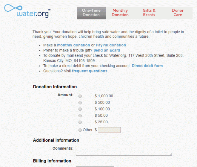
Once you have these forms, it’s important that you treat your advocacy form like a donation form (if possible), where you are continually testing and refining your system.  For example, if you are doing a national petition, you may just ask for name and email address in order to maximize form completion.  I would advocate also asking for zip code; if you are going to be asking people to participate in other advocacy efforts, you will have to know in which districts they fall.  That may be it in order to get people into your organization.  Physical address may impair your form activation rates to the point that it is more profitable (side note: we need a term for profitable, but for non-profits; non-profitable sounds like the opposite of what it is) to leave that off and either ask for or append (or, more likely, both) the data afterward.

Further, there are all the usual things to test:

  • Does your petition work better at left or right?
  • Pictures on the page or spartan?
  • One-step action or multi-step?
  • How much copy to sell the petition action?
  • And so on

You definitely want this tested before trying any sort of paid campaign so you are not pouring water into a bucket without a bottom.

You also want to put similar rigor behind what communications you send advocates after their advocacy.  This would include a customized advocate welcome series, what (if any) is the first mailing they would get, what other actions you ask them to take, etc.  More on this tomorrow.

These are significant determinants of lifetime value, so you want these well in place before…

Determining the value of an advocate

For some organizations, having an advocate is its own reward.  For most, however, it’s also an activity on which you will want to break at least even.  Unfortunately, lifetime value is hard and multichannel attribution is its own week of blog posts at some point.  So here’s a quick and dirty hack for figuring out how much you should be willing to invest to get an advocate:

  1. Pull a list of everyone who came into your online database via advocacy action.
  2. Pull a list of the donations these people made online over the past year.
  3. Average the sum of the donations by the number of people in your database via advocacy action to find the one year value of an advocate.

That’s it.

I can hear purists out there screaming at me: “what about future year revenues from an advocate?”, “what about the value these constituents have in recruiting other constituents?”, “what about the gifts made in other channels?”, etc.

I agree: this is not the best way to pull an average advocate’s lifetime value.  It is, however, a quick one.  And it sets a baseline: if you know the average advocate is going to pay for themselves in 12 months, all of their other activities will be gravy.

That is, if you work this equation and it says the average advocate on your file gave you $3 last year, you know that acquiring an advocate for up to three dollars is valuable.  If your advocacy page converts at 10%, you know that you can put up CPC ads on search networks and pay up to $.30 per click.  You can experiment with online petition sites, which charge at least $1.50 per advocate (in my experience).  And you can value your online communications that bring in new advocates versus those that bring in new donors.

So this dart throw, primitive though it may be, can help you determine your communications mix and investment.  Not back for something you can do in Excel in 15 minutes.

If you would like more tips like this one, please sign up for our weekly newsletter. There you will get to pick new topics for the blog, see related content to what you get on Direct to Donor, and get a TL;DR version of the week’s news.  Thanks!

Acquiring new advocates in (and for) direct marketing