Attribution challenges for online and offline marketers

This week, we’ve been looking at the differences between online and offline direct marketing and how the specialists from these two different worlds can talk to each other.

This difference may be no more stark than it is for attribution.

With online attribution, you can follow a Web visitors journey through your site.  You can (and should) follow them through the site and say that someone we attract to the home page is worth X; if we get them to take an advocacy alert, they are worth Y; if they download a white paper, they are worth Z.  These steps toward donation each have their place in the donor journey firmament online.

With offline, attribution is usually applied with a sledgehammer — they donated to X mail piece, so X gets the credit.

Having run a quasi-membership program, I’ve seen the absurd joy of watching donations spike to last year’s membership pieces the moment this year’s come out.  (OK, “spike” is a bit dramatic; “hill” perhaps?  They go up by a little for a time, then back down.)  People almost certainly set them aside and then, reminded by the latest piece, send in whatever reply device they have at hand.

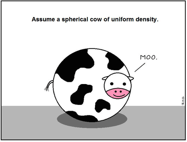
This is one minor example of how offline attribution is often done, but simplified to the point of absurdity.  One is put in mind of the old physicists’ joke about milk production:

Ever lower milk prices were driving a dairy farmer to desperate measures, so he consulted with  a theoretical physicist. The physicist listened to his problem, asked a few questions, and then said he’d take the assignment, and that it would take only a few hours to solve the problem. A few weeks later, the physicist phoned the farmer, “I’ve got the answer. The solution turned out to be a bit more complicated than I thought and I’m presenting it at this afternoon’s seminar.”  As the talk begins the physicist approaches the blackboard and draws a big circle. “First, we assume a spherical cow of uniform density…” (here’s the origin joke, which I simplified

b_-0px8ugaav6t7

So I guess was the only one who thought of that joke with oversimplification?  Sorry ‘bout that…

Anyway, this way of looking at attribution has several program-damaging faults:

  • It can cause people to cut cultivation communications.  These communications that help retain donors, learn about them, and bring them ever closer to the mission but don’t directly convert can have a big impact on eventual conversion.  In essence, you may end up cutting the wrong thing.
  • It can cause overcommunication.  If you add a communication and it nets positive, you may think it is the power of that communication, when it’s really about the the last communication but there wasn’t enough space between communications to differentiate.
  • It puts you in a mindset where you are thinking about the individual communications, not the individual donors.  This puts you in real trouble.  It’s natural to look at a mail piece or an email and think about how it “generated” the gift (when some research indicates that the last piece is about 16% responsible for a gift, leaving the vast majority to other causes).  In reality, the donor generated the gift.  How do you want to treat that donor going forward.

While sacrilegious to some, offline direct marketers would do well to take a bit of the humility from online attribution models (if not the models themselves) — there is only so much the proximate communication is responsible for.

Attribution challenges for online and offline marketers

What are the open rates and click-throughs of your mail pieces?

It sounds like a non-sensical question.  And it highlights another major difference between offline and online direct marketing — trackability.

Those who live in the digital marketing space are used to being able to track what happens with their emails and campaigns down to the user level.  They complain when tracking pixels don’t work quite the way they are supposed to on every device and aim for ever better attribution models to understand where their investments are going.

XX Home Maytag B.jpgThose in the offline space are used to sending something out and waiting for results.  And waiting.  And waiting.  

Further, they are used to looking at packages as a whole.  They get one result: did someone donate (OK, two: and how much)?  Because of this, it’s tempting to think of mail testing as the thumbs up or thumbs down as in the Roman coliseum.

But you can find out things like your offline open rates and tweak them to your heart’s content. Take a simple 2X2 testing matrix.

While you won’t be able to tell what your actual open rate was, you can to content yourself with relative open rates.  With online, you have an intuitive feel for whether a 20% open rate is good or bad compared with the emails around it (and whether they generally are opened at 10% or 30%).  This same relative weighing works well in mail.  If 20% more people donating with envelope A than with envelope B all other things being equal, then you have a 20% better open rate with envelope A.

Similarly, if letter C does better than letter D by 30% with the other parts of the mail piece staying constant, you have a 30% better “click-through” rate.

And you probably already know the trick that you only have to test three of the four quadrants here.  If envelope A beats B when they both use letter D and letter C beats D when they both use envelope B, chances are pretty good that the winning test is envelope A with letter C, even though that wasn’t a tested combination.

But what you may not know is the right algorithm can do this writ large with a wide variety of variables.  Ask your vendor(s) if they can run permutations that will allow you to figure out what happens when you five envelopes, four offers, three letter permutations, six different ask strings, and so on.  They should be able to create a variablized stew that helps you run a number of tests at once.

The other thing that I’d recommend is not just taking a page from the online playbook, but using online tools to test your efforts first.  Don’t know if your teaser copy will work well?  Try it as an email subject line or a CPC ad headline first.  While the audiences are a bit different online and offline, catchy is generally catchy and boring is boring.  Working out details like this online can save your testing for things that can actually help you get to know your donor better, leading to more valuable communications and donors.  

(Or, better yet, scrap your teaser copy and test a plain white envelope — it may have the best open rate of all.)

What are the open rates and click-throughs of your mail pieces?

Testing the post-content ask

Someone has come to your site.  They have downloaded your eight-point plan or a white paper.  They’ve taken an advocacy alert.  They’ve looked at your infographic.  Now what?

When we think about donors, it’s often with our fundraising glasses on, thinking how do I get this person to donate?

One of the underrated aspects of donorcentricity is starting off with the idea of “how do I solve this person’s problem?”.

That is to say, for people who come to your site with the intent of making a donation, most of them are going to make a donation.  For the majority that come with some other intent, however, what is their mindset and how can you help them achieve it?

Let’s take the person who wants to do something about your issue.  That something is, to them, to email their legislator about a particular piece of legislation you are working on.

A traditional fundraising approach would be to have a button on the advocacy page that encourages them, instead of taking an action alert, to donate to your advocacy campaigns.  This interruption marketing is trying to take them away from what they want to do to what you want them to do.

What I would advocate testing is finding your biggest content engagements and put a logical ask (not necessarily a donation ask) after the person has completed what they came there to do.

This could be:

  • On the confirmation page.  If someone downloaded a white paper, it could be “this white paper was made possible by the generous support of people like you” or, perhaps more engagingly, “now that you know about the plight of the Brown Bar-ba-loots, can you email your legislator to add them to the list of protected species?”
  • In a lightbox.  We talked about these earlier this week.  In addition to coming up after a page opens, you can also do them as they are about to close.  This type of ask can serve up your best reason or pitch to complete the action they came to the page to do.
  • As a follow-up email.  The test here can be what the appropriate action to ask for is.  If you have someone who has taken an action alert, what do they want to do next?  And what is of most value to you?

On a related note, I’ve worked with advocacy campaigns where a donation ask after an advocacy alert performed better than a similar up front ask by email without the action alert.  People wanted to take action, then donate.

The great thing about this is that you can be very specific in your ask.  That is, if someone took your Brown Bar-ba-loots action alert, your donation ask (if you choose to do that) can be a Bar-ba-loot specific campaign, crossing confirmation page, lightbox, and email follow-up.  You don’t have to ask this person about polar bears or penguins, because you already know what they care about.

So test out how you can solve your potential donor’s problem first, then ask for something of value.


Thank you for reading.  If you’d like more content like this, please sign up for my free weekly newsletter here.

Testing the post-content ask

What color are online donations?

I was once a color theory skeptic.  People forget that, before blue meant male and pink meant female, blue meant female and red meant male.  Because of this and the sometimes Chinese zodiac level of imbuing colors with different emotions, impacts, and even personalities, I branded the whole thing voodoo.

Then I looked at the data.  And while there is definitely still some chromatic shamanism* out there, there’s also some real life impact to the colors that you use on your site.

I’m not going to talk about the blue means passive, yellow means cowardly, etc. type stuff that you can get from research.  If you would like that, I recommend the Information is Beautiful color chart that you can see here

But in the words of a tweet from @NaomiNiles:

Next time I see an article telling people to increase their conversion rate by using one color instead of another, I’m going to cry.

So there will be no magic color at the end of this (or in the middle).  I’m speaking specifically about the colors you use to delineate the important, converting parts of your site and how that can pop.  Let the people who make up thick brand guidelines have the rest of the site; your job will be to stand out.

Because we are hardwired to seek out that which is different.  Even now, people will look longer the lion or snake in a picture than an antelope or mouse.  Our brains still seek out, notice, and fear perceived dangers even when our greatest professional threat has gone from “gored” to “recipient of cutting remark.”

Colors can make a big difference in this regard.  Dr. Nicolas Guéguen sent female hitchhikers out to get rides wearing different color T-shirts.  With male drivers, there was a significant color impact for red — so much so that the title of his article included Gentleman Drivers Prefer Red. This is likely because of the romantic associations of red as a color.

However, there was a potential impact among female drivers as well.  Females stopped 9.6% of the time for hitchhikers in yellow shirts and 9% for red shirts.  On the other side of the spectrum (rim shot), green shirts were picked up 5.3% of the time, with black at 6%.

The theory, because it is less likely statistically for female drivers to be impacted by romantic cues, is that red and yellow pop out visually when the background is largely gray roads.  

The same thing holds true for your donate (or subscribe) button.  How does it stand out from the rest of your site?

Hubspot looked at red versus green buttons:

red_green_button

They found the red button outperformed the green button by 21%.

But that was likely because other things on that page were green.  The red button was meant to stand out from the rest of the site.  

Let’s see how St. Jude does it:

stjude

You can see the two actions they want people to take — treatment and donation — are specifically delineated to get people to notice them amid the other colors.

WiderFunnel calls this type of button the BOB — the Big Orange Button.  The trick is that if your background color is orange, an orange button is the last thing you want.

On the flip side, here’s Autism Speaks’ home page.  In disclosure, I have two kids on the autism spectrum and have been both a recipient of its services and a donor to them.  I advocate for you to do donate as well.  But the donate button doesn’t jump out at you on their site:

autismspeaks.gif

This is clean and beautiful and fits their brand guidelines.  But I’d bet they could increase their donations if the donate button was orange (or red or yellow).

So I strongly encourage to use color (and size) to make your button stand out from the rest of your site — whatever that color is.  You can go down a rabbit hole trying to trick out your color to the exact shade you want, but having something that differentiates is most important.

Actually, what’s most important is having a compelling ask that touches the heart of the potential donor, but color can help it get noticed.
* Google says this is the first page on the web to use the phrase “chromatic shamanism.”  Now we just wait for the searchers to come, like moths to an extremely dim flame…

What color are online donations?

Let there be lightbox

Come, children.  Let’s gather ‘round the fire and I’ll tell you a tale of the Old Web.

Once upon a time, when you went to a site, you would be confronted with “pop-ups”.  These were new browser windows that would open when you would go to, interact with, or try to exit a site.  Sometimes, when you closed them, they would automatically open a new pop-up and so on.  

I’m told that the more ethically dubious the site, the more likely they were to have an endless loop of these.

We fought them with all of our might and hatred, until they became a casualty of the Second Browser Wars, as web browsers realized that they could make us happy by purging these from us once and for all.  Now only a few scattered pop-up survivors live among us, surviving on the barest scraps of attention.

Unfortunately, some of the stigma of pop-ups rubs off on lightboxes (or sha220px-fionaappleshadowboxerdowboxes, which I prefer (while less common) because I think of the Fiona Apple song)

You made me
A shadowboxer, baby
I wanna be ready
For what you do

People think that a light box* (slash shadow box) is just a glorified pop-up.  But when done properly, it has several advantages: it is easily closed, doesn’t cause a loop of pop-ups, and provides a quick guide to the first thing someone might want to do or know on a page.

But most of all, you should be trying light boxes because they work.  One report found that the average conversion rate for email acquisition light boxes is 1.66%.

So how do you make a lightbox work for you?  A few tips:

  • With a few exceptions, I would not suggest a donation ask lightbox.  Like we talked about yesterday, getting the first microconversion is easier and potentially more profitable that a straight ask on the home page.
  • Those few exceptions are:
    • End-of-year fundraising, when people are far more likely to be coming to your site with the express purpose of donating.  A light box will make it significantly easier for them.  (If there are similar campaigns for you, like Giving Tuesday or a special anniversary.  For your non-profit, not your spouse, although you should get them something nice.)
    • Any ask with urgency associated.  For example, if you have a matching gift campaign and can count down to the end of the match in your lightbox, I strongly recommend it.
    • When you are using the lightbox not on your homepage, but after some other action.  For example, shadowboxing the confirmation page of an advocacy action with a campaign-specific ask is a great idea.
  • Make them easy to get out of.  If this offer isn’t for the person, you want them to still enjoy browsing your site, rather than hating your guts.
  • Make them easy to get out of in mobile.  It is a little known fact that hell has expanded to a tenth level to accommodate new technology-associated crimes.  These include:
    • Making a lightbox that is unclosable on a mobile device because you can’t get to the X
    • Taking mobile phone calls in a public restroom
    • Replying all to company wise emails
    • Putting a conference call on hold so that 70 other people have to listen to your hold music before they hang up on you and call back in
    • Making a lightbox that is unclosable on a mobile device.  Oh, I mentioned this one twice?  That’s because it’s a special hell within the special hell.  Like child molesters in prison or Kourtney Kardashian**.
  • Make it smart.  Don’t show a repeat visitor the same shadow box over and over; use cookies to either vary your offer or leave it off altogether.  Research shows that you get the same number of sign-ups showing your light box every month rather than every time.  Also, customize your ask to the content a person is seeing.  If they go to your statistics page, give them an offer for your statistics white paper.  This will increase your conversions and their satisfaction.
  • Give a reason. You don’t want a lot of text on your light box, but you do want to have at least one statement that says why a person would want to take the action you want them to take.
  • Wait about five seconds.  That gives the person enough time to look at (and more than enough time to judge) your site, but not enough time to lose them to another offer.
  • Make sure you are layering in other techniques.  In particular, social proof XXX (“join the other 123,456 people who enjoy our email newsletter”), color theory (having a button color that stands out), and having a no option that doesn’t fit with a person’s self-image (“yes, I’d like to join the fight” versus “no, I don’t care about the environment”) can all be very effective.

So, pop-ups didn’t really die that day, kids.  They evolved to be less intrusive, more useful, and something that both users and nonprofits can value.  Now, alla you young’uns get some sleep, and dream of increased conversion rates.

* No, not a typo.  There does not appear to be a consensus on whether people say light box or lightbox or shadowbox or shadow box.  Thus, I’ve included all of the words in this piece so that they can be found by search engines.  I suggest you do the same in your content marketing.

** I don’t actually understand this joke myself, but I’m told it’s funny.

Let there be lightbox

Boiling a frog online

They say that the way to boil a frog is not to put them in boiling water.  It’s to put them in cold water and slowly turn up the heat.  Because the change is gradual, the frog will not notice until it is boiled.

Who “they” are and why they want to boil a frog is still unknown.  But the somewhat unfortunate metaphor has a point — it’s often easier to get someone to make a big change in small steps.

Thus, instead of thinking in conversions (for example, getting a visitor to your site to donate), it’s often easier to think in terms of microconversions — the little steps that lead to your (and hopefully your prospect’s) goal.  As the great conversion expert Avinash Kaushik says, “Focus on measuring your macro (overall) conversions, but for optimal awesomeness identify and measure your micro conversions as well.”

There are a few ways you can make this work for you:

Track microconversions and how they lead to your ultimate goal.  Some of these microconversions can include:

  • Connecting with you on social
  • Commenting on a blog post
  • Taking an advocacy action
  • Signing a petition
  • Downloading a white paper
  • Looking at a donation page
  • Subscribing to your e-newsletter
  • Contacting your organization
  • Creating an account
  • Looking for directions to your office

From here you are looking at a classic consultant’s 2×2 matrix:

  • High usage of the microconversion; high conversion to your end goal.  These are the things that make you happy.  For example, if action alert usage is the highest activity on your site and advocates are among your most likely people to donate, you are doing your job well.
  • Low usage of the microconversion; low conversion to your end goal.  You can ignore these things for now; they’ll require a lot of work to get into shape.  You have lower hanging fruit.
  • High usage of the microconversion; low conversion to your end goal.  This is one form of an opportunity — you want to work to optimize the path from the microconversion to your end goal.  Let’s say many people are downloading your white paper, but few of them are donating.  You might find that your communications are largely around different topics from the white paper and your asks aren’t related — these are all fixable things.
  • Low usage of the microconversion; high conversion to your end goal.  If almost no one is commenting on your blog, but almost everyone who comments donates, you should be working to get as many people as possible comment on your blog.

Also, if you are getting fancy, you can compute the value of each microconversion by looking at the donation history of people who take the action.  I’d advise you to get fancy, but the matrix is a good start.

Test a multi-stage donation form.  Tradition says that you click a big button that says “Donate” and you are taken to a long form that you fill out in its entirety.  Tradition will get you all of the gifts that you traditionally get.  The boiling a frog analogy works here; people want to finish things they start, so turning a long form into a series of microsteps easier can increase your overall conversion rate.

Heritage Foundation tried this technique and found it increased registrations by 99% with a two-step versus one-step form.

A few ways to do this include:

  • Ask for a donation amount up front.  If you mouse over a donate button, an ask array or a free response question can capture an amount immediately and pass it through to the next step.  It’s a simple step and once someone has taken that action, they are more likely to fulfill their donation.  (And if they don’t, you have a solid ask amount for their next visit or remarketing.)
  • Separate the credit card information from basic address information, with the address first.  Credit card information is the most personal information, so you want to get someone to volunteer their more basic information first.
  • Remember to use the period after donation confirmation to make a monthly giving ask as described here.


Introduce your surveys with easy questions first.  There is a reason that professional pollsters save questions like race and household income to the end — they come at a time when the subject is already psychological committed to completing the survey.  As we’ve discussed, commitment is a very powerful thing.  (Also, because if the person stops at that point, you still have the main data you want.)

If you are doing an online survey, start with a simple question up front, then build on future screens.  An online progress gauge is also helpful.  When a person knows there’s only 20% left in the survey, they are more likely to complete it (just like they are more likely to donate when there’s only 20% left in a campaign).

The big commonality with all of these techniques is to start small and build to a larger commitment.  It won’t help convert those who come to your web site looking to make a donation (OK, may it might), but it will help you build commitments among constituents who are less certain about taking a big step forward in their relationship with you.

Boiling a frog online

Simplifying your donation form

This week, we’re going to look at different online techniques you can try to help increase your conversion and donation rates.  I’d love to be able to share your ideas as well, so please email me at nick@directtodonor.com with your comments and case studies.  Or leave them in the comments section below, where we actually have intelligent conversations, unlike some sites (*cough*cough*YouTubecomments*cough*cough*).


henry_david_thoreau1

We’ll start with simplifying our donation page.  As patron saint/oversoul of simplification Henry David Thoreau almost said:

“Our [donation form] is frittered away by detail… Simplicity, simplicity, simplicity*! I say, let your [form requests] be as two or three, and not a hundred or a thousand; instead of a million count half a dozen, and keep your accounts on your thumb nail.”

Let’s start from first principles.  What is the point of your donation page?

It’s not a trick question.  The point is to get donations.  Anything else on that page should be subordinated to helping the person coming to the page make the donation for which they came to the page.

Once you have this as the aim, you’ll find that many of the things you put on that page don’t help in this regard:

Top navigation.  You should still have your logo that links back to your home page.  After all, you could do as well in user interface design with the maxim “never make the user use the back button” as you could in Christianity knowing only the Golden Rule.  In each, there’s a lot more to learn, but that one bit will get you through for now.

But do you need the link to each area of your mission, your about us page, and so on?  You do not, because the goal of the page is to get donations.  Take a look at St. Jude’s home page.

stjude.gif


It serves those who want to learn about, engage with, and donate to the organization.  However, once you go to donate, they know what you are there for and everything else melts away:

stjudedonation

Only those things necessary to make a donation remain.

Extraneous fields.  The donation form is not the place to ask for your entire database to be filled in.  Thus, prefix, middle name, and suffix can all be deleted.  Nor is it the place to ask for things you are interested in, but do not need.  Thus, phone number, fax number, connection to the cause, etc., should all go away.  (This is not to say you shouldn’t ask for them; that’s why God invented the confirmation page and/or post-donation survey.)

Any more convincing than is necessary.  I’m being intentionally vague here.  The challenge is that people come to your donation form from very different places.  If they came to your site, clicked on your light box (which we’ll talk about later in the week), and got to your donation form, they probably need some convincing to donate.

On the other hand, if a person subscribed to your e-newsletter, got your welcome series (you do have a welcome series don’t you?  If not, learn the basics here), and clicked to donate on the final email, they have already followed the journey you set out for them.  They are convinced and converted, so get them on their way successfully.

There was a great test I recommend a read of here.  In a nutshell, a nonprofit was testing their donation form, which normally had a video at the top of it, versus a back-end book premium.

The key to this test (I believe) was that it connected with email — people would already have been sold once they got to the page.  Thus, the non-video version had three times the conversion rate of the video version.  The goal of the page was to get them to donate, not to get them to watch the video.

This isn’t to say that the video can’t be an important part of the conversion process; just that it probably doesn’t belong on the donation form.

Similarly, reducing copy at the top of this email acquisition campaign increased response by 26%.

So I would definitely test taking much of the verbiage out of your donation page and see what happens to your conversion rate.

Remember, a simple donation form is (usually) a converting donation form.

* Yes, he said “Simplicity, simplicity, simplicity” instead of “simplify, simplify, simplify.”  I was surprised too.

Simplifying your donation form

Online advertising metrics basics

You may be saying “Mr. Direct to Donor, why would I read this?  My online advertising budget is limited to whatever I can find between the couch cushions.”

First, please call me Nick.  Mister Direct to Donor is my dad (actually, Dr. Direct to Donor, DDS, but that’s another thing).

Second, knowledge of the basic online advertising metrics, along with a deep knowledge of what you are willing to pay for each type of constituent or click, can help you bootstrap an online marketing budget by making investments that will pay off in shorter timeframes that you can get offline (usually).

So, first things first.  Online advertising is dominated by CP_s.  The CP stands for “cost per” and the _ can be filled in by C for click, A for acquisition, or M for thousand.

(Yes, I know.  It should be “T is for a thousand.”  However, youmille-feuille_franc3a7ais_1 can do that most American of things — blame the French — for this one.  M technically stands for mille, which is French for one thousand.  You may have encountered this in the dessert mille-feuille, which is French for a cake of a thousand sheets, or in the card game Mille Bourne, which is based on being chased by a thousand angry Matt Damons.)

The big question for advertising is “one thousand what?”.  In this case of CPM, it’s impressions.  You are paying whatever amount (the average is $3-4 right now) for one thousand people to see your ads.  It’s basically like every other advertisement you’ve ever seen (pre-Internet) where you buy a magazine ad from a rate card or TV ads based on how many people are watching.

With this new thing called the Internet, however, you don’t need to pay this way in almost any case.  You can measure at a greater level of interaction, so most advertisers will allow you to pay per click, especially in the areas of greatest interest to we nonprofit marketers like search engine listings, remarketing, and co-targeting.

But even that is not enough control for some, who wish to pay to acquire a donor (or constituent) and that’s where cost-per-acquisition comes in.  This is not as popular as CPC, as the publisher of the ad is dependent on you to convert the donation or registration, but has maximum advantage for you as an advertiser.

What you are buying in each successive step closer to the act that you want to achieve (usually donation) is certainty.  With CPA (also CTA or cost to acquire), you know exactly how much you are going to pay for a constituent; with CPC, you know how much you are going to pay, assuming this batch of people converts like the last batch; with CPM, you are spraying and praying other than your front-end targeting model.

The beauty of this level of control is that it can be used to justify your budget.  There are vendors who will run CPA campaigns where they get all of the initial donations from a donor.  Assuming they are reputable, these can be of great value for you, because you then get to keep the second and subsequent donations (that you will get because of your excellent onboarding and stewardship process).  Others will charge a flat CPA; if your average gift is usually over that CPA, you can pull in even these first donations at a profit.  Some are even doing this for monthly donors, where you can calculate a payout and logical lifetime value.

Once you have those running, you now have the budget (because of your additional net revenue) to look at CPC ads.  If you have your donation forms running and effectively tested, you should be able to net money on these as well, by targeting well and testing various ad copy/designs and offers.

So use your knowledge of ads to help bring in some extra money that can be used for… more ads (if profitable)!

Online advertising metrics basics

Judging your online file

We’ve gone over email, Web, and constituent metrics so far — now we need to look at how your online file stacks up.

imageThe easy, and lazy, metric is file size.  There is a certain type of person — and I’m not going to name any names or get political here — that always thinks that bigger is better.  And that yuge…  I mean huge… is better than bigger.

I would be lying if I had not seen this used as a case for investment at some points.  There is no small amount of power in standing up in front of a board (which is, sadly, more older white men than we should probably have as a society at this point) and saying “your X is too small.”  That X stands for “email file size” is not entirely relevant at that point.

These people, whoever they may be, because I have too much class to single out any one particular person, are wrong.  File size is a vanity metric.  It makes you feel good (or bad) but doesn’t impact performance.

Deliverable file size is a skosh better.  Here, you subtract out people who have unsubscribed, hard bounces, people who haven’t opened an email in a significant amount of time, and other malcontents.  At least this can’t be gamed (in the long term) by going on fiverr.com and paying five bucks for thousands of email subscribers, Facebook likes, Twitter followers, etc.

But ideally, you want to take your file size and overlay your value per constituents.  If your advocacy constituents are worth $1 and your information-requesters are worth ten cents, a file that is 90,000 advocacy folks and 10,000 requesters will be worth a lot more than vice versa.  So, deliverable file size by actionable segment is probably the thing to shoot for.

But more than that, you need to look at those segments by how you get there and where you are going.  This means looking at the positive side (growth) and negative side (churn).

I’ve professed my love of the M+R metrics report here, but there’s one thing I don’t 100% agree with.  They say:

Our job is not to block the exits; our job is to throw the doors open and welcome people in.

They put this in the proper context in the next line: “You should be paying more attention to growth than churn.”  But this doesn’t mean you should be paying no attention to churn.  You want to make sure that people aren’t leaving in droves, especially if they implicate one of your acquisition strategies.  For example, if 90 percent of the people who sign a petition aren’t on your file in six months, you are either doing a bad job of retaining them or you likely didn’t want them anyway.

But, as M+R says, don’t lose a lot of sleep over churn.  The two recommendations I have are:

1) Customize your exit plans.  Many of the people who unsubscribe from you don’t want to unsubscribe as much as they want a different email relationship with you.  That may be something you are able to provide with segmented emails, fewer emails, etc.

2) Do electronic change-of-address maintenance of your file so you can recapture all of the people you want to get back.

I also like to look at online list by origin.  Sometimes, increasing online subscribers from one means of acquisition (e.g., e-append) can mask weaknesses in others (e.g., organic conversion).  There is no ideal here, but it’s good to see some diversity in origin.

Finally, make sure you are measuring the share of online revenue you get from email. You want to stay in a Goldilocks zone here.  Too little from email and your emails aren’t effective in driving people to take the most important action on your site.  Too much from email and you aren’t attracting new people to the organization.

Judging your online file

What is the value of an email address?

There are any number of ways to acquire an email address.  Change.org or Care2 will run cost-per-acquisition campaigns with you.  You can do online advertising (paid or Google Grant-ed) that drives people to your site.  You can e-append your offline constituents in the hopes of further cultivating your relationship with them.  And there’s organic — getting people to come to your site, then getting to sign on the line that is dotted.

These all have one thing in common: they cost.  They cost in time, treasure or both.  So you need to know whether the effort is worth it.  And for that, you need to be able to put a price tag on a constituent.

This is anathema to some.  Witness our (fake) debate on whether we want more donors or better donors: there are some intangibles that are, well, intangible.

But we are judged against numbers.  Our goal is to raise money and make friends, in that order.  So let’s quantify what we can.

While we are attaching caveats to this, let’s also stipulate that you should do this exercise both for your average email address (since you won’t always know from whence your constituent came) and for as many subsegments as you can reasonable do.  The value of a Care2 advocacy person will be different from an organic advocacy person, which will be different from someone who is looking for information on your site, which will be very very different from an offline donor or a walk donor that you are working to make a multichannel or organization donor.  Each will have its own value and price.

So I’m going to describe the exercise for how you would do a generic email address; the principles are the same for any subsegment.

The first step is to determine the lifetime value of the person’s online donations.  Again, I’m going to eschew attribution modeling as very complex — do it if you can, but if you can’t, you are in the right place.

denslows_three_bears_pg_3

You might think, as I once did, that the way to determine this is to take the online donations you have for a year and divide by the number of email addresses.  However, this ignores that many of your donations are made by people who are not online constituents (and may never be).  So this estimate will be far too high.

You might think, as others I’ve seen do, that you can derive this by totalling the amount given by the amount given to ask emails throughout the year.  However, this ignores that your email may stimulate a desire to give that is fulfilled on another device, another day, and even by another method (more on that later).  Counting just donations given directly to emails will give you an estimate that is too low.

So those are the Papa Bear and the Mama Bear solutions; what does Baby Bear say is just right?  I would argue that you should count the donations given online by those who were signed up for and receiving emails at the time of their online gift.  This too will be an overestimate — you might have received some of those gifts if you didn’t have those folks as constituents.  However, it’s much closer than the Papa Bear model and, as you will see from having run your numbers on revenue per page from yesterday, a constituent gift is far more likely than a person-off-the-street gift.

You also need to factor in the lift that online gives to other channels.  I recently saw an analysis of an e-append that still has double-digit increases in both response rate and average gift of the mail donors four years later.  And this included people who had since unsubscribed.  So properly written and targeted emails can be a strong retention tool.

You can look at your file and see what the offline donation and retention rates are for people for whom you have email addresses and those who don’t.  The challenge is that these are likely to be different types of people.  You ideally want to compare someone to themselves before you had their email address as well as a control audience.

That’s why I like to look at e-appends of the past for this.  You can determine:

  • Value of average donor before e-append who got appended
  • Value of average donor before e-append who didn’t appended
  • Value of average donor after e-append who got appended
  • Value of average donor after e-append who didn’t appended

From that, you should be able to derive the lift that email itself gave.  (If you need the formula, email me at nick@directtodonor.com; it’s a bit boring to go through in detail here.)

Similarly, for events with online registration, the good news is that a lot of walkers fake their email addresses or don’t give you one.  How is that good news?  It gives you a nice experiment.  Take the people who gave you their emails versus those who don’t and their return rates and gifts given/raised amounts.  My guess is that being on your email list should increase both retention and value.  These too can go into the lifetime value hopper.

Now you have a formula to got back to your analysis of pages.  Maybe those advocacy participants of today are likely to be your donors of tomorrow.  Or maybe your Change.org advocates didn’t convert the way you would like in the long-term.  These will help you make choices around investments, pages, and people.  Hope it helps!

What is the value of an email address?