Using your real estate better: online images

As we discussed in the stop doing giant wads of text post, it’s a good idea to break up your text with images.  But too often online images stop at the first level of work for you: they show the problem or make the donor feel better or the like, but don’t do anything else.

We’re going to put pictures to work for us to do second and third level duty.  Here’s how.

Follow the eyes.  We discussed this a bit in what we can learn from political campaigns.  It’s one of my top 200 blog posts so far, so I’d recommend a read, but the TL;DR version is that we follow where people’s eyes are looking or where they are pointing.  Since having a homepage image of people pointing to your donate button is a little on the noise, having your image subject looking at the donate button can do this work for you.  Here’s a heat map sample from that earlier post:

Engage the multichannel donor.  It is well into 2016, which means not only am I no longer writing 2015 on my checks; I’m no longer writing checks.  Another implication of it being 2016 is that people are going to go to your Website to see what you are doing before donating.

So it’s to your advantage to tie the solution you telling on your site and in your offline communications together with the use of images.  If your mail piece tells the story of the impact of your mission on a child, it’s great to have a further picture of that child on your homepage with a link to the story and the ability to donate.  While you should have a personalized URL in your piece, a person may not be sitting down at their computer (laptop, phone, tablet, watch, etc.) with that mail piece in hand.

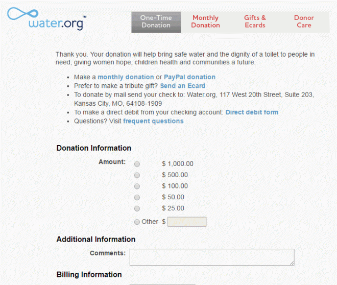
Insert key messaging.  And only key messaging.  Take a look at charity.water’s homepage monthly giving ask.  Very few words — just the essentials.  

water


Embed your ask in the picture.  You’ll note in the heat map above that even before we look at eyes, we seek out faces.

If the image is where people are going to be looking on your site anyway, where better to begin your ask?  If that ask is an email sign-up, you can probably do all of that in the same picture (as you only need first name, last name, email address, and maybe state or zip code.  What?  You are asking for more information on your email sign-up?  Have you tried asking for less and seeing what the difference is?  You can always ask for more in the welcome series.)

If that ask is an online donation, you might as well as for some of the starting information in the picture.  Most often, you can get someone to pre-select their donation amount in the initial image.

One of the cardinal rules for donation forms for a number of years has been to minimize the number of clicks necessary to complete the form.  Recent tests that I’ve seen may indicate this is no longer the case.  I hypothesize a few reasons for this:

  • We humans have a poor understanding of sunk costs.  A multistage donation form, then, gets people to take the first few steps quickly and then asks for more, getting the person to think “well, I’ve come this far.”
  • Multistage donation forms can often render better in mobile devices with smaller screens (and worse keyboards).
  • E-commerce has taught us how to use multistage forms.  Think of the arrows at the top of your Amazon order page telling you what step you are on and how much further you have to go.  The fact that you can probably picture an Amazon order page shows how common this has become.  (I’m not judging – I’m surprised it’s not burned onto my retinae).

Anyway, getting the person to give you the amount first asks as a commitment device and pre-checks the “sunk cost” box.  And you are saving a step: rather than clicking on donate, then putting in the amount, they are able to combine these.

Using your real estate better: online images

Let’s get small: microimprovements

402px-david_von_michelangeloThere is a story, perhaps apocryphal, that someone watched Michelangelo retouching every inch of one of this statues.  The bystander asked him why he bothered with such trifles; the artist replied “Trifles make perfection. And perfection is no trifle.”

In the direct marketing world, it’s difficult to say that there is such a thing as perfection.  You will likely never see, in any quantity, a 100% response rate or open rate.  But our goal is to strive, to seek, to find, and not to yield.

There rarely is an idea that you have that will double the completion of your online donation page.  But you can find 16 ideas that each get you five percent better, each one compounding to double your response.

So without further ago, a few small ideas that may make small (or big) differences.  In no particular order:

Change the color of your donate button to something not approved in your brand guidelines.  It will stick out.  Good.  Things that stick out get clicked on.  When this starts to lose its effectiveness, change it again.

Reduce the size of your download.  A Sprint phone downloads an average of 11 MB per second on 4G .  We can easily design pages with enough extra code and random things to download to cost an extra second.  One second lost means 7% fewer conversions.

That’s probably why water.org has their homepage look like this:

water

But their donation page looks like this:


waterdonationpage

Increase customization by a variable.  If you do name, do name and location.  If you do name and location, add in donation history.  Et cetera.  These are more than 5% tactics

Add a small donate bar at the top of your site.  Human Rights Watch reported (at DMA’s DC nonprofit conference) that the below orange bar and a larger orange footer on their site increased donations from the home page by 256%.  Many days, I’d settle for 2.56%.

Go into Google AdWords.  And do what it says to do.  If it recommends splitting up your keywords, it probably knows that doing so will allow you to customize your copy.  Punctuate your headline properly.  It knows that increases click-throughs.  And so on.  It will keep bringing up these opportunities; you just have to act on them.

Try adding a picture.  Not necessarily guaranteed, but a quality picture will usually improve a home page, mailpiece, donation page, content marketing, etc.  I’ve found a significant difference in the traffic I get from blog posts with pictures over those without.  Hence David hanging out at the top of this one.

Call some donors.  Ideally some of your best, but these thank you’s will both help with the donor’s loyalty and give you ideas for things you can try (or stop).

Take some fields off of your donation form.  Phone number?  Ask for that afterward.  If you have the ability to divine city and state from ZIP on your form, go for it.  You are looking to streamline this process.

Similarly, reduce the clicks to get to the donation form.  Hopefully, it’s one or zero (that is, you can start entering info on the Web page).

Remove the navigation from your donation page.  Now is not the time for someone to want to look at your executive’s pictures.  Four tests show improvements from the tiny to the oh-my-goodness here.  

Run a test.  Are those ask amounts correct?  How do you know?  If you are mailing, emailing, or calling with the same thing for 100% of your communications, you are missing out on your 5% opportunities.

Hopefully, one of these gets you 5%.  If it does, please leave it in the comments.  If it doesn’t, please let us know in the comments what did.

Let’s get small: microimprovements

Imagery in nonprofit storytelling

Picture the last time you watched a football game.  Think about a big hit that someone took to the head, whether it was a smashing tackle or someone getting upended and landing on his head.

What did you, as a spectator do?

Chances are pretty good that you cringed.  More specifically, you likely closed your eyes, turned your head from the screen, lifted your shoulders, and grimaced as if you were in pain.

And you were in pain, even though you were not in pain.  Your brain created the pain for you.  So you averted and closed off your gaze, so you wouldn’t feel any more of it.  You lifted your shoulders so as to protect your own neck.

Or, as a master of the written word put it:

vlcsnap-2011-10-26-10h44m46s196

“Tell me one last thing,” said Harry. “Is this real? Or has this been happening inside my head?”

Dumbledore beamed at him, and his voice sounded loud and strong in Harry’s ears even though the bright mist was descending again, obscuring his figure.

“Of course it is happening inside your head, Harry, but why on earth should that mean that it is not real?”

There is a robust debate ongoing as to whether this happening because of so-called mirror neurons or as a result of human empathy.  A good reflection on this debate is available here.   

However you come out on this debate, suffice it to say that seeing something happen to someone else can trigger the same feeling in ourselves.  But does it translate to the written word?

Absolutely.  Whoever said a picture is worth a thousand words may have simultaneously underestimated the worth of both the right picture and the right words.

Consider Hemingway’s famous challenge to write a six-word story: “For sale: baby shoes. Never worn.”  I’ve lost a child and those six words remind me vividly and painfully of a nursery.  We painted it to look like the blue of the sky, with a bright yellow sun.  And while I, with my complete lack of art skill, resigned myself to painting clouds and blades of grass (the ugly ones that didn’t taper properly at the top), my wife painted ladybugs and flowers and butterflies to welcome our child.

But the crib remained empty.  And while we did end up having two wonderful children, we moved from that house and used a different crib.

My point here is that words can create images.  Hopefully, you pictured our nursery a little bit above.  I used (or rather, tried to use) some of the same techniques you would see in a movie:

  • Setting the stage: a nursery.
  • Using colors to evoke an image.  Without using the Pantone or paint chip name, you have in your mind the picture of the sky and of the color or the sun.
  • Showing action: it isn’t just a static room; now it’s being painted.
  • Zooming in: on blades of grass.
  • Panning around to capture detail.

Chances are you are picturing it entirely differently from how it was (heck, because of the vagaries of memory, so probably am I).  That doesn’t matter as much as look as you are seeing a scene.

Studies of the brain find that when we read a story written this way, our brain processes it as if it is a visual and motor experience. 

And we can invite people to trigger imagery.  Good verbs like “imagine,” “remember,” and “picture in your mind” give a person the trigger to help them start to think in this way.  You still have to capture them with story and detail, but you are starting well.

Imagery in nonprofit storytelling

Is your direct marketing hot or not?

You are likely being inundated this week with best of 2015 posts in your feed.  This is not that kind of post.

Rather, I’m looking to spend this week delving into academic studies of nonprofit giving that may have been missed or underreported in the popular nonprofit press.  If this isn’t your cup of tea, I wish you a happy new year and I hope to see you again on January 4th.

However, I like the idea that other people are paying money for me to learn things about nonprofit giving, especially with the alternative is for nonprofits to pay for me to learn things through failed tests.

So today we’ll look at the impact of attractiveness in the photography that you use in your communications.  Think for a moment about the picture that for-profit businesses use alongside their inbound call center’s phone number.

attractive-blond-call-center-rep-13691665

Hi. I care deeply and passionately about your call.
Let’s ignore this stock photo watermark and get down to business.

BTW, you can order this stock photo here, where the intent of the photo is clear from the title they give it: Attractive blond call center rep.

Anyone who has worked at a call center, or thought much about what a call center looks like, or thought much about what the average member of the human race looks like can easily deduce that this is not likely to be on the other end of the photo line/fiberoptic cable.

Yet these images are often used.  Why?  Because for-profits think that attractive people make us want to buy.

A study that came out last month from Jenq, Pan, and Theseria shows this effect works for nonprofits as well.  They looked at direct philanthropy on Kiva, a microlending site of which I am a fan.

The authors asked research assistants from Singapore and the US, male and female, to rate the photos of the people requesting loans on Kiva on several criteria, some of which were:

  • Attractiveness
  • Physique
  • Skin color
  • Whether the person was smiling
  • Neediness of the person
  • Trustworthiness of the person
  • Creditworthiness of the person

They then looked to see if these factors impacted funding.

Let’s pause here to ask ourselves WWSD — What Would Spock Do?*

Spock would not care about the photo.  Rather, he would care 1) maximizing the social impact of his loan, 2) maximizing the likelihood of getting repaid, so he could regift and maximize someone else’s social impact afterward, and 3) there is no number three — he would care only about those two things and certainly not some photograph.

Yet, we are human.  Studies show that attractiveness has an impact on pay, dating profiles, perceived intelligence, perceived competency, tips, success in customer-focused enterprises, etc.  

So it should not be surprising that people take a non-Vulcan approach to photographs.  The study found that, all other measured things being equal:

  • Those people who were one standard deviation more attractive had an 11% shorter time to get full funding.
  • Those people who were one standard deviation heavier had a 12% longer time to get full funding.
  • Those people who had a skin color one standard deviation darker had a 8% longer time to get full funding.

For perspective, asking for 10% more money increased the amount of time to complete the loan by 13%.  So, in essence, being more attractive and skinnier than the average was the equivalent of getting almost 20% more money.  Just on the photograph that you use to ask for a microloan.

It’s important to note two things here:

  • Reporting this is not to justify this.  Attractiveness and skin color have no relationship to need, desire, or any other factor under the skin that would merit investment.  We should interrogate ourselves and our choices to try to dismantle this unconscious bias.
  • This is where we are right now.  I try to be a pragmatist.  In trying to get to the world to where we want it to be, we have to start at or near where it is right now.

So the implications of this study for nonprofits?  There are three in my mind:

  • Put your best foot forward.  Other than those pictures that are designed to show the harm you are trying to solve, the photos on your Web site should largely be smiling, happy people (happy people generally show as more attractive than unhappy).
  • Invest in photography.  Good lighting and posing can take someone like me and bring them to the median.  OK, it can bring me closer to the median.  OK, let’s just say it can help and leave me out of this.
  • Invest in professional retouching.  This is not to advocate for going the full fashion magazine airbrushing and Photoshopping; as Meghan Trainor would remind us, we know that [stuff] ain’t real.  But simple things like increasing the size of pupils can increase trust and attractiveness.  Similarly, increasing the size and darkness of the limbic ring (the ring around the outside of your iris) can increase attractiveness.  Look at that: three more studies for the price of just the original.

So, now you can ask yourself, knowing that (sadly) it matters, is your fundraising hot or not?

* Those of you who prefer can think of it as what econs would do in Richard Thaler’s description or what those thinking slow would do in Daniel Kahneman’s description.  

Is your direct marketing hot or not?