This week, we’re going to look at different online techniques you can try to help increase your conversion and donation rates. I’d love to be able to share your ideas as well, so please email me at nick@directtodonor.com with your comments and case studies. Or leave them in the comments section below, where we actually have intelligent conversations, unlike some sites (*cough*cough*YouTubecomments*cough*cough*).

We’ll start with simplifying our donation page. As patron saint/oversoul of simplification Henry David Thoreau almost said:
“Our [donation form] is frittered away by detail… Simplicity, simplicity, simplicity*! I say, let your [form requests] be as two or three, and not a hundred or a thousand; instead of a million count half a dozen, and keep your accounts on your thumb nail.”
Let’s start from first principles. What is the point of your donation page?
It’s not a trick question. The point is to get donations. Anything else on that page should be subordinated to helping the person coming to the page make the donation for which they came to the page.
Once you have this as the aim, you’ll find that many of the things you put on that page don’t help in this regard:
Top navigation. You should still have your logo that links back to your home page. After all, you could do as well in user interface design with the maxim “never make the user use the back button” as you could in Christianity knowing only the Golden Rule. In each, there’s a lot more to learn, but that one bit will get you through for now.
But do you need the link to each area of your mission, your about us page, and so on? You do not, because the goal of the page is to get donations. Take a look at St. Jude’s home page.
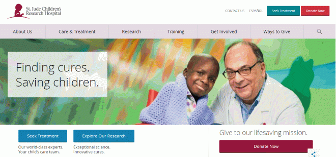
It serves those who want to learn about, engage with, and donate to the organization. However, once you go to donate, they know what you are there for and everything else melts away:

Only those things necessary to make a donation remain.
Extraneous fields. The donation form is not the place to ask for your entire database to be filled in. Thus, prefix, middle name, and suffix can all be deleted. Nor is it the place to ask for things you are interested in, but do not need. Thus, phone number, fax number, connection to the cause, etc., should all go away. (This is not to say you shouldn’t ask for them; that’s why God invented the confirmation page and/or post-donation survey.)
Any more convincing than is necessary. I’m being intentionally vague here. The challenge is that people come to your donation form from very different places. If they came to your site, clicked on your light box (which we’ll talk about later in the week), and got to your donation form, they probably need some convincing to donate.
On the other hand, if a person subscribed to your e-newsletter, got your welcome series (you do have a welcome series don’t you? If not, learn the basics here), and clicked to donate on the final email, they have already followed the journey you set out for them. They are convinced and converted, so get them on their way successfully.
There was a great test I recommend a read of here. In a nutshell, a nonprofit was testing their donation form, which normally had a video at the top of it, versus a back-end book premium.
The key to this test (I believe) was that it connected with email — people would already have been sold once they got to the page. Thus, the non-video version had three times the conversion rate of the video version. The goal of the page was to get them to donate, not to get them to watch the video.
This isn’t to say that the video can’t be an important part of the conversion process; just that it probably doesn’t belong on the donation form.
Similarly, reducing copy at the top of this email acquisition campaign increased response by 26%.
So I would definitely test taking much of the verbiage out of your donation page and see what happens to your conversion rate.
Remember, a simple donation form is (usually) a converting donation form.
* Yes, he said “Simplicity, simplicity, simplicity” instead of “simplify, simplify, simplify.” I was surprised too.


A good point from friend-of-the-blog Angela Struebing: another good tactic is to ask for the email first or very early on — that way you can run a donation form abandonment program more easily, as you’ll have a means of communication. Thanks, Angela!
LikeLike