Testing the post-content ask

Someone has come to your site.  They have downloaded your eight-point plan or a white paper.  They’ve taken an advocacy alert.  They’ve looked at your infographic.  Now what?

When we think about donors, it’s often with our fundraising glasses on, thinking how do I get this person to donate?

One of the underrated aspects of donorcentricity is starting off with the idea of “how do I solve this person’s problem?”.

That is to say, for people who come to your site with the intent of making a donation, most of them are going to make a donation.  For the majority that come with some other intent, however, what is their mindset and how can you help them achieve it?

Let’s take the person who wants to do something about your issue.  That something is, to them, to email their legislator about a particular piece of legislation you are working on.

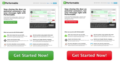
A traditional fundraising approach would be to have a button on the advocacy page that encourages them, instead of taking an action alert, to donate to your advocacy campaigns.  This interruption marketing is trying to take them away from what they want to do to what you want them to do.

What I would advocate testing is finding your biggest content engagements and put a logical ask (not necessarily a donation ask) after the person has completed what they came there to do.

This could be:

  • On the confirmation page.  If someone downloaded a white paper, it could be “this white paper was made possible by the generous support of people like you” or, perhaps more engagingly, “now that you know about the plight of the Brown Bar-ba-loots, can you email your legislator to add them to the list of protected species?”
  • In a lightbox.  We talked about these earlier this week.  In addition to coming up after a page opens, you can also do them as they are about to close.  This type of ask can serve up your best reason or pitch to complete the action they came to the page to do.
  • As a follow-up email.  The test here can be what the appropriate action to ask for is.  If you have someone who has taken an action alert, what do they want to do next?  And what is of most value to you?

On a related note, I’ve worked with advocacy campaigns where a donation ask after an advocacy alert performed better than a similar up front ask by email without the action alert.  People wanted to take action, then donate.

The great thing about this is that you can be very specific in your ask.  That is, if someone took your Brown Bar-ba-loots action alert, your donation ask (if you choose to do that) can be a Bar-ba-loot specific campaign, crossing confirmation page, lightbox, and email follow-up.  You don’t have to ask this person about polar bears or penguins, because you already know what they care about.

So test out how you can solve your potential donor’s problem first, then ask for something of value.


Thank you for reading.  If you’d like more content like this, please sign up for my free weekly newsletter here.

Testing the post-content ask

What color are online donations?

I was once a color theory skeptic.  People forget that, before blue meant male and pink meant female, blue meant female and red meant male.  Because of this and the sometimes Chinese zodiac level of imbuing colors with different emotions, impacts, and even personalities, I branded the whole thing voodoo.

Then I looked at the data.  And while there is definitely still some chromatic shamanism* out there, there’s also some real life impact to the colors that you use on your site.

I’m not going to talk about the blue means passive, yellow means cowardly, etc. type stuff that you can get from research.  If you would like that, I recommend the Information is Beautiful color chart that you can see here

But in the words of a tweet from @NaomiNiles:

Next time I see an article telling people to increase their conversion rate by using one color instead of another, I’m going to cry.

So there will be no magic color at the end of this (or in the middle).  I’m speaking specifically about the colors you use to delineate the important, converting parts of your site and how that can pop.  Let the people who make up thick brand guidelines have the rest of the site; your job will be to stand out.

Because we are hardwired to seek out that which is different.  Even now, people will look longer the lion or snake in a picture than an antelope or mouse.  Our brains still seek out, notice, and fear perceived dangers even when our greatest professional threat has gone from “gored” to “recipient of cutting remark.”

Colors can make a big difference in this regard.  Dr. Nicolas Guéguen sent female hitchhikers out to get rides wearing different color T-shirts.  With male drivers, there was a significant color impact for red — so much so that the title of his article included Gentleman Drivers Prefer Red. This is likely because of the romantic associations of red as a color.

However, there was a potential impact among female drivers as well.  Females stopped 9.6% of the time for hitchhikers in yellow shirts and 9% for red shirts.  On the other side of the spectrum (rim shot), green shirts were picked up 5.3% of the time, with black at 6%.

The theory, because it is less likely statistically for female drivers to be impacted by romantic cues, is that red and yellow pop out visually when the background is largely gray roads.  

The same thing holds true for your donate (or subscribe) button.  How does it stand out from the rest of your site?

Hubspot looked at red versus green buttons:

red_green_button

They found the red button outperformed the green button by 21%.

But that was likely because other things on that page were green.  The red button was meant to stand out from the rest of the site.  

Let’s see how St. Jude does it:

stjude

You can see the two actions they want people to take — treatment and donation — are specifically delineated to get people to notice them amid the other colors.

WiderFunnel calls this type of button the BOB — the Big Orange Button.  The trick is that if your background color is orange, an orange button is the last thing you want.

On the flip side, here’s Autism Speaks’ home page.  In disclosure, I have two kids on the autism spectrum and have been both a recipient of its services and a donor to them.  I advocate for you to do donate as well.  But the donate button doesn’t jump out at you on their site:

autismspeaks.gif

This is clean and beautiful and fits their brand guidelines.  But I’d bet they could increase their donations if the donate button was orange (or red or yellow).

So I strongly encourage to use color (and size) to make your button stand out from the rest of your site — whatever that color is.  You can go down a rabbit hole trying to trick out your color to the exact shade you want, but having something that differentiates is most important.

Actually, what’s most important is having a compelling ask that touches the heart of the potential donor, but color can help it get noticed.
* Google says this is the first page on the web to use the phrase “chromatic shamanism.”  Now we just wait for the searchers to come, like moths to an extremely dim flame…

What color are online donations?

Let there be lightbox

Come, children.  Let’s gather ‘round the fire and I’ll tell you a tale of the Old Web.

Once upon a time, when you went to a site, you would be confronted with “pop-ups”.  These were new browser windows that would open when you would go to, interact with, or try to exit a site.  Sometimes, when you closed them, they would automatically open a new pop-up and so on.  

I’m told that the more ethically dubious the site, the more likely they were to have an endless loop of these.

We fought them with all of our might and hatred, until they became a casualty of the Second Browser Wars, as web browsers realized that they could make us happy by purging these from us once and for all.  Now only a few scattered pop-up survivors live among us, surviving on the barest scraps of attention.

Unfortunately, some of the stigma of pop-ups rubs off on lightboxes (or sha220px-fionaappleshadowboxerdowboxes, which I prefer (while less common) because I think of the Fiona Apple song)

You made me
A shadowboxer, baby
I wanna be ready
For what you do

People think that a light box* (slash shadow box) is just a glorified pop-up.  But when done properly, it has several advantages: it is easily closed, doesn’t cause a loop of pop-ups, and provides a quick guide to the first thing someone might want to do or know on a page.

But most of all, you should be trying light boxes because they work.  One report found that the average conversion rate for email acquisition light boxes is 1.66%.

So how do you make a lightbox work for you?  A few tips:

  • With a few exceptions, I would not suggest a donation ask lightbox.  Like we talked about yesterday, getting the first microconversion is easier and potentially more profitable that a straight ask on the home page.
  • Those few exceptions are:
    • End-of-year fundraising, when people are far more likely to be coming to your site with the express purpose of donating.  A light box will make it significantly easier for them.  (If there are similar campaigns for you, like Giving Tuesday or a special anniversary.  For your non-profit, not your spouse, although you should get them something nice.)
    • Any ask with urgency associated.  For example, if you have a matching gift campaign and can count down to the end of the match in your lightbox, I strongly recommend it.
    • When you are using the lightbox not on your homepage, but after some other action.  For example, shadowboxing the confirmation page of an advocacy action with a campaign-specific ask is a great idea.
  • Make them easy to get out of.  If this offer isn’t for the person, you want them to still enjoy browsing your site, rather than hating your guts.
  • Make them easy to get out of in mobile.  It is a little known fact that hell has expanded to a tenth level to accommodate new technology-associated crimes.  These include:
    • Making a lightbox that is unclosable on a mobile device because you can’t get to the X
    • Taking mobile phone calls in a public restroom
    • Replying all to company wise emails
    • Putting a conference call on hold so that 70 other people have to listen to your hold music before they hang up on you and call back in
    • Making a lightbox that is unclosable on a mobile device.  Oh, I mentioned this one twice?  That’s because it’s a special hell within the special hell.  Like child molesters in prison or Kourtney Kardashian**.
  • Make it smart.  Don’t show a repeat visitor the same shadow box over and over; use cookies to either vary your offer or leave it off altogether.  Research shows that you get the same number of sign-ups showing your light box every month rather than every time.  Also, customize your ask to the content a person is seeing.  If they go to your statistics page, give them an offer for your statistics white paper.  This will increase your conversions and their satisfaction.
  • Give a reason. You don’t want a lot of text on your light box, but you do want to have at least one statement that says why a person would want to take the action you want them to take.
  • Wait about five seconds.  That gives the person enough time to look at (and more than enough time to judge) your site, but not enough time to lose them to another offer.
  • Make sure you are layering in other techniques.  In particular, social proof XXX (“join the other 123,456 people who enjoy our email newsletter”), color theory (having a button color that stands out), and having a no option that doesn’t fit with a person’s self-image (“yes, I’d like to join the fight” versus “no, I don’t care about the environment”) can all be very effective.

So, pop-ups didn’t really die that day, kids.  They evolved to be less intrusive, more useful, and something that both users and nonprofits can value.  Now, alla you young’uns get some sleep, and dream of increased conversion rates.

* No, not a typo.  There does not appear to be a consensus on whether people say light box or lightbox or shadowbox or shadow box.  Thus, I’ve included all of the words in this piece so that they can be found by search engines.  I suggest you do the same in your content marketing.

** I don’t actually understand this joke myself, but I’m told it’s funny.

Let there be lightbox

Boiling a frog online

They say that the way to boil a frog is not to put them in boiling water.  It’s to put them in cold water and slowly turn up the heat.  Because the change is gradual, the frog will not notice until it is boiled.

Who “they” are and why they want to boil a frog is still unknown.  But the somewhat unfortunate metaphor has a point — it’s often easier to get someone to make a big change in small steps.

Thus, instead of thinking in conversions (for example, getting a visitor to your site to donate), it’s often easier to think in terms of microconversions — the little steps that lead to your (and hopefully your prospect’s) goal.  As the great conversion expert Avinash Kaushik says, “Focus on measuring your macro (overall) conversions, but for optimal awesomeness identify and measure your micro conversions as well.”

There are a few ways you can make this work for you:

Track microconversions and how they lead to your ultimate goal.  Some of these microconversions can include:

  • Connecting with you on social
  • Commenting on a blog post
  • Taking an advocacy action
  • Signing a petition
  • Downloading a white paper
  • Looking at a donation page
  • Subscribing to your e-newsletter
  • Contacting your organization
  • Creating an account
  • Looking for directions to your office

From here you are looking at a classic consultant’s 2×2 matrix:

  • High usage of the microconversion; high conversion to your end goal.  These are the things that make you happy.  For example, if action alert usage is the highest activity on your site and advocates are among your most likely people to donate, you are doing your job well.
  • Low usage of the microconversion; low conversion to your end goal.  You can ignore these things for now; they’ll require a lot of work to get into shape.  You have lower hanging fruit.
  • High usage of the microconversion; low conversion to your end goal.  This is one form of an opportunity — you want to work to optimize the path from the microconversion to your end goal.  Let’s say many people are downloading your white paper, but few of them are donating.  You might find that your communications are largely around different topics from the white paper and your asks aren’t related — these are all fixable things.
  • Low usage of the microconversion; high conversion to your end goal.  If almost no one is commenting on your blog, but almost everyone who comments donates, you should be working to get as many people as possible comment on your blog.

Also, if you are getting fancy, you can compute the value of each microconversion by looking at the donation history of people who take the action.  I’d advise you to get fancy, but the matrix is a good start.

Test a multi-stage donation form.  Tradition says that you click a big button that says “Donate” and you are taken to a long form that you fill out in its entirety.  Tradition will get you all of the gifts that you traditionally get.  The boiling a frog analogy works here; people want to finish things they start, so turning a long form into a series of microsteps easier can increase your overall conversion rate.

Heritage Foundation tried this technique and found it increased registrations by 99% with a two-step versus one-step form.

A few ways to do this include:

  • Ask for a donation amount up front.  If you mouse over a donate button, an ask array or a free response question can capture an amount immediately and pass it through to the next step.  It’s a simple step and once someone has taken that action, they are more likely to fulfill their donation.  (And if they don’t, you have a solid ask amount for their next visit or remarketing.)
  • Separate the credit card information from basic address information, with the address first.  Credit card information is the most personal information, so you want to get someone to volunteer their more basic information first.
  • Remember to use the period after donation confirmation to make a monthly giving ask as described here.


Introduce your surveys with easy questions first.  There is a reason that professional pollsters save questions like race and household income to the end — they come at a time when the subject is already psychological committed to completing the survey.  As we’ve discussed, commitment is a very powerful thing.  (Also, because if the person stops at that point, you still have the main data you want.)

If you are doing an online survey, start with a simple question up front, then build on future screens.  An online progress gauge is also helpful.  When a person knows there’s only 20% left in the survey, they are more likely to complete it (just like they are more likely to donate when there’s only 20% left in a campaign).

The big commonality with all of these techniques is to start small and build to a larger commitment.  It won’t help convert those who come to your web site looking to make a donation (OK, may it might), but it will help you build commitments among constituents who are less certain about taking a big step forward in their relationship with you.

Boiling a frog online

Simplifying your donation form

This week, we’re going to look at different online techniques you can try to help increase your conversion and donation rates.  I’d love to be able to share your ideas as well, so please email me at nick@directtodonor.com with your comments and case studies.  Or leave them in the comments section below, where we actually have intelligent conversations, unlike some sites (*cough*cough*YouTubecomments*cough*cough*).


henry_david_thoreau1

We’ll start with simplifying our donation page.  As patron saint/oversoul of simplification Henry David Thoreau almost said:

“Our [donation form] is frittered away by detail… Simplicity, simplicity, simplicity*! I say, let your [form requests] be as two or three, and not a hundred or a thousand; instead of a million count half a dozen, and keep your accounts on your thumb nail.”

Let’s start from first principles.  What is the point of your donation page?

It’s not a trick question.  The point is to get donations.  Anything else on that page should be subordinated to helping the person coming to the page make the donation for which they came to the page.

Once you have this as the aim, you’ll find that many of the things you put on that page don’t help in this regard:

Top navigation.  You should still have your logo that links back to your home page.  After all, you could do as well in user interface design with the maxim “never make the user use the back button” as you could in Christianity knowing only the Golden Rule.  In each, there’s a lot more to learn, but that one bit will get you through for now.

But do you need the link to each area of your mission, your about us page, and so on?  You do not, because the goal of the page is to get donations.  Take a look at St. Jude’s home page.

stjude.gif


It serves those who want to learn about, engage with, and donate to the organization.  However, once you go to donate, they know what you are there for and everything else melts away:

stjudedonation

Only those things necessary to make a donation remain.

Extraneous fields.  The donation form is not the place to ask for your entire database to be filled in.  Thus, prefix, middle name, and suffix can all be deleted.  Nor is it the place to ask for things you are interested in, but do not need.  Thus, phone number, fax number, connection to the cause, etc., should all go away.  (This is not to say you shouldn’t ask for them; that’s why God invented the confirmation page and/or post-donation survey.)

Any more convincing than is necessary.  I’m being intentionally vague here.  The challenge is that people come to your donation form from very different places.  If they came to your site, clicked on your light box (which we’ll talk about later in the week), and got to your donation form, they probably need some convincing to donate.

On the other hand, if a person subscribed to your e-newsletter, got your welcome series (you do have a welcome series don’t you?  If not, learn the basics here), and clicked to donate on the final email, they have already followed the journey you set out for them.  They are convinced and converted, so get them on their way successfully.

There was a great test I recommend a read of here.  In a nutshell, a nonprofit was testing their donation form, which normally had a video at the top of it, versus a back-end book premium.

The key to this test (I believe) was that it connected with email — people would already have been sold once they got to the page.  Thus, the non-video version had three times the conversion rate of the video version.  The goal of the page was to get them to donate, not to get them to watch the video.

This isn’t to say that the video can’t be an important part of the conversion process; just that it probably doesn’t belong on the donation form.

Similarly, reducing copy at the top of this email acquisition campaign increased response by 26%.

So I would definitely test taking much of the verbiage out of your donation page and see what happens to your conversion rate.

Remember, a simple donation form is (usually) a converting donation form.

* Yes, he said “Simplicity, simplicity, simplicity” instead of “simplify, simplify, simplify.”  I was surprised too.

Simplifying your donation form

Web metric basics

We talked yesterday about email metrics; now it’s Web site metrics’ turn.

We start here with the most generic of all online metrics: traffic.  No less an authority that FiveThirtyEight says that we still don’t know how to measure Web traffic. The difference is how unique visitors are measured versus total visits.  If you are an advertiser, you want to make sure the 1,000,000 visits a person is claiming to her/his site aren’t just a guy hitting reload over and over again.  This can be done by cookie, by IP address.  

My advice on this is sacrilegious for a metrics guy: don’t worry too much about it as long as you are using a consistent system for measurement.  I’ve used mainly Google Analytics for this, because it’s free, but any system will have its own way of determining this.

From this number, you can derive revenue per visitor by simply dividing your annual online revenues by your number of visitors to determine revenue per visitor.  This is a nice benchmark because you can see what all of your optimization efforts add up to; everything you do to try to get someone to a donation page, what you do to convert them, your average gift tweaking, the value you derive from your email list — all of it adds up to revenue per visitor.

But more than that, revenue per visitor also allows you to see what you are willing to invest to get someone to your site.  Let’s say your revenue per visitor is right at the M+R Benchmarks Report 2016 average of $.65 per visitor.  If the average blog post you do results in an extra 1000 visitors to your site, you should in theory be willing to pay up to $650 to write, deliver, and market that blog post (because revenue per visitor is an annual figure, so acquiring someone at cost that you can then engage in the future is a beautiful thing).

I say in theory because revenue per visitor varies based on the type of content or interaction.  I’ll talk about this at the end because we need to go through the other metrics to break this down more efficiently.

A close cousin to revenue per visitor is site donation conversion rate, or how many of the people who come to your site donate.  Instead of dividing your annual online revenues by visitors, you’ll divide the number of donations by visitors.  This is one of two key inputs to revenue per visitor (the other being average gift) and is a good way of testing whether wholesale changes to your site are helping encourage people to give.  

I recently worked with someone who put a thin banner at the top of their site encouraging donation.  He was disheartened because less than half a percent of the people who came to the site clicked on the banner.  I asked him if the total clicks were additive to donation clicks (that is, they represented people who wouldn’t have clicked to donate otherwise) or substitutive (that is, total donation clicks didn’t go up; they just moved from another donate button to this bar).  We were able to tell not only because of the donation clicks went up over baseline, but because the site donation conversation rate went up.  Now we are working on a strategy to test this bar throughout the site and with different context-specific asks.

Drilling down from the site donation conversion rate is the page donation conversion rate.  This is people who donate to a donation page divided by visitors to your donation page.  It’s a standard measure of the quality of your donation page.  This and average donation on a donation page combine to create the revenue per page.  

Revenue per page is not only a good way of measuring which donation form is better — it’s a good way of getting a feel for the valuable content on your site.  See how many of the people who come to a page end up donating directly from the page (you can do sophisticated attribution models to determine this — going directly to a donation is a quick and dirty way of doing it) and what their average gift is.  Divide that by the number of visitors you have to that page and you can see what the revenue per page is on a non-donation page as well.

This is great information to have.  Let’s say the value of a visitor to your home page is 10 cents, to a program page is 20 cents, and to an advocacy page is 40 cents.  This helps you make decisions about your content.  Do you need better calls to action on your program page?  What should be your next home page feature? (Answer: probably something about advocacy)  Where should you direct the bulk of your Google Grant traffic?  Etc.

However, there is one thing missing from all of this.  You will note that I said site donation conversion rate and page donation conversion rate.  Usually metrics folks won’t put donation in there — it’s implied.

But there’s another conversion rate that’s vitally important and that’s conversion to a constituent.  Remember that the conversion to donation process often is a series of smaller steps.  You need constituents who subscribe to your email newsletter, volunteer for your activities, and read your social media posts (OK, maybe not that last one).  A person has given you permission to talk to them is a valuable thing and should not be forgotten about.

So there’s also a site constituent conversion rate and page constituent  conversion rate — how good are your pages at capturing people.  Only when you have this to add to your revenue per page do you have a true measure of page quality.

But wait!  How do you add people converted to revenue?

That’s the topic for tomorrow as we discuss how to value a constituent.

Web metric basics

Email metric basics

Every field does its best to be impenetrable to outsiders and the world of online testing is no different.  We measure KPIs instead of “important things.” The differences among CPA, CPC, CPM, CPR, CTA, CTR, and CTOR are all important (for example, one of these can save your life, but isn’t an online metric) and there are TLAs* that I haven’t even talked about.

So this week I want to look at measuring online successes (and not-yet-successes), but first, we need to get our terms straight so we know what we are trying to impact, starting with email metrics.

For me, this is easiest picturing the steps that would go from email to action.  An email is:

  • Sent
  • Delivered
  • Opened
  • Clicked upon (or unsubscribed from)
  • Responsible for a completed action

Almost all of the other important metrics are ratios of the number of people who did this (or the number of unique people who did this — unique meaning the number of people who did something, not the number of total times something was done.  For example, 1000 people clicking on a link once and one person clicking on a link 1000 times will have the same click-through rate, but very different unique click-through rates).

The most important of these ratios are:

Delivery rate: emails delivered divided by emails sent.  This is inexact, as different email providers provide different levels of data back to you as to whether an email was a hard bounce (email permanently not delivered) or soft bounce (temporary deliver issues like full email box or email message too large).  But as long as you are using the same email program to send your emails, you will have consistent baselines and be able to assess whether it’s getting better or worse.

Open rate: emails opened divided by emails sent.  There are a couple minor problems with this.  First, opens can’t be calculated on text emails.  That is, only HTML emails have the tracking to determine whether they were opened or not.  Second, some email clients allow people to skim the contents of an email in a preview pane and count it as an open.  Third, some email clients don’t count an open as an open (even if the person interacts with the message) if it is only in a preview pane.  So it’s an inexact science.

However, open rates are still a good, but not perfect, measure for testing the big three things that a person sees before they open a message:

Why isn’t it a perfect measure?  Because it’s hackable.  Let’s say your control subject line is “Here’s how your gift saved a life.”  If you test the subject line “Your gift just won you a Porsche,” it might win on open rate, but you’ve lied to your donor (unless you have an astounding back-end premium program).  That will spike your unsubscribe rate and lower your click-throughs**.

So you probably want to look at this in combination with click-through rates (CTR).  This is another one of those metric pairs that prevent you from cheating the system that I love so much.  Click-through rate is number of people who clicked (assuming you are using unique click-through rate) by divided by emails sent.  It’s a good way of measuring how well your content gets people to (start to) take action.

Another good way to look at how your email content performs is click-to-open rate (CTOR).  This is number of people who clicked (assuming you are using unique CTOR) by divided by opens.  As you might guess, it fits very nicely with the previous two metrics.  Let’s say two emails both had 1% click-through rates.  One of them might have had a 20% open rate and a 5% click-to-open rate; the other might have had a 5% open rate and a 20% click-to-open rate.  In this case, you’d want to see if you could take the subject, sender, and pre-header of email #1 and combined it with the body copy of email #2.

You also need to look at unsubscribe rate (number of unsubscribes divided by number of emails sent), but not as much as many would think. If it starts going too high, you may want to worry about how you are acquiring your subscribers; likewise, it’s good to compare unsubscribe rates across types of constituents (that is, do your advocacy supporters unsubscribe faster than your white paper downloaders?  Perhaps it’s time for more segmentation and better advocacy content).  But don’t let it drive the boat.

Finally, you want to look at conversion rate: those who took the action divided by those who clicked through.  While not strictly an email metric, I include it here because a person could try the same underhanded tactic with the Porsche to boost click-through rates (to bait and switch the clicker) and because it’s so vital to be measuring and optimizing against.

But that’s another post.

If you want to benchmark your metrics, I strongly recommend M+R’s benchmarks study here.  And please sign up for my free newsletter here.  We have strong metrics (40% open rates and 8% click-throughs) so others are (hopefully) finding it to be useful nonprofit direct marketing content.
* Three-letter acronyms

** Also, it’s wrong.  Don’t do it.

Email metric basics

An ode to the mostly filled thermometer

When was the last time you saw an analog, mercury-based thermometer?  Chances are, it was in a fundraising campaign, indicating how close you were to goal.  Even as thermometers go digital, their ancestors are honored through skeuomorphism* to symbolize progress.

But we come here not to bury the fundraising thermometer, but to praise it.

Specifically, we want to praise how the fundraising thermometer, or a specific state of it, can make people more likely to donate.

fundraising-thermometer-template

Cryder, Loewenstein, and Seltman took a look at how the amount toward goal already raised impacts a person’s likelihood of giving here.

They call it the goal gradient hypothesis: they think that people will be more likely to donate the closer a campaign is to goal.

So they tested this with Kiva, the microlending site that you may remember from such hits as “does being more attractive increase your chances of getting funded on Kiva”?  (Yes, it does.)

They found that when an individual fundraising goal was 0-33% complete, the average hourly progress toward goal was 6.7%.  When it was 33-66% complete, progress was 10.8% per hour; for the final third, it was 12.8% per hour.

So, having the thermometer partial full helped increase fundraising efforts.  This would tend to make sense, since the thermometer is a measure of social proof, a potent persuader.  (It’s the same reason that servers will seed a tip jar with larger denomination bills — it helps set the pressure and the anchor)

Hey, I can hear you yawning.  Yes, I know you aren’t going to be going on Kiva tomorrow.  But we’re just warming up.  The researchers then worked with a nonprofit to mail lapsed donors.  They had three separate goals that they were trying to reach and mentioned that one was 10% complete, a second was 66% complete, and the third was 80% complete.  They also had control conditions where no progress was mentioned.

Sure enough, the 10% and 66% conditions were not significantly different from the no progress control.  However, the 85%-to-goal piece significantly increased response rate (from .5% in the control to 1.17% in the 85%-to-goal version).

They even tested the “why” of this with donor surveys.  They asked people if they would be more likely to buy candy bars from a 7th grade fundraiser if the fundraiser was two bars short of goal or 32 bars short.  Two-bars-left won handily.  Additionally, the donors who chose the two bars indicated they felt like they were having a bigger impact and were more satisfied with their donation.

So, since not everyone can be the donation that pushes you over the finish line, how can you use this?

One tactic is to have a silent period of a campaign.  For online year-end giving, I’ve worked with organizations that will set their goal and their thermometer based on what it will take to hit goal starting from November 1, but only announce the goal and the effort on Giving Tuesday.  That way, their thermometer is at least 20% full when the first donor hits the form.

Another is to ask internal audiences (especially board members) to make the first gifts.  Showing them this research may help them feel like their gift is making a difference by getting others to give more freely.

Finally, you can define down your goal.  The 85%-to-goal condition mentioned above was based on being 85% toward buying a GPS unit for an international relief organization.  This is not a high-ticket item.  By setting the goal low, they were able to talk about 85% complete easily.  This type of microcampaign, repeated writ large, can help illustrate impact for your donors.

So keep those thermometers more than half full and you should be on your way to filling it up the rest of the way.
* A design based on an older version of an item to help people understand the newfangled version.  It’s the reason that email programs look like folded envelopes and your video app probably features an old-school movie clapper.

Thanks to Tim Vandevall here for the thermometer image.


If you’d like more nonprofit direct marketing content like this, please subscribe to my free weekly newsletter. You’ll get all of my blog posts, plus special subscribers-only content.

An ode to the mostly filled thermometer

Breaking down “our donor” barriers within nonprofits: a modest proposal

snakes_on_a_planePeople will generally do what they are given incentives to do.  Try to curtail the snake population by putting a bounty on the heads of snakes and soon people will start raising snakes for the purpose of collecting more bounties.  Then, eliminate the bounty and people will release the multitudes of snakes, leading to the classic Samuel L Jackson gosh-darn-snakes-on-my-mother-lovin’-flying-contraption scenario. This was a real thing

What we’ve talked about this week are examples of incentives at work.  Direct marketers who are measured against a net budget loathe to give up “their donors” to major donor prospecting or try to drive them to events.  Events folks want their walkers, bikers, gala goers, etc. to keep walking, biking, going to galas, and et cetering with no “interference” from those who might try to turn them into institutional donors.  And major gift officers would prefer to have a clean field to solicit “their donors,” turning off the direct marketing that a hundred people choose to give to raise money from the one or two that come out of that portfolio.

We didn’t even mention the digital/non-digital divide, except to say that if your organization has a head of marketing and a head of digital marketing, one of these two people should not have a job or should be reporting to the other.

So how do you create incentives to share your toys with the other children?  The answer lies in transfer pricing.

This is a concept in the for-profit world to allow for transactions between and among business units.  Think of a large oil company, for example, as two different companies: one that finds oil and one that sells oil.*  In order to see how each business unit is doing, the overall company has to figure out the price at which a good is transferred (hence the name transfer pricing) from the exploration folks to the marketing folks.

In essence, the company is buying a good from itself in order to determine its value.  This is the source, as you might guess, of much debate because business unit success or failure is hinged on this number that gets negotiated out.

So the modest proposal for nonprofits is to establish transfer pricing among our various business units and people.  If the major donor officer wants a lead from the direct marketing database, they run the numbers and determine how much they are willing to pay for a lead.  Because this “money” goes into the direct marketing coffers, proper incentives are built up for the direct marketing folks to acquire and nurture potential major donors.

Similarly, direct marketers know to the ha’penny how much they pay for a potential acquisition candidate from an outside list.  How much are they willing to pay for an event donor to the event organizer?  Likewise, how much is the event runner willing to pay for a group of direct marketing donors who model out as likely walkers?  We could see a much more orderly market in these donors, perhaps where 100 walkers are traded for 80 telemarketing donors plus a 7th round draft pick and a ream of copy paper.

And forget about doing e-appends simply because a multichannel donor does better for your organization than a single channel donor.  Why would you do this when you charge the digital marketing manager per lead?  After all, in this brave new world, they would now want to charge you per online donor you try to get to give their next gift offline.

The great thing about this is everyone gets to see either where market value truly is or who the truly great negotiators in your organization are.  The market sets the price for the lead and you either pay it or you don’t.  And if you don’t like the price, then you can try to acquire some other organization’s donors.  After all, they may not have a cause connection to your organization, but it may be worth it to not have to try to pry potential major donors out of the iron grip of the person that runs your Charlotte fashion show event.

It’s only when donors are a commodity with a chattel price that we will understand how important they are to our organization or, more importantly, our various business units.

Because the only alternative – working together with your co-workers, realizing that your cause is a common good to which everyone should strive, and focusing on the donors’ wishes and what optimizes their experience and giving – seems really hard.  Bring on the markets!

* My wife, who is brilliant and has a master’s in oil policy, would want me to say here that everything that I’m saying about the oil business here is vastly oversimplified.  It is and there’s a reason for that: I don’t entirely know what I’m talking about.  To the extent that I do, there are details like the multiple business units of an oil conglomerate and the different types of oil and such that don’t bear on telling a decent story.  These details have been taken out back and shot.

Breaking down “our donor” barriers within nonprofits: a modest proposal

Nailing the direct marketing-event relationship

Yesterday, I argued:

a quality direct marketing program can help increase both event and non-event giving.  Moreover, you get people who are more connected to the organization.  And when these people are already giving to 6-9 other organizations, usually through direct marketing, unilateral disarmament doesn’t seem the wisest approach.

Let’s test the three major assumptions here:

  • Event participants and donors are connected to your organization
  • Event participants and donors are likely direct marketing donors
  • Direct marketing can raise all boats

First, are event participants and donors really connected to your organization?  Yes and no.  Certainly they are willing to give money that benefits your organization.  However, let’s take a donor to a person’s walk team for your organization.  Your organization clearly isn’t repugnant to them.  However, they are likely giving more to their friend than to your organization.  So let’s say they are more likely to support you than a person off the street would be (because some of them won’t like your organization), but not much more likely than the average outside acquisition list (because you’ve chosen those lists to include people who support like-minded organizations).

fh6wo8vmcukic2qcl4p2lq Second, are event participants and donors likely direct marketing donors?  Yes and no. Yes, because they are willing to give to charity.  Gallup asked Americans if they gave to charity in the last year.  As you can see, not everyone did.

If you set aside that people are likely to inflate their charitable giving to pollsters, you have one out of every six people who don’t give to charity.  Clearly, you’ve weeded out this group by talking to event folks.  However, it’s likely that your event participants are different demographically from your “normal” direct marketing donors.  If you take an extreme example like walk participants versus telemarketing or mail donors, you may find that the former are demographically the sons and daughters of the latter.

Thus, as before, they are more likely than a person of the street to donate through direct marketing.  But they haven’t proven channel responsive and that could be troubling.


You might question, then, whether event participants and donors are good direct marketing prospects.  The answer is definitely yes.  Both Making Strides Against Breast Cancer and MS Society (this link goes to an excellent webinar on the topic) reported significant gains in both event and direct marketing revenues from adding direct marketing to their marketing mix for events.

So why?

It’s because these communications centered on the person’s previous experience.  I can support this anecdotally. I’ve both customized communications to walkers and walk donors and dropped them unprimed into an ongoing direct marketing stream.  Customized is better.

What would a program like this look like?

Recruiting people to the event: This would include inexpensive communications to your existing constituents about the event (inexpensive because the transitive property says that if your event donors are unlike your direct marketing donors, your direct marketing donors are unlike your event donors).  These could include buckslips, stories in existing donor newsletters, email communications, outbound voice mail announcements, and online co-targeting.  Using lookalike audiences and remarketing could also help bring new people to the event.

Reattracting lapsed participants: This would look very much like any other lapsed campaign you would run.

Engaging current walkers: Try new walker online welcome kits that engage walkers in the general mission.  Also, don’t forget direct marketing nudges to fundraise for the event.

Converting the event donors:  Here’s where you customize your regular communications to event participants.  You might even try “The walk is over, but the fight continues” walker specific emails and mail pieces, but mission-forward pieces and engagement opportunities like surveys, membership appeals, and the like tend to do better with this audience.  And, as any good donor steward knows, making sure these event donors get outstanding gratitude is highly predictive of future donations.  

And, as I’ve stated previously, because of the inherent national/field friction in some national organizations, I would strongly recommend running these techniques as a test in year one with sites that are willing to experiment.  Using the other sites as a control, you can then present how much better the direct marketed to walks did versus those that didn’t have the wind at their back from email, online, mail, and telemarketing.
Hopefully, this will help you acquire your own donors and cross people over into organizational/cause donors.  More importantly, I hope it helps break through the “my donor” mentality that can be so destructive to programs.

Nailing the direct marketing-event relationship