I was once a color theory skeptic. People forget that, before blue meant male and pink meant female, blue meant female and red meant male. Because of this and the sometimes Chinese zodiac level of imbuing colors with different emotions, impacts, and even personalities, I branded the whole thing voodoo.
Then I looked at the data. And while there is definitely still some chromatic shamanism* out there, there’s also some real life impact to the colors that you use on your site.
I’m not going to talk about the blue means passive, yellow means cowardly, etc. type stuff that you can get from research. If you would like that, I recommend the Information is Beautiful color chart that you can see here.
But in the words of a tweet from @NaomiNiles:
Next time I see an article telling people to increase their conversion rate by using one color instead of another, I’m going to cry.
So there will be no magic color at the end of this (or in the middle). I’m speaking specifically about the colors you use to delineate the important, converting parts of your site and how that can pop. Let the people who make up thick brand guidelines have the rest of the site; your job will be to stand out.
Because we are hardwired to seek out that which is different. Even now, people will look longer the lion or snake in a picture than an antelope or mouse. Our brains still seek out, notice, and fear perceived dangers even when our greatest professional threat has gone from “gored” to “recipient of cutting remark.”
Colors can make a big difference in this regard. Dr. Nicolas Guéguen sent female hitchhikers out to get rides wearing different color T-shirts. With male drivers, there was a significant color impact for red — so much so that the title of his article included Gentleman Drivers Prefer Red. This is likely because of the romantic associations of red as a color.
However, there was a potential impact among female drivers as well. Females stopped 9.6% of the time for hitchhikers in yellow shirts and 9% for red shirts. On the other side of the spectrum (rim shot), green shirts were picked up 5.3% of the time, with black at 6%.
The theory, because it is less likely statistically for female drivers to be impacted by romantic cues, is that red and yellow pop out visually when the background is largely gray roads.
The same thing holds true for your donate (or subscribe) button. How does it stand out from the rest of your site?
Hubspot looked at red versus green buttons:
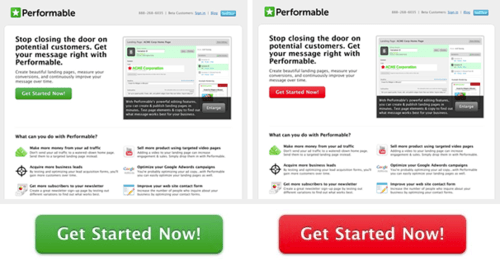
They found the red button outperformed the green button by 21%.
But that was likely because other things on that page were green. The red button was meant to stand out from the rest of the site.
Let’s see how St. Jude does it:
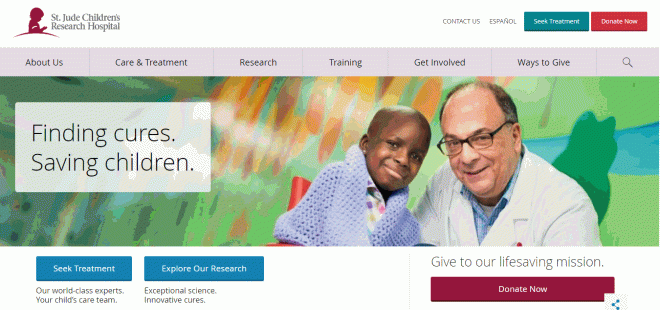
You can see the two actions they want people to take — treatment and donation — are specifically delineated to get people to notice them amid the other colors.
WiderFunnel calls this type of button the BOB — the Big Orange Button. The trick is that if your background color is orange, an orange button is the last thing you want.
On the flip side, here’s Autism Speaks’ home page. In disclosure, I have two kids on the autism spectrum and have been both a recipient of its services and a donor to them. I advocate for you to do donate as well. But the donate button doesn’t jump out at you on their site:

This is clean and beautiful and fits their brand guidelines. But I’d bet they could increase their donations if the donate button was orange (or red or yellow).
So I strongly encourage to use color (and size) to make your button stand out from the rest of your site — whatever that color is. You can go down a rabbit hole trying to trick out your color to the exact shade you want, but having something that differentiates is most important.
Actually, what’s most important is having a compelling ask that touches the heart of the potential donor, but color can help it get noticed.
* Google says this is the first page on the web to use the phrase “chromatic shamanism.” Now we just wait for the searchers to come, like moths to an extremely dim flame…
