Using your real estate better: customization

One of the very few useful concepts I remember from undergraduate economics is the difference between fixed and marginal costs. This is in part because I was taught in the pre-behavioral economics days, so the world the equations described was entirely unfamiliar to me.  But it’s also because this difference reverberates for me even today.

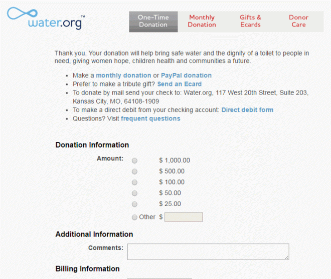
To review, the difference is what you have to pay regardless of the scope of the project (fixed costs) and what you have to pay per quantity generated (marginal costs).  If you want to send out a mail piece, the copywriting costs are fixed — they are the same regardless of whether the piece goes to one or one million.  But the paper, postage, etc., are not.

For implications, think of Metcalfe’s law that the value of a communications network is proportional to the square of the number of users connected to it (which is why Facebook will be hard to dislodge — it’s tough to leave a place where all of your friends are).  A recent HBR article showed the dark side of this law when the marginal cost of some communications are so low:

w160219_mankins_darkside-850x544

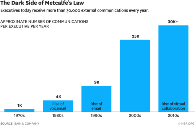
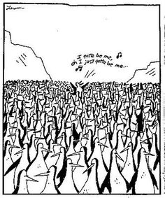
It’s tempting to look at this graph and say “30,000 messages?  Sounds like Thursday.”  And that’s the challenge — we are inundated as consumers and inundating as marketers.

This means we want to maximize the real estate that we have in our communications.  While we have a constituent’s or donor’s attention, we want to milk it for all it’s worth.

pch-sweepstakes-partsOften, this is done crudely.  When a direct mail envelope is stuffed with so many offers, buckslips, and tchotchkes to make a 1980s-era Publishers Clearing House mailing blush, the effectiveness of any one offer is diminished and the ask can often go missing.  

(Incidentally, the modern Publishers Cleaning House is a great transitional story; look at this case study for a quick idea of just the social media side.)

Similarly, many email newsletters look like nonprofit Christmas trees, where every department wants to hang a few ornaments on them.

But this week, we’re going to explore some untapped resources and hidden gems — places you can put content that are both impacting and low (marginal) cost.

And, since every blog post should have at least one good tip in it and not be full of just introductory material, one of the biggest and easiest of these is:

Customization

When you decide to send a mail piece or make a phone call to a person, the vast majority of the costs of that communication are already incurred. Then, it’s just a question of what you put into that communication.

True, there is an additional cost of customization.  But once you customize anything in a phone script or on one side of a letter, the marginal cost of adding in additional customization is almost nothing — maybe some additional data costs.

The return is almost always positive.  And, since the alternative to getting additional revenues is likely communicating more, which incurs additional costs and has diminishing returns, it’s a preferred route.

So here are some ways to customize your communications that will let your donors know you know them and increase their receptiveness to your appeals:

All of these can cost you little, but bring you significant results.  This is what we’ll shoot for for the rest of the week, so if you don’t think you’ll be back, please sign up for our weekly newsletter here for a digest of these tips and tricks, plus some secret subscriber benefits.

Using your real estate better: customization

Microtargeting and the ABCs of customization

Microtargeting is most often thought of in the political realm, where increasingly granular models are able to predict how people are going to vote and think about various issues.  A good example is how Ted Cruz won Iowa: by microtargeting the interests and issues of voters down to fireworks regulation.

But you don’t have that type of time, budget, or modeling power.  Yet you still want to connect with your donors in ways so that they know that you know them.

Enter the poor person’s microtargeting.  We’re going to slice and dice our control letter in such a way that there’s something in it for everyone.

The important thing to remember is that the cost in customization is largely in customizing one side of a piece of paper in the mail.  Online, it’s virtually nothing.*  There can be some data costs, but while the maximum customization approach below may churn out thousands of different combinations of letter, it still is all very simple variables acting predictably.

So here goes the ABCs approach.  Try as many of these as you can on your appeals and see how different one person’s would look from another:

Age:  Does your older donor want a larger font size?  Different levels of formality?  Two spaces instead of one?  Including the Oxford comma?

Buckslip: What could you put in the envelope, based on what you know about the donor that would make them more likely to donate?  Remember, you don’t have to have it for all donors, just some…

Channel responsiveness: Don’t ask someone for their email if you already have it.  But do sent them an email that support the mail package they just received.

Donation history: Putting last gift in the upper right can help bring back lapsed donors

Event history: “You wanted with us to cure X.  Now we need your help again.”

Frequency of giving: If someone is giving 4+ times per year, might now be the time to ask about that monthly giving program?

Giving history: “your gift” versus “your gifts.”  Also, have they given the same amount year after year?  You probably don’t need to push the upgrade.  However, if they’ve been steadily rising, go for the gusto.

History with this appeal: “As someone who supported our matching gift campaign in the past…

Initiation: “your support has helped X over these past Y years” or “since you joined X years ago.”

Jargon: J is tough, so a reminder to go through your letter and remove anything that sounds like a great buzzword to you, but gobblygook to those outside your organization.

Knowledge: How much explaining do you do?  Is it the same amount for someone who has read 50 letters as someone receiving their second?  

Location: “we’re looking for seven dollars from XXCityXX willing to chip in…”  This works.

Mission area supported: tie your ask to what they want to support.

Nicknames: Does your letter sound like it was written by C3PO: “Dear Dr. Lt. Col. R. Winthrop Huntington III, MD (ret.),”?  If you tell by his checks that he actually goes by Bob, do you want to try saying “Dear Bob”?

Online activity: Mention they were a petition signer as an inducement to get them to sign an offline petition.

Postage: Send your most valuable donors’ mail first class.

Questions they’ve answered: The letter of someone whose survey said they thought it was most important you educate young people should look different from the one who said you should be advocating for better laws as a top priority, no?

Rhythm of pieces: (aka cadence, but I already had a C).  Should this person even be getting this piece or are they likely to make a gift without?

Single versus multi: With singles, you can switch up the ask string. Much harder to do with multis.

Tchotchkes: Are you sending premiums to everyone?  Even those people who have never responded to a premium?

Unique URLs: Not necessarily personalized URLs, but different URLs for different messaging so you can see what creates the greatest online response.

VIPs: If someone is a member of the “Founder’s Circle” or the “Legion of Good Deed Doers” or whatever it is you have, are you referencing that?

Wealth screening: You can do a higher-dollar treatment if you know a person has the capacity to make a larger gift.

seX: You didn’t think I was actually going to get a real X in here?  Appeal to women’s emotions in your ask and to men’s self interest

You: I’m cheating with this, because it’s not a customization.  But it does give me the opportunity to quote Jeff Brooks’ sample fundraising ask letter, which makes me happy:

Dear [name]:

You. You. You. You. You. You. You. You. You. You. You. You. You. You. You. You. You. You. You. You. You. You. You. You. Yes, you. You. You. You. You. You. You. You. You. You. You. You. You. You. You. You. You. You. You. You.

Sincerely,

[Signature]

P.S. You. You. You. You. You. You. You. You. You. You. You. You.

Instructions: Liberally sprinkle in nouns and verbs. Use adjectives and adverbs sparingly. Include specific examples of what the donor’s gift will accomplish. Include true-life stories that demonstrate the need for the donor’s involvement. Be sure to clearly and articulately ask for a gift more than once.

Someday, I’ll write a blog post that good.

Zip selects:  Increase your ask string multiplier if they are from a wealthy ZIP code.


* Get it?  Online?  
Virtually nothing?  I absolutely slay me.

Microtargeting and the ABCs of customization

Let’s get small: microimprovements

402px-david_von_michelangeloThere is a story, perhaps apocryphal, that someone watched Michelangelo retouching every inch of one of this statues.  The bystander asked him why he bothered with such trifles; the artist replied “Trifles make perfection. And perfection is no trifle.”

In the direct marketing world, it’s difficult to say that there is such a thing as perfection.  You will likely never see, in any quantity, a 100% response rate or open rate.  But our goal is to strive, to seek, to find, and not to yield.

There rarely is an idea that you have that will double the completion of your online donation page.  But you can find 16 ideas that each get you five percent better, each one compounding to double your response.

So without further ago, a few small ideas that may make small (or big) differences.  In no particular order:

Change the color of your donate button to something not approved in your brand guidelines.  It will stick out.  Good.  Things that stick out get clicked on.  When this starts to lose its effectiveness, change it again.

Reduce the size of your download.  A Sprint phone downloads an average of 11 MB per second on 4G .  We can easily design pages with enough extra code and random things to download to cost an extra second.  One second lost means 7% fewer conversions.

That’s probably why water.org has their homepage look like this:

water

But their donation page looks like this:


waterdonationpage

Increase customization by a variable.  If you do name, do name and location.  If you do name and location, add in donation history.  Et cetera.  These are more than 5% tactics

Add a small donate bar at the top of your site.  Human Rights Watch reported (at DMA’s DC nonprofit conference) that the below orange bar and a larger orange footer on their site increased donations from the home page by 256%.  Many days, I’d settle for 2.56%.

Go into Google AdWords.  And do what it says to do.  If it recommends splitting up your keywords, it probably knows that doing so will allow you to customize your copy.  Punctuate your headline properly.  It knows that increases click-throughs.  And so on.  It will keep bringing up these opportunities; you just have to act on them.

Try adding a picture.  Not necessarily guaranteed, but a quality picture will usually improve a home page, mailpiece, donation page, content marketing, etc.  I’ve found a significant difference in the traffic I get from blog posts with pictures over those without.  Hence David hanging out at the top of this one.

Call some donors.  Ideally some of your best, but these thank you’s will both help with the donor’s loyalty and give you ideas for things you can try (or stop).

Take some fields off of your donation form.  Phone number?  Ask for that afterward.  If you have the ability to divine city and state from ZIP on your form, go for it.  You are looking to streamline this process.

Similarly, reduce the clicks to get to the donation form.  Hopefully, it’s one or zero (that is, you can start entering info on the Web page).

Remove the navigation from your donation page.  Now is not the time for someone to want to look at your executive’s pictures.  Four tests show improvements from the tiny to the oh-my-goodness here.  

Run a test.  Are those ask amounts correct?  How do you know?  If you are mailing, emailing, or calling with the same thing for 100% of your communications, you are missing out on your 5% opportunities.

Hopefully, one of these gets you 5%.  If it does, please leave it in the comments.  If it doesn’t, please let us know in the comments what did.

Let’s get small: microimprovements

Priming with donation history and localization

I realized while preparing this post that I have used the phrase “play back” donation history in four different posts — in measuring retention, in the power of commitment and consistency, in my first post on customization, and yesterday.

But I realized I had not provided the intellectual background for why, other than as an example of commitment and consistency.

That ends today.  Kessler and Milkman of the Wharton School did a study of identity in charitable giving.  As they are from Wharton, they gussy up the paper with all sorts of stuff likewharton

But the paper is basically did two split tests with the American Red Cross.  The first was with lapsed (25+ month) donors, where the test version added the line “Previous Gift: [Date]” at the top of the letter (this was the only change).  Lapsed donors renewed 20% better when this statement of their donor status up front.

Also, response rates were 6-8 percent.  Can someone tell me what Red Cross was mailing to lapsed donors in 2010? Because if it wasn’t gold bricks, I want to test it.

I would wager that this is part the idea that the nonprofit knows who I am and what I’ve done.  It’s nice not to be treated anonymously, especially in this day and age.


farside

Copyright: someone who isn’t me. My apologies.
If it helps, I owe all of the Far Side books…

Part of this is reminder: “oh, goodness me, I meant to send a check, but I forgot.  Has it been that long?”.  Part is almost certainly shame.  Like we said yesterday, people want to feel good about themselves and a donation four years ago likely isn’t enough to cut it.

The second test looked at community identification.  People received solicitations for one of four efforts: the annual drive, the state drive, the winter drive, and the city drive (with the name of their state and city filled in).  Customizing this down to the city level significantly helped response rate:

  • City: 5.51%
  • State: 4.12%
  • Annual: 4.01%
  • Winter: 3.82% — proof that people hate winter

There was also a 4.8% higher average gift for those who received the city mailing.

The authors went a step further and looked at community size.  Sure enough, people from smaller communities were even more influenced by having the drive be about their city than people from larger ones.  After all, it’s easier to have community pride for Greendale, WI, than the entirety of Chicago, IL.  In part because Greendale is awesome, but mostly because of size.

So these two types of priming work and are thus things that can work for us in the mail, on the phones, and online, considering that the costs of these types of tweaks are typically low.  So go forth and customize!

Priming with donation history and localization