 There is a story, perhaps apocryphal, that someone watched Michelangelo retouching every inch of one of this statues. The bystander asked him why he bothered with such trifles; the artist replied “Trifles make perfection. And perfection is no trifle.”
In the direct marketing world, it’s difficult to say that there is such a thing as perfection. You will likely never see, in any quantity, a 100% response rate or open rate. But our goal is to strive, to seek, to find, and not to yield.
There rarely is an idea that you have that will double the completion of your online donation page. But you can find 16 ideas that each get you five percent better, each one compounding to double your response.
So without further ago, a few small ideas that may make small (or big) differences. In no particular order:
Change the color of your donate button to something not approved in your brand guidelines. It will stick out. Good. Things that stick out get clicked on. When this starts to lose its effectiveness, change it again.
Reduce the size of your download. A Sprint phone downloads an average of 11 MB per second on 4G . We can easily design pages with enough extra code and random things to download to cost an extra second. One second lost means 7% fewer conversions.
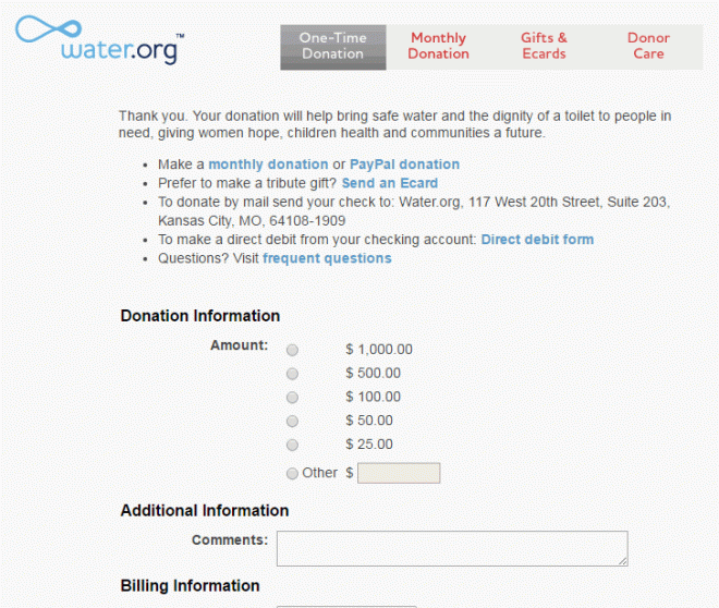
That’s probably why water.org has their homepage look like this:

But their donation page looks like this:
Increase customization by a variable. If you do name, do name and location. If you do name and location, add in donation history. Et cetera. These are more than 5% tactics.
Add a small donate bar at the top of your site. Human Rights Watch reported (at DMA’s DC nonprofit conference) that the below orange bar and a larger orange footer on their site increased donations from the home page by 256%. Many days, I’d settle for 2.56%.
Go into Google AdWords. And do what it says to do. If it recommends splitting up your keywords, it probably knows that doing so will allow you to customize your copy. Punctuate your headline properly. It knows that increases click-throughs. And so on. It will keep bringing up these opportunities; you just have to act on them.
Try adding a picture. Not necessarily guaranteed, but a quality picture will usually improve a home page, mailpiece, donation page, content marketing, etc. I’ve found a significant difference in the traffic I get from blog posts with pictures over those without. Hence David hanging out at the top of this one.
Call some donors. Ideally some of your best, but these thank you’s will both help with the donor’s loyalty and give you ideas for things you can try (or stop).
Take some fields off of your donation form. Phone number? Ask for that afterward. If you have the ability to divine city and state from ZIP on your form, go for it. You are looking to streamline this process.
Similarly, reduce the clicks to get to the donation form. Hopefully, it’s one or zero (that is, you can start entering info on the Web page).
Remove the navigation from your donation page. Now is not the time for someone to want to look at your executive’s pictures. Four tests show improvements from the tiny to the oh-my-goodness here.
Run a test. Are those ask amounts correct? How do you know? If you are mailing, emailing, or calling with the same thing for 100% of your communications, you are missing out on your 5% opportunities.
Hopefully, one of these gets you 5%. If it does, please leave it in the comments. If it doesn’t, please let us know in the comments what did.

