Winning the battle against scope insensitivity, part 2

A reminder for those joining our program already in progress: scope insensitivity means that people are willing to give the same about to solve a program almost no matter how big it is.

Part of this is likely that humans don’t reckon big numbers well.  After all, in our salad days, we needed to figure out how many animals were nearby and how many people were in our group, but we didn’t need to count the stars or, God help us, remember how many zeros are in a petabyte (answer: a lot).

Which leads us to have troubles with numbers like this:

1000_times

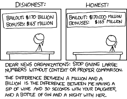
Thanks to xkcd for the illustration.

So how do you make large numbers comprehensible to your target audience?  In a great piece on Gizmodo, mathematician Spencer Greenberg covered some important ways to anything over a thousand into perspective.  His tips include:

Breaking the number down.  When MADD talks about the cost of drunk driving, the amount talked about is usually not the billions of dollars; it’s $500 for every adult in the United States.  Everyone can picture $500 or what they could buy with it, whereas we don’t know where to start with a billion dollars.

Actually, we do — with a vintage battleship gray Aston Martin DB5 — but that’s only a start.

Change the unit of measurement. The example he gives in the article is when talking about the deepest point in the ocean, don’t say 36,000 feet; say almost seven miles.  I would argue that for nonprofits, you may want to change the type of unit of measurement.  When doing earthquake relief, 8.4 on the Richter scale may not mean much.  But “I saw a sign that talked about the building being earthquake-proof buried under a pile of rubble” gives someone an idea for the force we are talking about.  Or 8.4 can be “the same force as the largest nuclear weapon ever tested.”

Batching the numbers.  We can’t picture 2.3 million people.  But we can picture the football stadium we saw on TV last night.  So “every NFL stadium filled to capacity at once” gets the message across.

Incorporate time.  In the article, he mentions that during the Battle of Stalingrad, Russians broadcast the message that “every seven seconds, a German soldier dies in Russia.”  That gets the message across (that message being “RUN!!!”) in a way that 388,000 people dying each month does not.

These are some good tips.  I would add another — infographics.  For the modern nonprofit, an infographic can explain in a way that simple numbers can not.  There is a strong article in this month’s Bulletin of the Association for Information Sciences and Technology (get it on any quality newsstand today!) that highlights tips for creating a good infographic.

They include:

  • Identify a meaningful comparison for your audience. It has to be something that resonates with your audience, not just you.
  • Tell your audience what you want them to do or think. Like all things, we want to begin with the desired action in mind.
  • Don’t crowd your message with less important numbers or statistics.

There are some good nonprofit examples in the article, so I recommend a read.  Hopefully, you can now get your millions and billions down to something that people feel like they can do something about.

Winning the battle against scope insensitivity, part 2

Winning the battle against scope insensitivity, part 1

Back in February, we talked about how humans have scope insensitivity; that is, they don’t look at the scope of a problem.  This manifests that we are more likely to give to an individual story than to a global problem; it also means that we are willing to give just as much to help save 2000, 20,000, or 200,000 birds.  Even though the problem is greater, we have the same mental bucket for the amount we are willing to allocate.

What if you could change this with your copy?

It turns out you may be able to.

Hsee et al experimented with a way to combat scope insensitivity called unit asking.  The method is deceptively simple: before asking how much a person would give to support a group of needy people, ask how much the person would be willing to give to support a needy person.

The psychology here is brilliant: by setting a mental anchor for an individual person, suddenly the scope of your program is working for you instead of being a spectator in your ask.

Their first experiment was with a survey: people were asked how much they would donate to help 20 children in need.  Half of the audience had a preceding question:

“Before you decide how much to donate to help these 20 children, please first think about one such child and answer a hypothetical question: How much would you donate to help this one child? Please indicate the amount here: $____.”

People who got this priming question expressed a willingness to donate more than twice as much as the control group ($49 versus $18).

Then, like good researchers, they wanted to see if this would actually have an impact in the real world.  They worked with a company in China that was raising money among its 800 employees to help 40 school children in the Sichuan province, which had just gone through an earthquake.

The company emailed its employees, half with a unit ask, half without.  Average gifts went up 65% among those asked to envision what they would give to support one children first.  Additionally, response rate was unaffected (actually, response rate was slightly higher with the unit ask, but not significantly so).

They then tested the wording in the mail, with even bigger results — those who received the unit ask first had gifts that were four to five times higher than those who received a plea for the 40 children alone.

So, if you have a large number of people affected, ask how people would treat one person first.  Here, we return to the wisdom of Mother Teresa again:

engaging-millennials-as-organ-donors-june-13-2011-35-728

That probably works for numbers that people can picture.  I can picture one child, multiplied by 40, to get 40 kids.  What do you do if you are working with numbers large enough that people can’t picture it?  We’ll talk about that tomorrow.

Winning the battle against scope insensitivity, part 1

For donations, speak like a human.

If you are among my fellow nerds and geeks, you likely can recall Captain Jean-Luc Picard’s beverage order of choice from Star Trek: The Next Generation:

b89f31a85da7290ddecdad44f2628c17e208901f

Tea. Earl Grey.  Hot.

Captain Picard was talking to a computer; there is no way he would speak to a person thusly.  For a person, you would use a complete sentence and probably add a “please” for good measure.

Picard was adapting himself for the computer, presumably using narrowing categories (tea; of the teas, I’ll have Earl Grey; of the Earl Greys (Earls Grey?), I’ll have it hot).

In the real future, it appears we won’t actually have to do this.  Starting on slide 112 of Mary Meeker’s Internet Trends report, she talks about how we are moving toward voice interface for computers.  In the long-term, the keyboard on which I’m typing this will seem as antiquated as the typewriter on which it is based.  Specifically, there are several reasons she says this is happening:

Further, she shows that Google has seen voice queries increase by seven times since 2010, with a projection of half of search terms going through voice by 2020.

There are a couple of implications to this.  First, the obvious one — we’re going to have to change our Google Grant Adwords terms and ads.  Right now, someone is adapting themselves to the search engine when they put in “autism services parent.”  When they are able to say “Please tell me how to get help for my son; he’s two years, three months and he isn’t talking yet” and the search engine understands them, we are going to have to understand the statement and deliver the answer in our ad.

But the second lesson is broader and it has to do with the curse of knowledge we talked about way back in October.  When you know something, it’s difficult to communicate with someone who doesn’t.  That’s because you make assumptions about what they know and can’t picture what it is like to function without that knowledge.

Our donors have suffered long enough with us talking about “food security” and “science-based curriculums” and “paradigm shifts” instead of hunger and classes and whatever the heck a paradigm shift actually is.

It’s time to speak plainly. It’s time to call things as we see them. It’s time to come to our donors as they are, not as we might think we wish them to be.

Pretty soon, our computers will understand us as well are.  Hopefully, humans at nonprofits won’t be too far behind.

For donations, speak like a human.

Who is the hero of your story arc?

Going back to Aristotle, drama has been described in rising action, climax, and falling action (or, in his words, protasis, epitasis, and catastrophe).  Even now, when a movie is good, even great, for a while (*cough*cough*Spectre*cough*cough), but doesn’t have a satisfying ending, we call it a third act problem.

The German playwright Gustav Freytag formalized this in Freytag’s pyramid for a five-act structure:

2000px-freytags_pyramid-svg

I was skeptical of how much this could have an impact today.  After all, as we said with the donor pyramid, all pyramids are lies.

But research backs this up.  Keith Quesenbery, a researcher at Johns Hopkins, looked at 108 Super Bowl commercials and found that people were drawn to the ones that had a five-act narrative arc like a Shakespearian play.  In fact, from this, he was able to predict the most effective 2014 Super Bowl ad in ratings and, apparently, in sales.

What does this tell us about how we should structure our nonprofit stories?  With this type of narrative, clearly.  Good stories like this release oxytocin in our donors’ brains and oxytocin is related to increased giving.

But how?  

If the pyramid doesn’t speak to you, perhaps Wall-E or Woody or Lightning McQueen will.  Former Pixar storyteller Emma Coats tweeted out (speaking of, her feed is a wealth of storytelling ideas) story rules for Pixar films.  #4 was:

Once upon a time there was ___. Every day, ___. One day ___. Because of that, ___. Because of that, ___. Until finally ___.


Think of how this fits a tradition nonprofit story:

Once upon a time there was Janice.  Every day, Janice would pick up her kids from school.  She’d ask them how their days were.  Joan said “fine” every day and little Jake would talk a mile a minute until they got home.

But then one day, Janice found a lump in the shower.  She forgot to ask her kids how their day was, so preoccupied was she with this discovery.  So she went to her doctor, who gave her the news.  She’d caught it early.

She decided to fight.  Her whole family decided to fight.  And fight she did.

It’s five years later now.  She still picks her kids up from school.  But today, she’s going to celebrate — five years cancer-free.  She’ll be walking to end all cancer.  Will you?

This is not a bad story.  Granted, it lacks a certain what you might call… quality — details and action verbs and things that will create a fleshed out narrative.  You can picture it being an appeal letter or email.  And it’s a strong narrative.

So I encourage this type of five-act structure as you build out your campaigns.

But that’s not the end of this story.  Here’s the M. Night Shyamalan twist ending. (Hopefully early Shyamalan.)

Who is the hero of this story?

The person you are talking to — the potential donor — enters the story in the last two words of that appeal.  Two words.

What if you took that same narrative structure and made the donor the hero, or at least a parallel hero?

Three years ago, every day, you would go to the mailbox and see a phone bill or a Sharper Image catalog you would never order anything from.

One day, you got a letter. It asked you to save a life.  And you, being a kind and generous person made a gift, to see what type of an impact you could have.

Because of that, because of you, Janice knew how to perform a self-examination.  Because of that, because of you, Janice was able to get the care she needed.  And now, she’s cancer-free.

And it’s not just Janice.  Because of your support over the past seven years, there’s been research that will help other survivors survive.

Together, I know we’ll keep saving lives and helping people.  Until that great day when your support takes down all cancer, now and forever.

Which do you think will raise more?  I’d say they’d be about even as they stand; we need to get some of that emotion from the first piece into this one.  But it’s a philosophical shift we can make to engage better.

Who is the hero of your story arc?

Make your donor fill in the blanks

What’s brown and sticky?

This is my wife’s favorite joke in the world.  And it puts me in mind of the power of either asking the person who gets your communication to fill in the blanks or evoking their curiosity, compelling them to read on.

Of course the answer is at the end.  How would I do a blog post about building interest through questions and not put the answer at the end?

While it may be fatal to our feline companions, curiosity is a basic human motivator.  Jerome Kagan, one of the forefathers of development psychology found in a 1972 paper that what he termed “uncertainty resolution” is a primary motivator of human behavior.  We are hardwired to want to know.

This can work to our advantage in direct marketing.  More and more research indicators that the donating decision isn’t a yes/no dyad; it’s a series of microconversions that lead up to the act of pulling out the credit card/checkbook/wallet/etc. and giving the gift of a life saved or changed.

Our goal, then, is to shepherd the potential donor through the little steps that lead to that big step.  One of these is often the decision to open, whether it’s a physical or virtual envelope.

A good question in a subject line or intriguing statement in teaser copy can help draw in a prospect.  One of my favorite subject lines of all time was one that was intended to show our gratitude, but could be read one of two ways:

Look what you’ve done

When you opened the email, it was telling the story of what the person’s support had meant: the small dent they put in the world that year.

But I’d be surprised if at least some of the people who opened it (and it had a 25%+ open rate) didn’t think we were saying:

jerk

Incidentally, you might think of this as a bait and switch, but not shockingly, no one complained about being tricked into being thanked profusely.

You can also create an information gap.  Think of the teaser of your local news: “Coming up after the break: what common household object could kill you today?”  Sometimes, asking the question that your email aims to answer can get people to read and read all the way through.  Just like brown and sticky things.

There’s a specific manifestation of completionism that is particularly interesting.  It started with Austrian waiters.

See?  “It started with Austrian waiters.”  You can’t help but read on to resolve the uncertainty that comes with a statement like that.

Psychologist Bluma Zeigarnik was watching waiters in Vienna.  She noticed that their memory was astoundingly good for orders that were in progress, but very bad for those that were already served.  She went back to the lab and found that our memories work well for unfinished or incomplete things (know as the Zeigarnik effect).  Subsequent testing has shown it works best for tasks that are very important to a person.

There are a good number of ways to deploy this:

  • Don’t put a period (or God help you, an exclamation point) on the end of your subject line.  Punctuation there (other than a question mark) signals that the thought is complete and you need not read on.
  • Test out two-step opt-ins.  This is the not only the perfect compromise by the people on your Web site that want to reduce form friction and the ones who think you need your participants middle initial and blood type (you don’t; the first people are right).  Simply have the person fill out the most basic information on the first screen (usually just email address).  Then ask for some of the important information on screen two, with a big friendly opt-in button (note: it should not say opt-in) right there for the taking.
  • Finally, you should end your content with an idea that the content will continue on in another letter, post, email, etc..  There’s a reason every Bond movie ends with “James Bond will return” — there’s always more to the story.  So tune in tomorrow for the end of story week when we talk about story arcs and hero’s journeys.


* What’s brown and sticky?  A stick.

Make your donor fill in the blanks

What the Greeks have to teach us about fundraising rhetoric

Classic rhetoric structures almost always have no place in fundraising letters.  We govern largely in prose, not poetry.  In an effort to simplify, the flowery and verbose take a back seat to hard-punching Anglo-Saxon words of action.

But there are a few classical rhetorical devices worth knowing for even the humblest of appeals.

The first is that we tend to remember things in opposing twos and common threes.

For those of you keeping score at home, having opposing pairs is called antithesis.  The most famous of these is “It was the best of times; it was the worst of times.”  Many forget that Dickens then went on in that vein for quite some time, showing that he was paid by the word.

These opposing pairs can be a powerful way of setting an expectation and then denying it.  An opening sentence could be something like “Mary and John had long dreamed of owning their own home; little did they know that dream would become a nightmare” then going on to talk about the predatory lending practices that did them in and how you want to solve them.  While not a true antithesis (as those tend to have the same rhetorical structure), we tend to remember pairs of things.

We also remember three things if they are in a similar structure (known as tricolon).  We wouldn’t remember how Julius Caesar took Gaul if he just said “check Gaul off the list.  Conquered it.”  But because he came, he saw, and he conquered, it’s memorable.  We remember Churchill’s blood, sweat, and tears.  What we forget is that Churchill actually asked for blood, toil, sweat, and tears.  Even a master rhetorician as he went a rhetoric bridge too far.  We aren’t equipped to remember four things together.

14c14v

For our purposes in writing, the rule of three often applies well to adjectives.  A strong three adjective pile-up can add emphasis, focus, and detail to a sentence.

An additional rhetorical device that is very useful is intentionally grammatical mistakes (catachresis, if you are feeling fancy).  Some effective ones:

  • Saying “over” when you technically mean “more than.”
  • Avoiding your brand speak (e.g., ® and ™ and capitalizing many a word, as if they were special)
  • And starting sentences with “and” or “but.”

When in doubt, ask if it’s how people speak.  If it is, you are probably fine.

Yes, your copywriters will run a river of red ink through these.  Ignore them, unless they are prepared to pay you the difference in donations.

Finally, alternating hypotaxis and parataxis can be effective at getting people to think about what they’ve read.  In English, this means mixing up your long sentences with subordinated clauses (your flowery sentences designed to evoke a mood) with short ones.  This breaks up the mind and allows for some rest between longer orations.

Most of the other rhetorical devices you can keep; a fundraising letter full of alliteration or written in iambic pentameter is too cute by more than half.  But these help keep attention.  And that’s our goal.

What the Greeks have to teach us about fundraising rhetoric

The four American stories

Your English teacher probably told you at some point about types of stories: man versus man, man versus nature, man versus society, etc.  English teachers like this may or may not be why so few movies pass the Bechdel test.

hickey-bechdel-11-0

Anyway, there is a taxonomy of storytelling I prefer to these types of conflicts — it’s the four American stories discussed by Robert Reich in Tales of a New America.  Those stories are:

  1. The mob at the gates.  The enemy is out there and we are in here.  We are a beacon to others, but we are fragile unless we arm ourselves against the barbarian horde who want to destroy us and our way of life.
  2. The triumphant individual.  This is the person who made her own bootstraps and pulled herself up by them.  These stories include pluck, grit, gumption, not to mention moxie and spunk.  It’s hard works, late nights, and early mornings.  It’s Abe Lincoln and Ben Franklin and Horatio Alger.  It’s Rocky and Rudy and the venerated entrepreneur.  
  3. The benevolent community.  This is neighbors coming together to help.  It’s the end that we are generally good at heart and will come together as one people to solve the tough problems.  
  4. The rot at the top.  These can be aristocrats, bureaucrats, banks, the 1%, the conspiracy of the day.  These people in high places are corrupt, decadent, and reckless and the keep their boot on us all.

In their raw forms, these are the intersections of two dichotomies: optimistic versus pessimistic and few versus many.

Few stories are only one of these and powerful ones intertwine them.  A classic example of these is the ebb and flow of the fortunes of George Bailey in It’s a Wonderful Life.  In one scene, he defends his bank on his own (triumphant individual) against a bank run (the mob at the gates) engineered by Mr. Potter (the rot at the top) and triumphs when his neighbors agree their money is best kept in their neighbors’ houses (the benevolent community).  

So, how do you craft your nonprofit’s story and people’s places in it?  Some implications:

  • You want to yin with your yang in temperament.  An unrelentingly positive communication leaves no thought that there is still a need.  An unrelentingly negative one makes a person want to take a bath, not try to create their own hero story.  I would recommend making sure you are both heroing your donor (whether you cast them as the triumphant individual or part of the benevolent community depends on their personal bend) and talking about the threat you face, whether from without or within.
  • Like temperament, I also find that it’s good to have few versus many in opposition.  True, two evenly matched individuals or equally sized armies can make for good stories.  But when one individual stands up for what is right against the masses (there’s a narrative reason we like when the crowd isn’t chanting Rocky’s name at the beginning of the fight, especially when fighting godless Commies) or when a people throw the bums out, you have a truly gripping story.  
  • Everything that isn’t in a category here is noise.  You’ll note that there isn’t a storytelling category for talking about how great your programs are, for the same reason that the benevolent community story of a barn-raising doesn’t dwell on the awesomeness of the hammers.

Tomorrow, we’ll talk about some tricks to make your story more compelling.

The four American stories

How long should a story be?

Long enough, and no longer.  There!  That was a quick post.

I just realized that I’ve referred many a time about telling quality stories, but haven’t gone into a lot of detail on how.

So that starts today with length of your story.  I like this topic partly because I get to quote Jeff Brooks’ Fundraising’s Guide to Irresistible Communications:

“I’ve tested long against short many times.  In direct mail, the shorter message only does better about 10 percent of the time (a short message does tend to work better for emergency fundraising).

But most often, if you’re looking for a way to improve an appeal, add another page.  Most likely it’ll boost response.  Often in can generate a higher average gift too.

It’s true in email as well, though not as decisively so.”

In addition to emergencies, I’ve personally found shorter to be better with appeals where urgency is a main driver (e.g., reminder of matching gift deadline; advocacy appeals tied to a specific date) and institutional appeals like a membership reminder.

Other than that, length is to be sought, not avoided.

This is counterintuitive; smart people ask why our mail pieces are so long.  And it’s not what people say themselves.  There is a recent donor loyalty study from Abila where they indicate that only 20% of people read five paragraphs in and only seven percent of people are still reading at the ten paragraph market.

Here’s a tip: if you are reading this, this data point is probably not correct.

The challenge with this data point is that they didn’t test this; they asked donors.  Unfortunately, donor surveys are fraught with peril, not the least of which is people stink at understanding what they would do (much better to see what they actually do).  We talked about this when talking about donor surveys that don’t stink.

Other questionable results from this survey include:

  • Allegedly the least important part of an event is “Keep me involved afterward by sending me pictures, statements on the event’s impact, or other news.”  So be sure not to thank your donors or talk to them about the difference they are making in the world!
  • 28% of people would keep donating even if the content they got was vague, was boring, talked about uninteresting programs, had incorrect info about the donors, and was not personalized.  Unfortunately, I’ve sent these appeals and the response rate isn’t that high.
  • 37% of donors like posts to Twitter as a content type.  Only 16% of donors follow nonprofits on social media.  So at least 21% of people want you to talk to them on Twitter, where they aren’t listening?

So length can be a strong driver and should be something you test.  But you want the right type of length.  Avoid longer sentences and paragraphs.  Shorter is easier to understand, and therefore truer.

Instead, delve into rich detail.  Details and active verbs make your stories more memorable.  And that helps create quality length, and not just length for length sake.

And don’t be afraid to repeat yourself in different words.  Familiarity breeds content.  It also helps skimmers get the important points in your piece (which you should be underlining, bolding, calling out, etc.).

This may not seem like the way you would want your communications.  Remember, you are not the donor.  Especially in the mail, donors who donate like to receive and read mail.  Let’s not disappoint.


After posting this, I heard a great line in Content Inc that stories should be like a miniskirt: long enough to cover everything it’s necessary to cover, but short enough to hold interest.  So I had to add that as well…

How long should a story be?

Using your real estate better: online images

As we discussed in the stop doing giant wads of text post, it’s a good idea to break up your text with images.  But too often online images stop at the first level of work for you: they show the problem or make the donor feel better or the like, but don’t do anything else.

We’re going to put pictures to work for us to do second and third level duty.  Here’s how.

Follow the eyes.  We discussed this a bit in what we can learn from political campaigns.  It’s one of my top 200 blog posts so far, so I’d recommend a read, but the TL;DR version is that we follow where people’s eyes are looking or where they are pointing.  Since having a homepage image of people pointing to your donate button is a little on the noise, having your image subject looking at the donate button can do this work for you.  Here’s a heat map sample from that earlier post:

Engage the multichannel donor.  It is well into 2016, which means not only am I no longer writing 2015 on my checks; I’m no longer writing checks.  Another implication of it being 2016 is that people are going to go to your Website to see what you are doing before donating.

So it’s to your advantage to tie the solution you telling on your site and in your offline communications together with the use of images.  If your mail piece tells the story of the impact of your mission on a child, it’s great to have a further picture of that child on your homepage with a link to the story and the ability to donate.  While you should have a personalized URL in your piece, a person may not be sitting down at their computer (laptop, phone, tablet, watch, etc.) with that mail piece in hand.

Insert key messaging.  And only key messaging.  Take a look at charity.water’s homepage monthly giving ask.  Very few words — just the essentials.  

water


Embed your ask in the picture.  You’ll note in the heat map above that even before we look at eyes, we seek out faces.

If the image is where people are going to be looking on your site anyway, where better to begin your ask?  If that ask is an email sign-up, you can probably do all of that in the same picture (as you only need first name, last name, email address, and maybe state or zip code.  What?  You are asking for more information on your email sign-up?  Have you tried asking for less and seeing what the difference is?  You can always ask for more in the welcome series.)

If that ask is an online donation, you might as well as for some of the starting information in the picture.  Most often, you can get someone to pre-select their donation amount in the initial image.

One of the cardinal rules for donation forms for a number of years has been to minimize the number of clicks necessary to complete the form.  Recent tests that I’ve seen may indicate this is no longer the case.  I hypothesize a few reasons for this:

  • We humans have a poor understanding of sunk costs.  A multistage donation form, then, gets people to take the first few steps quickly and then asks for more, getting the person to think “well, I’ve come this far.”
  • Multistage donation forms can often render better in mobile devices with smaller screens (and worse keyboards).
  • E-commerce has taught us how to use multistage forms.  Think of the arrows at the top of your Amazon order page telling you what step you are on and how much further you have to go.  The fact that you can probably picture an Amazon order page shows how common this has become.  (I’m not judging – I’m surprised it’s not burned onto my retinae).

Anyway, getting the person to give you the amount first asks as a commitment device and pre-checks the “sunk cost” box.  And you are saving a step: rather than clicking on donate, then putting in the amount, they are able to combine these.

Using your real estate better: online images

Learning from political fundraising: chip in change for change

You’ve seen the headlines: “Americans more divided than ever”, “Gridlock reaching threat level crimson, which is worse than red somehow”, and “Pelosi-McConnell dancing knife fight leaves two dead.”*

Seemingly, parties can’t agree on anything.

But here’s a ray of hope.  They can agree on donors chipping in:

Martin O’Malley:

chipinomalley

Rand Paul:

chipinrandpaul

Bobby Jindal:

chipinjindal

DCCC:

chipindccc

RNC:

chipinnrcc

Jeb Bush:

chipinbush

Bernie Sanders and MoveOn:

chipinsanders

John Kasich:

chipinkasich

Marco Rubio:

chipinrubio

Hillary Clinton:

chipinclinton

I’ll be honest: usually my research for this blog is harder than this.  The hardest parts of finding these were:

  1. Remembering who had been running for president.  For example, it turns out Lincoln Chafee is not a model of car.
  2. Finding photographic from former campaign sites.  There’s evidence that Scott Walker, Chris Christie, Mike Huckabee, and others used chip-in language, but couldn’t find them online.  So passes away the glory of a presidential campaign.

But nonprofits don’t seem to be using “chip in” much.  Yet.  I think BirdConservancy.org was the largest organization I could find in my Googling.

So why do political organizations almost unanimously use “chip in”?  Here are my theories:

  • “Chip in” sounds very small. Giving permission for small donations increases the likelihood of giving. This is probably part of the appeal.  This extends to the standard ask strings.  Clinton, Cruz, Kasich, Rubio, Sanders, and the current Republican frontrunner (since I pledged I wouldn’t use his name as a cheap SEO play) all start their asks at $3-25.  In fact, if you take out Kasich, the highest initial ask is $15 (ironically, for Bernie Sanders).
  • Making a cost sound small also decreases the amount of pain that someone feels from making a purchase/donation. 
  • The value of a name in political spheres far exceeds just their donation value.  A $3 donor is also a voter at worst and perhaps a volunteer or district captain.  And of course, they may be able to give more in the future.  A $2,700 donor is these things, plus someone who may be able to attract like-minded funders at a max level.

    I say this is in political spheres.  But isn’t this true for your nonprofit as well?  You want that $3 donor as a volunteer, walker, bequest donor, monthly donor, etc.  And yet we generally have higher online ask thresholds. 
  • “Chip in” implies that others are doing the same.  In fact, Oxford Dictionaries defines “chip in” as “contribute something as one’s share of a joint activity, cost, etc.”  Social proof is a powerful persuasive force and knowing that others are doing it and are counting on you too can greatly influence decisions. 
  • People like to be a part of something bigger than themselves.  This is especially true for causes, political or non-profit.  The ability to make something part of your identity that ties you into a larger in-group can be very powerful.

So I’d encourage you to try chipping in as part of your emailing strategy (and, if it works, test elsewhere) as a way of pulling these cognitive levers.

A post-script: after I drafted this piece, this came in from the Clinton campaign:

unnamed


* I will offer a free signed book (in that I will print out any one of my ebooks , sign it, and mail it to you) for the first person who can do a Photoshop of this based on West Side Story.


Learning from political fundraising: chip in change for change