It’s time to stop… dense wads of text only

I’m going to be a bit of a hypocrite here, as giant, dense wads of text are kinda my specialty.  But it’s also something we need to stop doing.

This is because dense text is hard to read and understand.  One study (that I couldn’t find live, but here it is in the Internet archive) shows this clearly.  There are a few key points:

  • Bullet points help break up text and make it more readable.  Hence why I’m doing them here.
  • Space between lines makes text more readable
  • White space around text makes it more readable
  • Good margins are key

This is all the same content.  It’s just a matter of how it’s presented that makes it understandable.

That makes me think that if they did those dense Russian novels in a children’s book format with a sentence on each page, more people would get through them than in the current 8-point font printed on a brick with pages.

But maybe this is just because I would love to see what Dr. Seuss would draw next to “All happy families are alike; each unhappy family is unhappy in its own way.”

Anyway, readability is important because it’s more retainable and persuasive.  Since we are in the business of persuasion, getting our readability up and the pain that people have in reading our materials down is vital.  One study found specifically that bulleted lists specifically help increase readability and average gift.  It also found that only 19% of letters used this technique, so bullet away!

The big point here is ignore readability at your peril — it helps cause people to give.  That includes white space and that includes pictures.

Humans seek out faces and we seek out eyes specifically.  There’s a reason that people think there’s a man in the moon — our pattern recognition systems see two circles and a line and assume it’s a face.

Pictures of what you are doing can have a significant impact on the emotional state of your potential donor (as well as breaking up big blocks of text…)

Like this picture of a kitten.

Come and meet Maggie!

Anyway, because of our fixation on eyes, there is a particular trick you can use online, which is to have the picture of your person looking at or pointing at your donate button.  If you heat map your site, you will generally see people look at the eyes of the pictures of people, then look automatically to see what they are pointing at.  A seemingly random trick, but it works.

(If I were smart, I would have this kitten looking at the isign-up for the weekly e-newsletter here.  But there’s only so much Googling of kitten pictures I’m going to do today.)

So make sure that when you design, you are incorporating space, using bullets, using photos — almost anything to avoid making your letter or email look like a wall of text.  Like, for example, this post.

It’s time to stop… dense wads of text only

Imagery in nonprofit storytelling

Picture the last time you watched a football game.  Think about a big hit that someone took to the head, whether it was a smashing tackle or someone getting upended and landing on his head.

What did you, as a spectator do?

Chances are pretty good that you cringed.  More specifically, you likely closed your eyes, turned your head from the screen, lifted your shoulders, and grimaced as if you were in pain.

And you were in pain, even though you were not in pain.  Your brain created the pain for you.  So you averted and closed off your gaze, so you wouldn’t feel any more of it.  You lifted your shoulders so as to protect your own neck.

Or, as a master of the written word put it:

vlcsnap-2011-10-26-10h44m46s196

“Tell me one last thing,” said Harry. “Is this real? Or has this been happening inside my head?”

Dumbledore beamed at him, and his voice sounded loud and strong in Harry’s ears even though the bright mist was descending again, obscuring his figure.

“Of course it is happening inside your head, Harry, but why on earth should that mean that it is not real?”

There is a robust debate ongoing as to whether this happening because of so-called mirror neurons or as a result of human empathy.  A good reflection on this debate is available here.   

However you come out on this debate, suffice it to say that seeing something happen to someone else can trigger the same feeling in ourselves.  But does it translate to the written word?

Absolutely.  Whoever said a picture is worth a thousand words may have simultaneously underestimated the worth of both the right picture and the right words.

Consider Hemingway’s famous challenge to write a six-word story: “For sale: baby shoes. Never worn.”  I’ve lost a child and those six words remind me vividly and painfully of a nursery.  We painted it to look like the blue of the sky, with a bright yellow sun.  And while I, with my complete lack of art skill, resigned myself to painting clouds and blades of grass (the ugly ones that didn’t taper properly at the top), my wife painted ladybugs and flowers and butterflies to welcome our child.

But the crib remained empty.  And while we did end up having two wonderful children, we moved from that house and used a different crib.

My point here is that words can create images.  Hopefully, you pictured our nursery a little bit above.  I used (or rather, tried to use) some of the same techniques you would see in a movie:

  • Setting the stage: a nursery.
  • Using colors to evoke an image.  Without using the Pantone or paint chip name, you have in your mind the picture of the sky and of the color or the sun.
  • Showing action: it isn’t just a static room; now it’s being painted.
  • Zooming in: on blades of grass.
  • Panning around to capture detail.

Chances are you are picturing it entirely differently from how it was (heck, because of the vagaries of memory, so probably am I).  That doesn’t matter as much as look as you are seeing a scene.

Studies of the brain find that when we read a story written this way, our brain processes it as if it is a visual and motor experience. 

And we can invite people to trigger imagery.  Good verbs like “imagine,” “remember,” and “picture in your mind” give a person the trigger to help them start to think in this way.  You still have to capture them with story and detail, but you are starting well.

Imagery in nonprofit storytelling

Priming with donation history and localization

I realized while preparing this post that I have used the phrase “play back” donation history in four different posts — in measuring retention, in the power of commitment and consistency, in my first post on customization, and yesterday.

But I realized I had not provided the intellectual background for why, other than as an example of commitment and consistency.

That ends today.  Kessler and Milkman of the Wharton School did a study of identity in charitable giving.  As they are from Wharton, they gussy up the paper with all sorts of stuff likewharton

But the paper is basically did two split tests with the American Red Cross.  The first was with lapsed (25+ month) donors, where the test version added the line “Previous Gift: [Date]” at the top of the letter (this was the only change).  Lapsed donors renewed 20% better when this statement of their donor status up front.

Also, response rates were 6-8 percent.  Can someone tell me what Red Cross was mailing to lapsed donors in 2010? Because if it wasn’t gold bricks, I want to test it.

I would wager that this is part the idea that the nonprofit knows who I am and what I’ve done.  It’s nice not to be treated anonymously, especially in this day and age.


farside

Copyright: someone who isn’t me. My apologies.
If it helps, I owe all of the Far Side books…

Part of this is reminder: “oh, goodness me, I meant to send a check, but I forgot.  Has it been that long?”.  Part is almost certainly shame.  Like we said yesterday, people want to feel good about themselves and a donation four years ago likely isn’t enough to cut it.

The second test looked at community identification.  People received solicitations for one of four efforts: the annual drive, the state drive, the winter drive, and the city drive (with the name of their state and city filled in).  Customizing this down to the city level significantly helped response rate:

  • City: 5.51%
  • State: 4.12%
  • Annual: 4.01%
  • Winter: 3.82% — proof that people hate winter

There was also a 4.8% higher average gift for those who received the city mailing.

The authors went a step further and looked at community size.  Sure enough, people from smaller communities were even more influenced by having the drive be about their city than people from larger ones.  After all, it’s easier to have community pride for Greendale, WI, than the entirety of Chicago, IL.  In part because Greendale is awesome, but mostly because of size.

So these two types of priming work and are thus things that can work for us in the mail, on the phones, and online, considering that the costs of these types of tweaks are typically low.  So go forth and customize!

Priming with donation history and localization

Read this article for less than the price of your Starbucks coffee

OK, you got me.  This post is actually free.

But it’s a phrase that is often used in DRTV spots: “you can X for less than the price of your morning coffee.”  The goal is clearly to get a monthly donation and to make the pain of spending money less by breaking it into smaller chunks.

But since my two most popular posts so far have been the study of ask strings and the anchoring of ask strings, I did want to update it a bit with new research on reference points in asks for donations.

In the American Marketing Association journal, there was a study that looked at referencing an indulgent product as a reference point for your ask.

This worked pretty darn well.  In each test, there was a control with no reference point, a hedonic (related to pleasure, usually with no socially redeeming value) reference point, and a utilitarian reference point.  So for example, they asked people to donate $1 to UNICEF.  People who got the hedonic version had the ask followed by “One dollar is the cost of downloading one top-ten song off of iTunes, such as the current #1 hit ‘Hallelujah’ by Justin Timberlake.” (Which dates this paper very nicely).

justin-timberlake-trolls

Image credit.  This is what comes up when I Google “Justin Timberlake hedonic condition.”  I’m really hoping I’m the first person ever to Google this…

People who got the utilitarian version got “One dollar is the cost of downloading one top-ten podcast lecture from iTunes U, such as MIT Professor of Physics Walter Lewin’s lecture, ‘Electricity and Magnetism .’”

Less than half (47%) of the control group donated, 57% of the utilitarian folks donated, and a whopping 88% of hedonic folks donated.*  

They replicated this with donations of time, where two hours was either “how long it takes to watch the season finale of MTV’s Jersey Shore” (hedonic) or “to watch the season premiere of House” (utilitarian).  Before I go to the results, I’ll say here that I will donate any amount of time you want if the only alternative is to watch Jersey Shore.**

In this case, 12% of the control group volunteered, 14% of utilitarian folks volunteered, and 30% of hedonic folks volunteered.  

They also tested with similar results in increased donations with an online $10 donation to UNICEF, which I mention only so I can repeat the hedonic condition:

“Remember, $10 is about the cost of a hand blender, which is great for making exotic cocktail drinks and is a good tool for a luxurious lifestyle.”

I love science.

The authors hypothesize this is because we feel the need to signal to ourselves that we are good people.  I’d agree.  The same element is at work as in the slacktivism study that people who didn’t take a petition were more likely to donate to an unrelated non-profit.  They were compensating for their lack of action on one thing with another action.  A similar mechanism seems to be at work here.  We like Ben and Jerry’s (because it’s gosh-darned delicious) but we also know that it is a selfish act to eat it.  Thus, thinking about it reminds us of our faults and we need to make amends by donating.

How does this work for us in direct marketing?  There’s the obvious point that bringing in a comparison that we know we shouldn’t like, but we do, can increase our giving.  It’s a good solid and now proven tactic.

I think there’s a side note to this, however.  I’m hugely in favor of the donorcentricity movement.  I think we should be learning about our donors, telling them the impact they are creating, and customizing their experiences to them.

However, sometimes we can overdo it in our copy, making it seem as though our $10 donor from 24 months ago has moved a mountain and is a saint among men.  When we do this to extreme, we trigger the opposite of this effect: people who feel very good about themselves tend to do hedonic, not charitable, things.  So, yes, customize your ask to what the person wants to give to, play back their donation history to them, and treat them well.  But when it comes to flattering copy, like Ben and Jerry’s, too much of a good thing is not an even better thing.

* This brings up the tantalizing, but not entirely relevant, possibility that for about 10% of the population, a physics lecture is a hedonic good.  Whoever you are, find me, as I long to be among my people.

** In case you think this is snobbery, let me disclose for the record that if the question had talked about Impractical Jokers on TruTV, not only would I not have volunteered, but I wouldn’t have finished the survey because I could be watching Impractical Jokers.

Read this article for less than the price of your Starbucks coffee

Revisiting social proof: does liking or doing matter more?

One of my favorite Stephen Colbert lines is from the 2006 White House Correspondents Dinner:

hqdefault

Image credit 

“He believes the same thing Wednesday that he believed on Monday, no matter what happened Tuesday.”

Not only is it a great piece of writing, but it also is a nice indictment of a certain type of worldview.  Evidence and continued questioning are the signposts along the path of ascent of our species, with willful ignorance its downfall.

So, as this week will contain my 100th blog post, I wanted to take a look back at some previous posts and bring new evidence to bear on them.

In December, I did a week on the principles of influence and how you can use them in direct marketing.  Social proof — the idea that people tend to want to do what other people do — can be a large part of this.

But what makes for good social proof?  The answer surprised me, at least.

An article in Advances in Consumer Research looked at whether we are more influenced by what other people like or what other people do.

My thought was that this is a slam dunk.  We have the answer in maxim form: actions speak louder than words.  But that’s not what the researchers found.

They took basic consumer goods (chewing gum, hangers, etc.) and had one person in a dyad either express her/his preference or take one of the two items.  The second person would then choose an item for themselves.  They were more likely to choose the same item as the first person when the person said what they like instead of taking one of the items.

The researchers then replicated this on Amazon and YouTube; when both preferences (ratings or likes) and consumption (sales or number of views) of other people were available, people were more likely to choose the item/video that related to preferences rather than consumption.

So what does this mean for us?

First thing is that a lot of us are doing social proof wrong.  

And I should be the first to put my hand in the air for this.

I’ve advocated for putting the number of people that are subscribed to your newsletter on the sign-up as an inducement to sign up.  But what if that read “Join the 146,233 people who enjoy our monthly newsletter” instead of “Join the 146,233 people who get our monthly newsletter”?  

This also argues for more privileged places for testimonials and other forms of liking social proof.  We talked about scope blindness and how people are more likely to donate to one good story than the story of several disparate people.  Perhaps what we see in liking social proof is that there is also scope blindness — knowing that someone (who is like them) liked this content is enough to get them to engage as well.

Anyone out there have experiences with this type of test?  I’d appreciate any insight because if you wait for me to test it, you may have to check back around my 200th post.

Revisiting social proof: does liking or doing matter more?

Inputs, activities, outputs, outcomes, and impacts in direct marketing

I’ve made the case to avoid the easy, seductive, and wrong-headed use of overhead rates as a way of assessing and marketing nonprofits.

However, this rejection can not be nihilistic; we need to be able to communicate what we do and why that matters.

And, more specifically, since we know that people donate more and more often to prevent a bad thing than to create or sustain a good thing, we need to be able to communicate it in this way.

Our activities can fall into four buckets:

  • Inputs: what resources do we have to get our job done?  The biggest of these, of course, are time and money, but people and expertise also fall into this category.  Picture the Apollo 13 scene where they have to turn this filter… into this filter… with this box of stuff.  Inputs are the box of stuff.
  • Activities: what do you do with your resources?  We love to talk about these.  We give our programs fancy trademarked names and want our donors to care about these.
  • Outputs: what do you get by using your resources?  A training program creates people who are trained.  A research effort creates a white paper and a study.  Everyone loves to talk about outputs because there is a number: we filled X beds, we had a Y% graduate rate, we served Z meals.
  • Outcomes/impacts: what is the effect of your outputs?  A humanitarian delivery of food doesn’t end when the food reaches the dock — the output is reduced hunger among this target population.  Some people look at outcomes and impacts as separate things, with outcomes being a short-term implication and impacts being the long-term impact.  For me, there’s short-term, medium-term, and long-term impacts of the action.

Impacts and outcomes are hard.  Did your delivery of food reduce hunger or was it an improvement in overall economic conditions?  Once you increased the graduation rate, did those people go on to live better lives as a result?

Donors provide us inputs.  Their goal is to buy an impact.  They think that with their donation, they can buy a little more good in the world.

And they care not at all about the name of your trademarked program or the number of outputs that you have.

Your job is to connect the dots between the donor providing the input and what change they will help create.

If you are trying to sell someone on buying a hammer and a nail, it’s easy to talk about the hammer allows you to put a nail in a wall.  Someone might say that the goal is really to hang a picture.

But what the person really wants to do is have a feeling of family, nostalgia, and memories.  To do that, you need to hang a picture and to do that you need a hammer and nail.

So, how do you present your programs without resorting to the destructive “88% of your donation goes right to the people we are trying to serve?”

You cut as much out of the middle part as possible.  In Stephen King’s On Writing, he talks about cutting the parts of the book that people skip over reading (even cutting a section he loved but that his wife Tabitha thought was not necessary).  You must do this too.

You need to cut the activities and outputs to the bone.  Your support keeps the boot of despair off of young people, allowing them to succeed as productive adults — and succeed they do: look at Brian’s story.  You will prevent empty chairs at Christmas dinner.  You make sure that our country doesn’t forget those who served us when they have a time of need.

There’s nary a program name or a 14% percent this or a discussion of logic models.  Start with the end in mind.  That’s what lights a fire in someone and causes them to care little for how much an overhead ratio goes up or down.

Inputs, activities, outputs, outcomes, and impacts in direct marketing

What’s in a name? Word choice in direct marketing

It is an article of faith that names have power. In Genesis 1 and 2, Adam names the animals as part of his dominion over them. Many wizards in the Potterverse dare not speak the name of Voldemort, choosing He Who Must Not Be Named instead. Shakespeare asked what was in a name and it turned out it was quite a bit, given the death toll at the end of that play. Rumplestiltskin, Isis versus Ra, Doctor Who, Bilbo in Smaug’s den, YHWH, and so on: so much of our myth and mythology is about there being power in what something is called.

The truth is that, because of nominal biases, what something is called matters. I’m cheating a bit with this topic, because this isn’t one big cognitive bias, but a few different ones. They can have an impact on your direct marketing language.

People tend to prefer things, people, objects, etc. that are easy for them to understand. (study here). This is known as the fluency bias. There’s a reason that only eight names cover more than half of our presidents (James, John, William, George, Thomas, Andrew, and Franklin (which used to be a lot more popular than it is now)). Names that are more common help people rise faster in occupations. Believe it or not, stocks that have ticker symbols that can be pronounced as words outperform stocks that can’t be

Our brains are more persuadable by things that are easy to read and to hear. Winston Churchill, winner of the Nobel Prize for Literature (and he did some other stuff), talked about how he intentionally chose words with few syllables in his speeches. As a result, they have a fluency that sticks in the mind.

Even as an American, I can easily recall more of Churchill’s rhetoric (“this was their finest hour”, “an Iron Curtain”, “we will fight them on the beaches”, “blood, toil, sweat, and tears”) than FDR’s (“a day that will live in infamy”, “all we have to fear is fear itself”, and I hit a wall).

So never select a gargantuan word when a minuscule one will suffice.

Of course, the most fluent name for something is one’s own name. Believe it or not, people who have the same initial as a hurricane give more in disaster relief to that hurricane. The theory is that people want to distance themselves from the act that “they” are committing.

This works in other ways as well. I once tested state-specific victim stories in direct mail pieces. In half of them, I indicated that the story came from that person’s state; in half, I didn’t. Response rates went up an average of 30% when the story presented in a place the person was familiar with. Thus, customization to personalize the details of stories to your audience can raise more money.

Details also have a powerful nominative effect. In the classic Made to Stick, which I strongly recommend, the Heath brothers relay the study that stuck in my mind as the Darth Vader toothbrush study. Simulated juries were given eight facts for and eight facts against.

darth vader toothbrushThe stories differed only in detail. Half received irrelevant details for the good side: e.g., instead of just “Mrs. Johnson sees to it that her child washes and brushes his teeth before bedtime,” they added “He uses a Star Wars toothbrush that looks like Darth Vader.”
The other half received irrelevant details for the dark side: e.g., in addition to “The child went to school with a badly scraped arm which Mrs. Johnson had not cleaned or attended to. The school nurse had to clean the scrape,” they mentioned that the school nurse spilled the treatment, staining her uniform red.

Jurors who heard vivid details for the good things judged Mrs. Johnson to be a more suitable parent than jurors who heard the unfavorable arguments with vivid details. So make sure you are providing a real picture for your audience.

There is also a framing effect to word choice. Everyone in the abortion debate wants to be pro-life or pro-choice and not anti-life or anti-choice.

I find this to be especially true for verbs. Ideally, you will be able to ditch adverbs like ideally and have your verbs do the heavy lifting. In a study, witnesses were asked how fast two cars were going when they crashed. Except instead of crashed, the authors tended a few different verbs; here are the results:

  • Smashed: 40.5 MPH
  • Collided: 39.3 MPH
  • Bumped: 38.1 MPH
  • Hit: 34.0 MPH
  • Contacted: 31.8 MPH

Let me stress this: they watched the same crash. All that was different was the word that the question used and you still see an impact of almost 30%.

So how can you improve your own copy? One solution is Hemingway, an app that allows you to upload your copy. It then highlights long sentences, adverbs, passive constructions, etc. The reading ease score that comes with Word or similar software can also help.

Or ask a child to read it and see what s/he thinks.

Hope this helps your writing! If you would like some more of my favorite writings of the week, please sign up for my weekly newsletter, which has the feature “favorite thing I didn’t write this week.” I’m very creative at naming things.

What’s in a name? Word choice in direct marketing

Scope insensitivity and direct marketing: why one beats many

There is a famous study in nonprofit marketing that shows that an appeal that tells the story of a child does better than an appeal that tells that same story with information about the general problem of poverty in Africa. Even more oddly, a story of one boy did as well as the story of one girl; both did better than the story of the boy and the girl. The study is here and it is both fascinating and disheartening.

We humans think in simple narrative. We are used to hearing a story of a person (then using availability bias, which we talked about, to generalize). When we hear the story of a person, we react to it with emotion and affect. When we hear the story of many people, we react to it with logic and calculation. Or as Stalin put it: “If only one man dies of hunger, that is a tragedy. If millions die, that’s only statistics.”*

engaging-millennials-as-organ-donors-june-13-2011-35-728

Image credit here. Odd that Stalin and Mother Teresa had similar sentiments on this. And I don’t think anyone has ever seen them in the same room at the same time…**

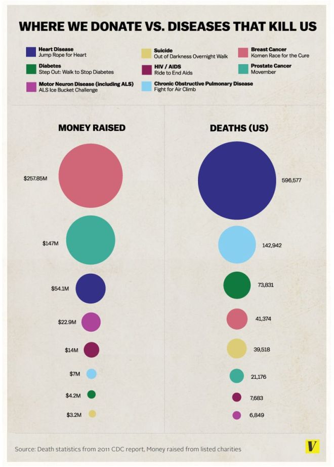
Unfortunately, this leads to us (in theory) misallocating our resources. Vox did an illustration of the types of cancer people donate to, versus what they die of.

fundrasing4disease

Image credit here.

This seems to focus on special events and looks at one organization per disease, so it isn’t perfect but is emblematic of this problem. In 2010, the humanitarian aid response to the Haiti earthquake (which affected 3 million people) was more than 3 billion dollars. The flood in Pakistan (which affected an estimated 20 million people) received only 2.2 billion dollars. (study here)  People donate relatively the same amount to save 2,000, 20,000, and 200,000 birds.

So the rule you could get from this is to tell only one story at a time. Which is not a bad rule.

However, your organization likely has a scope you want to achieve. You don’t just want to help one person. You want to help one person, then another, then another, etc., until your problem is solved and you can take up golf or something.

So how do you talk about scope without turning off your donors?

One way is to talk about scope and statistics, but to do it with the right donors. I would point you to the post I did about a month ago about the study that shows that statistics depress response among smaller donors, but increase it among larger donors. Thus, you can save it for the right audience.

Another solution that was interesting to me came from a study in the Journal of Consumer Research

At first, they just found what we’ve been talking about: single identified victim works better than large numbers of victims. Scope blindness in action.

However, you can get people to donate more to large numbers of victims if the victims are seen to be entitative.

This was the point in reading the study that I had to pull out the dictionary. I thought that entitative meant “similar to a walking talking tree from Lord of the Rings.”***

In reality, “entitative” means how much people consider something to be a coherent whole. This can be helped by group membership. In the study, they found that donations to help children were greater when the children were part of the same family, instead of random so-and-sos.

Similarly, they asked about saving butterflies, showing butterflies either flying randomly (low entitativity) or together (high entitativity). The butterfly flock (is that a thing?) raised 69% more on average.

They also found when that in-group had positive qualities, people were more likely to donate. Specifically, when the starving children in Africa were said to be in the same prison, rather than the same family, the group dynamic hurt donations rather than helping them.

So if you are going to talk about multiple people, try to frame them as part of the same in-group and make that in-group as positive as possible. Then, and seemingly only then, will you be able to tell more than one story and get more donations instead of fewer.
* I’d heard a different pithier version of this also (one where if you kill one person, you are a murderer; if you kill a million, you are a conqueror). However, this one seems to have the greatest basis in fact according to Quote Investigator.

** This is a joke, of course. This seems obvious, but one can not be too careful on the Internet. Clearly, Stalin is the evil twin of Mother Teresa.

*** Yes, I know that the ents aren’t really trees. They are treelike guardians that take on the shape of the trees they herd. But I’m trying to get everyone to read to the end of this, not just people who are as nerdy as I am.

Scope insensitivity and direct marketing: why one beats many

Increasing your non-electronic mail open rates

These direct marketing kids today, with their emails and analytics and the Facebook — they don’t know how hard it used to be.  Back in my day, we sent people letters.  You couldn’t measure open rates!  You’d just see if they sent back their check and hoped they opened it!  And the mail carrier walked uphill both ways.

The problem is that my day was yesterday.  We still can’t tell if people are opening our envelopes.  Given the amount of testing of colors and windows and teaser copy that goes into this area that can only be measured tertiarily, this is a pity.

Today’s study doesn’t entirely solve this but takes a nice step forward in understanding what gets people to open and react to envelopes.

[TANGENT]

I know I shouldn’t be talking about this right now — I should be writing about direct marketing New Year’s Resolutions, just like I should have done the year in review last week, Star Wars content the week before that, and preparing for year-end giving content in November.

And maybe I’ll do that some day, but for right now, I’m going to try to remain counterprogramming.  Think of me as the nonprofit direct marketing Puppy Bowl — if you tire of zigging, come over here and I’ll probably be zagging.

puppybowl

As Chekov said, if you mention the Puppy Bowl in Act 1,
you must show an image of it in Act 3.

[/TANGENT]

To test envelopes, GfK has a panel of German households who give GfK the direct mail pieces they do not want at the end of each month, either opened or unopened.  The study authors (Feld et al) then looked at the impact of envelopes on the open rate and keeping rate of the mail pieces.  They looked at 68 attributes of 36 design characteristics across almost 400 nonprofit campaigns.  You can get the whole study here if you want the full list, but suffice it to say that when you are looking at what percentage of the response device in an envelope is colored and have five different segments for this, you are doing a pretty comprehensive look at the piece.

The first big result to note is that the open rate did not correlate to the keeping rate. I’ve seen this personally — when an envelope promises something the contents do not deliver, the piece is shredded with extreme prejudice.  Now on the nitty-gritty:

  • Colored envelopes decreased open rates.  I know, it’s difficult to cut through the clutter, but that apparently isn’t the way to do it.
  • Larger envelopes, questioning teasers, and a promotional design on the envelope back all increase open rates.  I would go one step further and advocate for questions that can’t be answered with a yes/no and that elicit curiosity.  While you could put “What is the capital of North Dakota?”* on your envelope, I wouldn’t recommend it.
  • Pre-stamped return envelopes increase keeping rate; postage paid on the outside envelope decreases open rates.  These may seem obvious, but you will have to assess whether the cost involved is worth the increases, as both will increase your cost per piece.
  • A testimonial from a helper increases keeping rates.  It seems like I’ve been talking about variants of these for the past couple of weeks — how social proof and authority can help your appeals, as well as how information can enhance persuasiveness among high-dollar donors.
  • Premiums can work, but expensive ones decrease keeping rates.  People like to receive things (reciprocity at work), but the idea that the nonprofit is spending more on the premium than on the mission is a significant turnoff.
  • Efforts to recruit new members decrease keeping rates. My guess here is that it’s too much too soon.  I’ve seen membership efforts do very well to existing donors (who likely want a sense of belonging), but for new supporters, it might be like proposing marriage on the first date.
  • In the letter, logos and fax numbers increase keeping rates.  Yes, fax numbers.  It also appears that having the phone number decreases keeping rates.  I have no idea why this would be.  If you do, please leave it in the comments to help illuminate us.
  • People kept letters more closer to the end of the month.  Perhaps a “more disposable income” effect at the end of the month?  I’m not sure here either.

Finally, longer letters and personalization increase keeping rates.  I’ve talked about personalization helping your efforts.  Longer, in this case, means more than one page of letter, but my guess is that there may be a sweet spot after that in the 2-4 page range.

We hear about information overload, but I would argue that there is mostly an overload of bad content generated by the same people who created Mad Libs (e.g., [number] ways to [verb] your [noun]; [number] videos that will keep you [verb]ing: number [number] will blow your mind).

A well-written letter, by contrast, can be a beautiful and effective thing.

So, the idea mail piece in this study (were cost no object) would be a larger than average white envelope.  It would not use the impersonal “postage paid” indicia, would ask an enticing question to get the potential reader interested, and the reverse would feature a strong offer.  A letter with your logo and fax number (for now, don’t question it — just go with it) that is more than one page would be on the inside, featuring a testimonial from a helper.  And your return envelope would be prestamped.

Nothing completely earth-shattering here, I would say, but these are some very solid tips for making your pieces more effective.


* It’s a trick question — both the N and the D are capitals.

Increasing your non-electronic mail open rates