Semi-advanced direct marketing Excel statistics

In addition to not being a database, Excel is also not a statistics package.  If you are going to do anything advanced, I highly recommend R.  The programming language, not the John-Cleese-played Q replacement in The World is not Enough and Die Another Day.

Cleese

Cheer up! Yes, it’s a lesser part in lesser Bond movies.
You, John Cleese, are still an international treasure.

Anyway, stats in Excel.  We’ll start with correlations, as they can give us some insight into blog and Facebook traffic and interactions.

Wait, you argue – Facebook is not direct marketing.  First, yes, you are correct.  Second, no, you are wrong; there is a way that you can use Facebook as a direct marketer.  I’ll talk about this more when I do a whole social media week (don’t worry, folks, I promise to spend time deflating the hype and hopefully producing things you can print out and get to board members and say “See? Let’s put money in places where it will make money!”).  Third, because Facebook has limited value (but not zero) as a direct marketing vehicle, you can test things on there to see how they resonate with your audience.  Granted, your Facebook audience and direct mail audience will probably be fairly dissimilar, but your online audience is probably similar to your Facebook audience.  And what you are looking for is what makes compelling online content for you.  So this is a way to make Facebook your testing ground before you put it on to a real platform (i.e., your Web site, your emails).

I’m going to demonstrate this on this blog’s stats because I have the data available. However, I’ve also done this with Facebook posts very successful.  The prep work you will have to do for either blog posts or Facebook posts is to record your outcomes (view, likes, shares, and/or comments), to code the subject matter of each post, and to put in any other variables like day of the week that may be relevant.  Here’s my version of this:

beginningofregression

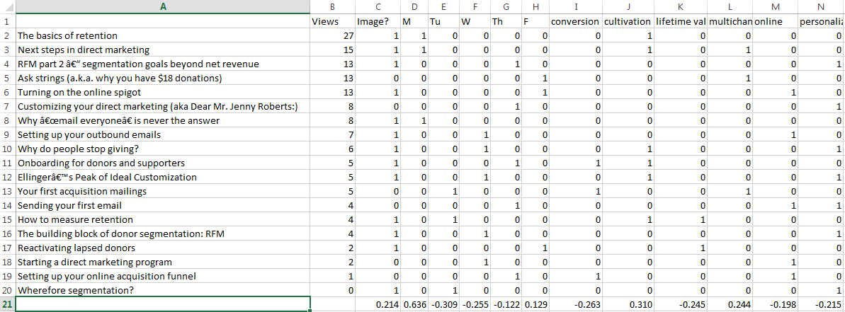
I have my blog posts on the left and the various factors on the right (and there are more tags, but I need to cut it off at some point to display it.  Yes, I have a blog post that has zero views. If you would like to break the seal on a blog post about why we do segmentation, it’s here; I’m sure it would appreciate a visit.

I then went through this and deleted tags that only applied to a single post. Then I ran a correlation for each individual variable to page views. The correlation function looks like

=CORREL($B2:$B20,I2:I20)

And is expressed from 1 to -1.

correlations

Here’s what that looks like.  Let’s look at the days of the week first, because there appears to be an effect here — Monday content has been king, with a strong correlation to page views. It will be interesting going forward to see in the long term whether that is the nature of the content (I’ve been trying to put introduction content on Mondays and get progressively more involved throughout the week) or that people are more interested in reading blog posts on Mondays.  Nevertheless, I can probably do a better job of setting up the rest of the week as must-see content, since Tuesday, Wednesday, and Thursday are all a bit negative.

Images tend to correlate well to views as well, probably because they show better in social media.  I’d been noticing this from just a glance as well, so you will probably be seeing more images here in the weeks to come. They will also be less boring images, since some of the lower performers were images of equations and Excel sheets. It is not coincidence that the tallest Python led this blog post.

And it looks like cultivation and multichannel efforts are winning while conversion, lifetime value, and personalization are not as strong, with negative correlations to page views. I won’t be acting on this immediately, but keeping an eye on it. And I do have a multichannel week planned in the near future, so we’ll be able to test whether that’s an artifact in the data.

However, you might notice that the reason cultivation is ranked so highly is that it is in the two top performing posts, which are Monday posts. Is it the topic or the day that made those strong?  For this, you need regression.

Normally, you wouldn’t do this after only 20 blog posts.  We are not going to be able to draw any statistically significant conclusions, but I do want to show you how it’s done.

  1. Go to Data > Data Analysis > Regression
  2. Select the range from your outcome variable as your Y range and the range of the independent variables you want to test in the X range like so:
    regression panel
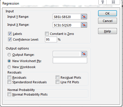
  3. Hit OK. You’ll get something that looks like this.  In my case, it’s a really, really bad regression:
    a bad regression

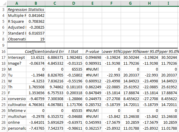
Yuck. The things you would normally be looking for are:

  • in R-squared, you are looking for as close to 1 as possible.  One would mean your model is totally predictive. Zero means it predicts nothing at all.
  • In P-value per variable, you are looking for less than .05.  That would show if there is a statistically significant relationship between any of the variables and your output. In this case, there isn’t and we can pretty much throw out the whole thing.
  • If there is a relationship, you want to look at the coefficient for two things:
    • Is it positive or negative? Positive is good things; negative is bad things.
    • How big is the relationship? In this one, if these were significant, it would be a bad idea to post about personalization again, as posting about it reducing views by 7.  But it isn’t significant, so I’m not yet worried.

Hope this helps you with the stats side of Excel.  Tune in next week, when we look at some of the things that Excel is actually good at.

Semi-advanced direct marketing Excel statistics

Appending data in Excel

One of the primary reasons to have a database is to have data in various tables.  A simple example is a database with a people table – a list of your donors – and a donations table.  This allows for there to be a one to many relationship between the donors and donations.  After all, a good donor will generally donate multiple times.  By using a key in the people table, each donation is marked with that same key – e.g., all donations from donor 12398 have 12398 in their donor field and are associated with that record in the people table.

Excel can’t do this.  As a flat file, all you can represent are one-to-one relationships.  If you had to have multiple gifts in Excel, you would have duplicate donor records for each instance of the gift.

But you can append data to a record in Excel.

A while back, I wanted to do some homemade modeling on a file to add sex in as a variable (male/female in this case, to simplify the model).  Unfortunately, I didn’t have a list of who was male or female in this particular file, so I used US census records to determine how many males and females there were with a given first name.  This led to the odd conclusion that someone who had a name that 60 females and 40 males have in the US is a 60% woman.  Thank goodness I was using this for modeling and not for assigning Mr. or Ms.

By the way, if you were wondering if there were any perfect half-female, half-male names, there were three: Ariel, Hong, and Kris.  Sydney, Robbie, Frankie, and Kerry were almost androgynous, just missing the cut.  The Excel sheet is here if you are curious.

To complete the model, I had to put the percentage of femaleness with each record.  I used a somewhat fiddly function called VLOOKUP.

VLOOKUP tells Excel to look through a bunch of rows to find a particular value in the left column of an array, find it, and return another column in that array.  To wit:

=VLOOKUP(A1, ‘[Male v Female first names.xlsx]Sheet1’!$A:$B,2,FALSE)

This assumes that A1 is the first name you want to look up.  This then goes over to the document called Male v Female first names and looks at the first two columns, A & B.  It searches for the name in column A.  If it finds it, it returns back the value in B next to that value.  So, if A1 is Hong, it finds Hong in the array, sees the value next to that is 50%, and puts it in the cell in question.  The FALSE at the end just means you want an exact match, rather than the closest one.

It is by no means as pretty or efficient as a SQL JOIN statement.  In fact, if you have a lot of these to do, as I did, copy and paste it for the full column, then get yourself some tea and a crossword puzzle while Excel labors like a hamster on a wheel.  But, on the plus side, you don’t have to learn SQL.  You still should, and we’ll cover SQL for direct marketers at some point, but you can’t learn everything immediately.

Appending data in Excel

A brief instructional video about the benefits of data hygiene

(Billy is walking to school.  He is in black and white, but mostly white, between is grey blond hair, grey pale skin, grey khaki pants, and white white button up shirt.  Only his shoes show black – certainly not his small town.)

Narrator: Woah.  Hold on there, Billy.

(Billy stops and looks for the voice).

Narrator: Where you going in such a hurry?

(Billy holds up the books he is carrying and taps on his watch with a finger)

Narrator: Ah, going to school.  And I suppose you haven’t even given a thought to DATA HYGIENE?

(Billy pauses, has a quizzical look, and proceeds to sniff his armpits.)

Narrator: No, not that type of hygiene.  DATA hygiene.  One of the things that makes America great (cut to stock footage of a flag waving and other good and wholesome things) is Americans doing positive, American things for other Americans, helping our neighbors, our pets, and our environment.  For example, elderly people! Puppies! Parks!  All of this is possible because of our positive, American civic associations of good people.

(Cut back to Billy nodding enthusiastically.  If Billy were tragically stuck inside a paper bag, he could not act his way out)

Narrator: But what if ALL OF THIS CAME TO AN END?  Were there no data hygiene, our civic associations won’t be able to help preserve our positive American way of life?  They wouldn’t be able to reach new volunteers, get voluntary donations, or help out in your neighborhood.

(The previous images of an elderly person, a puppy, and a park, all disappear in rapid succession)

Narrator: THIS WOULD LEAD TO COMMUNISM!

Billy: Holy shit!

Narrator: Wait, you can talk? I thought we had you muted.  Why didn’t you talk before?

(Billy shrugs.)

Narrator: There are two types of data: data that you control and user-entered data.  Let’s take a tour of data you control.

(Billy is whisked away to an average city street)

Narrator: Here is the hustle and bustle of a nonprofit organization’s traffic.  All sorts of data come through here on a daily basis, from caging vendors to development officers to syncs with other databases.  And we can control these with some basic community standards.  But you have to make sure these community standards are followed, from address 1 line standards…

(close-up on the street sign, which magically changes from Mockingbird Lane to Mockingbird Ln)

…to address line 2 standards…

(close-up on an apartment, labeled as 123 Main Street, Apartment 3-B, which changes to
123 Main St
Apt 3B)

…to pick lists that dictate what titles and suffixes can be used.

(A mailbox that says Reverend Timothy Lovejoy, III, changes to Rev Timothy Lovejoy III).

Narrator: It’s better that these things are cleaned up in the database…

(Billy opens a door and see workers in a dank, grey office working on various spreadsheets.  A supervisor is whipping them if they don’t clean lists fast enough.  He recoils in horror.)

So that hard-working Americans don’t have to fix them later.  Fortunately, you have professionals doing data entry here, so that should limit duplication and errors.  The same can’t be said for…

(Click. Billy is instantly transported to a seedy red light district.  Crude graffiti adorn the spare brick walls and trash lays, some in bags, some not along the street).

Narrator: USER GENERATED DATA!

(A scantily clad woman of the night beckons to Billy.  He starts to walk over)

Narrator: Billy! What do you think you are doing?

(Billy stops and gives the camera a sheepish shrug).

Narrator: Here in user-generated data, anything goes.  In order to get people to fill out forms, you have to make it very easy.  Most of the time, that means leaving out items on the form…

(a metal mailbox is embedded in the wall.  It says simply “Jim”.)

… not validating standard fields or following capitalization rules…

(the neighbor’s mailbox is labeled “mt. cHris hartnet, mbs”

… having people put data wherever…

(the camera pans up to reveal a steel mill in the background labeled “Dr. Alice Humphries, DDS”)

… and just plain having jokers plant fake information.

(the building next to the mill is labeled “I. P. Freely.”  Billy looks frightened.)

Narrator: Yes, this lack of cleanliness is the price you pay for freedom.  American freedom!  But we all have to do our part, or else the civic organizations won’t be able to reach anyone in this neighborhood.  And you know what that means, don’t you Billy?

(Billy nods and mouths the word “communism”)

Narrator: That’s right.  Here we have to use more broad hygiene techniques.  Enforce your capitalization rules, not theirs.  Every one of these houses should be run for address standardization, so the addresses are correct.  They should also go through strict National Change of Address forms, so you know when someone has moved.  If someone’s email address doesn’t work, make sure to suppress it or you will be labelled a spammer.  And you know what happens to spammers.

(The camera shows a man in a stockade.  Residents are throwing cans of Spam at him.)

Narrator: Appending data like telephone numbers, addresses, and email address when you don’t have them is also usually worth the investment.  That way, you know if Jim back there is the same Jim who just wrote your nonprofit a big check.

(Click. Billy is back on his school grounds.)

Narrator: So, Billy, you know the importance of data hygiene, right?

(Billy nods enthusiastically and runs off camera)

Narrator: Data hygiene: it’s the right thing to do.  America.

A brief instructional video about the benefits of data hygiene

Deduplication 2: Deduplicate harder

The deduplication exercise from yesterday talked about how to deduplicate clean, easy-to-use data.  If you ever find data like that, please let me know.

In reality, there are always quirks in the data to work around.  Here’s how to solve a few of them.

The middle name conundrum.  There is no good way to deal with middle names in a database, because the way people use them is non-standard.  For some people, a middle name is never used and sometimes a throwback to a bygone ancestor (e.g. ,Ronald Bilius Weasley).  For some, it is an integral part of the first name (e.g. Mary Kate and Ashley Olson; that is just one long name, right?).  Others skip right over the first name and go right to the middle (e.g., F. Murray Abraham).  This is why a good database will have a salutations field you can fill in, so your letters go to Ron, Mary Kate, and Murray, and not Ronald, Mary, and F.

This, however, makes deduplication a bear.  You want to preserve the original first name, but need to manipulate the data:

  1. Insert two columns next to your first name row (more if you think people will have three or more names in the first name field)
  2. Copy (Ctrl + C) the first name column into the first empty column.
  3. Highlight the column and go to Data > Text to Columns
  4. Choose Delimited and hit Next
  5. Choose Space and hit Finish

This separates the names into separate columns.  Dedup as normal based on these fake name columns, then delete these columns and you have clean(er) data.

Forms of names. An automated system won’t be able to tell you that Robert and Bob are the same person, but you can figure out close matches of names like Robert and Rob.  The trick here is when you deduplicate for first name to put

=LEFT(A2,3)=LEFT(A3,3)

Instead of

=A2=A3

 This compares the three first letters of cell A2 to the first three letters of cell A3.  This solves your Rob/Robert’s and Nick/Nicholas’s of the world.  If you want to be a little less restrictive, you can do two instead of three and solve for your Nicole/Nikki’s and your Jo/Joanne’s.

This handy trick also works well for addresses.  Generally if the first 4-5 digits of the address are the same, they are close enough for government work (but still catches them if someone put Rd instead of Dr).

Adding as you go

Because Excel is a flat file and not an actual database, you will frequently have to sum gifts to get a total amount of giving.  Let’s go back to our initial email list, now with gift amounts and the middle names broken out.  Columns F, G, and H, are set up to compare A, C, and D.

thirdexcellist

Here’s how to proceed:

  1. Set up column I with the statement =AND(F2,G2,H2) (and copy it for all of the rows). This returns TRUE if all of the columns are TRUE and FALSE if any are.  This puts in one cell whether something is a duplicate or not.
  2. Set up the first row of column J with the statement =IF(I1,J1+E2,E2). This is the trickiest bit.  What this is saying is “Look at the row before this.  If it’s the same as this row, add this donation to all of the previous donations that match this record.  If not, just put in the one gift.”
  3. Copy this column and paste values like you did with the TRUE/FALSE earlier.

fourthexcellist

Now, when you deduplicate, you’ll be getting the total amount of gifts for a donor, summed up.

There are certainly not perfect.  But to do perfect, you need a database.

Deduplication 2: Deduplicate harder

Your trapezoid zero database – a spreadsheet

Why trapezoid zero? Because square one is too dignified.

If you are like most nonprofit direct marketers, you have one true donor database that filters in all of the data you need from various applications, gives you a view into what every constituent needs and wants, and allows you to segment and communicate with them instantly.

Then you wake up from your dream. You perform requisite amounts of personal grooming, cover your dirty shameful bits with clothing sufficiently uncomfortable to convey gravitas, go to work, and stare at the latest list you have pulled in Excel.

Excel is not a bad program per se and has gotten even better since Clippy was taken out for some cannoli in downtown Redmond and never heard from again.  The trick is that it is not intended to do what we do with it for address lists and the like.  For that, Microsoft created Access, which is actually a bad program per se.

I promise to talk about using Excel for its intended purpose, but first, here’s how to manage your lists in Excel, starting with basic deduplication.

edharris

Deduplication could effectively be called Sisyphean except some is pushing the blinkered rock down as you are trying to push up. You are never, never done deduplicating, especially given that the most common records for deduplication are your best supporters (given that they will be engaging the organization from all angles).

So let’s assume you have a very simple list.  You want to remove duplicates from an email list.  Specifically, you are looking for exact duplicates – you don’t mind emailing the same email twice as long as it is for different names and you don’t mind emailing the same person twice as long as it is at two separate addresses.  Here’s your list:

firstexcellist

As you can see, there are a few Blofelds in there to get rid of.  Your list will be longer and less menacing.

  1. Select all by hitting Ctrl + A
  2. Go to Data > Sort
  3. Sort by all three fields in any order
  4. Now, you are going to compare each row to the one below it. Go to the top row and the first empty column and put in =A2=A3.  This creates a TRUE/FALSE statement where anything that comes back TRUE is identical.
  5. Drag the lower right corner of the cell you just created down so it covers all rows and over to the right so it covers as many columns as you have. It will look something like this:
  6. Highlight the TRUE/FALSE columns, hit Ctrl + C to copy the columns, then right-click on the same columns to bring up the special menu. Select Paste Values.  What you are doing here is replacing your TRUE/FALSE statements with the results of those statements.  Because you are going to be sorting by these, you don’t want Excel recalculating.
  7. Select all by hitting Ctrl + A
  8. Go to Data > Sort
  9. Sort by the three TRUE/FALSE columns. The output will look something like this.

    secondexcellist
    As you can see, there are two records in rows 14 and 15 that were exact matches for other records in the database, since they have three columns of TRUE.  Those are your duplicates and you can delete them.  One might say you have a license to delete them.

That works fine for simple data.  But how often does that happen?  Tomorrow will be some advanced tips for deduplication in Excel.

Your trapezoid zero database – a spreadsheet

Beyond RFM – doing intermediate-level segmentation

By now, hopefully, you have seen the benefits of segmentation and the value of RFM as a preliminary tool.  But you have probably intuited a few of the flaws in it already:

  • The distinction between recency groups is sometimes artificial. Let’s say two people give $20 per year, one at the end of January and the other at the beginning of February.  The former would be at 13 months for a January mailing; the latter at 12 months.  A few days difference could mean that one gets mailed and the other didn’t.  (In fact, I’d love to test a segmentation out to 13 months instead of the standard 12 because of this; please comment or email me if you’ve done this, so I can share and illuminate myself).
  • The distinction between frequency groups is artificial. Your multidonors range from people who donate once a year over a series of years to people who donate to literally every communication they get.  RFM analysis gives these two people the same number of communications.
  • The distinction between monetary value is artificial. You probably saw this one coming, given the first two.  Which donor would you prefer – a donor who donates $10 ten times per year or a donor who donates $50 once a year?  RFM prefers the latter; I’m guessing you would prefer the former.
  • It carries literally no other information. The $25 dollar donation of today could be from someone who clipped coupons to raise the money to donate or Bill Gates divesting himself of what he found in one cushion of his couch.  What a person donates is an indicator of capacity, but it’s a blunt tool when a scalpel is possible.
  • You probably noticed I was talking only about the mail in examples. RFM doesn’t look at channels of donation, nor at the sensitivity of people to those channels.

Let’s address this last one first, as we look for ways to customize RFM more than using it alone.

Separate RFMs by channel. When you do your telemarketing list pull, you will almost certainly want to call deeper into your file to people who have made a previous telemarketing gift than those who you are trying to make their first gift on the phone.  Same thing in the mail: you may be willing to mail multidonors out to 48 months $50-99.999 for people who have given through the mail, but only to 12 months or 18 months $50-99.999 for people who have only given online or on the phone.  Separate RFMs by channel will help you make these determinations.  Remember that you are looking to make sure that you have a strong multi- or omni-channel program, but that doesn’t mean you have to be agnostic as to channel of origin or preference.

Cadence analysis.  This goes to your $10 10x versus $50 1x donor example above.  You have to figure out who likes/needs multiple communications to make a gift or gifts and who doesn’t.  Some ways you can do this:

  • Look at how many types of offers you have going to a person in rotation; hammering the same key on a piano over and over isn’t music, nor will the same approach be music to your donor’s ears.
  • Take a look at how many times you mail someone in acquisition. Sometimes chronic non-responders need a different offer (as with rotating your offers above), but you can also see whether someone after seven or 17 or 27 times of getting a message from you means they almost certainly won’t donate and you can bless and release.  The same holds true for your lapsed donors as well.
  • Test consistent communication versus no communication versus resting periods to see what happens when you try different cadences.
  • Look at frequency of gifts within a certain period of time, rather than ever. You can see dramatic results sometimes by decreasing your mailings to your one-time-per-year donors versus your multi-per-year donors.

Mission area: I mentioned this when discussing customization types, but tailoring your communications toward the area of your donor’s interest is also a legitimate segmentation target.  Why would you send that advocacy alert to people who care only about your work in schools or your calendar with pictures of dogs to your car people?

Income: If you don’t want to ask that millionaire for $17, a wealth append can get you the information you need to customize your ask strings and communications strategy.

Location: Zip codes are the poor person’s income append and can be free-ish, so that’s a potential win.  More often, though, you can use zip code modeling to breathe life into underperforming acquisition lists.  Simply find your top X percent of zip codes from your current file and ask for just those zip codes from the rental list.  It will be slightly more expensive to rent per name this way, but it can provide a 20%+ lift in response rates and/or average gifts.  This is also a way to test new lists while minimizing risk.  One caution: you don’t want to do this for all lists or you risk self-limiting your acquisition strategy.  If a list works well for you across zip codes, use the whole thing – that way you give yourself a chance to be wrong about a zip code long-term.

Demographics: Some nonprofits find that different messages work better for men versus women.  Age can also be helpful, as you work to avoid sending your one millennial donor your planned giving brochure (there’s optimistic and there’s delusional…).  With demographics, backtesting makes initial sense, where you see how people of different demographics responded to previous appeals and messages, then use that data to define your strategy.

Previous responsiveness: It sounds obvious, but it’s ignored by CRM: if someone like getting your calendar three years ago, they may like getting it again.  Replace “calendar” with member card, action alert, survey, etc., and you have the makings of a profitable add on to your usual list mix.

Those are some of the things you can add to spice up RFM.

I said at the beginning that this was intermediate segmentation.  Advanced segmentation is modeling.  The hacks above will help get you many of the benefits of modeling at a fraction of the cost, but it won’t get you all of the benefits, so definitely leave yourself open to building smarter and smarter donor modeling solutions.

Any other segmentation recommendations you’ve seen work?  Please leave them in the comments.

Beyond RFM – doing intermediate-level segmentation

My new book

This is apropos of absolutely nothing in the nonprofit direct marketing world and I will have a normal post later today.  However, I did want to let you know that:

  1. My first novel has been published online.  It’s called Underling, and it’s a dark workplace comedy, where the workplace happens to be an evil mastermind’s lair.  Very much an homage to a certain British secret agent who will remain unnamed for copyright reasons.  It’s $2.99, because I can’t make it any cheaper yet. Mostly, I want to put it out into the world and see if people like it as much as I liked writing it.  So, please take a look here.
  2. In honor of the first novel being launched, I have made my other two books free of charge on Amazon through Saturday the 31st.  They are:

    Did I mention they are free for download?

  3. Finally, I’m making the prologue of the new book available below, so you can tell if it’s your particular cup of tea.

Prologue

It was considered an honor to be able to guard this particular room on this particular day. Benny knew it was really a great danger. He was senior enough to be competent, but not important enough that it would be a loss to kill him if things went wrong. That said, death might be a blessed respite from this management consultant droning his presentation with an unceasing march of complex, unnecessarily colorful charts. There is a reason no known language has a common simile “as beautiful as a pie chart.”

“On our SWOT analysis, we’d looked at our guards as an area of weak-ness.” The consultant said the last word slowly, as if he was explaining to a group of kindergarteners that it meant “things you aren’t good at.” “Let’s mind-scape some ways to turn this weak-ness into an op-por-tun-i-ty,” gesturing from the upper right to lower left quadrant of his slide.

The consultant wasn’t really sure if mindscape was a word and, if so, if it was a verb, but he’d found that if he said it instead of “brainstorm” or, even worse, “think about,” while wearing an expensive suit and glasses he didn’t need, he could increase his fees. This gig was certainly a bit unusual, in that he arrived at location blindfolded. And he didn’t quite know why he was being paid to deliver this presentation to this motley collection of nerds, knuckle-draggers, and freaks, rather than just talking with the big boss. He did know he was being paid handsomely for the gig, half up front, half after completion.

Dr. Frederick von Schlaukopf thrust his hand into the air, lifting out of his seat. Mike, Benny’s boss, leaned over to Victor and whispered “Chill, Hermione.” Victor chuckled.

But the consultant was happy to have audience participation and gestured to invite comment. Frederick straightened and permitted himself an almost smile. “I belief ve have overlooked ze potential for ze creation of supah genome soldiers zru ze use of ze nanobots.”

Mike Richards rose to his feet. When it looked like he was done rising, he rose another few inches. Then he brought his shoulders back to look even wider than before, his gray T-shirt on the verge of surrender to the muscles of this former boxer. He growled “We’ve been over this. You keep your needles away from my men, Freddy.” The target of these words shrunk back a bit.

Benny felt a warm wave of affection wash over him for Iron Mike. He’d seen what had happened to test subjects in the past. Even for this place, the German was a bit off.

Winston, the new head of human resources, jumped in with a query about whether they could use robot guards. Kevin, the IT whiz kid, snorted dismissively and said “Costa Rica.” Everyone except Winston, the guards, and the consultant acted as that closed the matter. Wei Fung leaned over to Winston and started to explain in a whisper.

The consultant realized that he hadn’t spoken for at least a minute and jumped back in. “I appreciate all of the outside-of-the-box” (here, he used his two forefingers to trace and illustrate the concept of “box”) “thinking, but I was thinking more about empowering the guards and allowing them more initiative.”

Mike showed Victor a drawing he’d done on his scratch pad of the consultant in considerable pain wrapped in the clutches of a giant snake. Victor snorted a laugh and passed his pad over. His drawing was a bit more rudimentary — having two mechanical arms impedes fine motor control — but it appeared he had drawn the consultant being thrown from a helicopter. Benny saw the exchange and bit his lip to prevent some un-guard-like laughter.

Cesar Aguilar, second in command over the guards, asked the question that the consultant was dying to be asked: “What do you mean… empowerment?”

“Well,” the consultant said, steepling his hands, “Zen Master Suzuki Roshi once said that to control your cow, you need to give it a bigger pasture.” He was proud of that quote, and it showed as he puffed up. He’d found it on a Web site of quotes about empowerment. He had even Googled to make sure that Suzuki Roshi wasn’t really a model of car. That, he felt, was dedication to the craft. “That’s the idea behind empowerment. You allow decision-making at the lowest possible level and, at your strategic level, you set goals, not dictates. That gets you to what I like to call The Empowerment Enclave.”

The SWOT slide zoomed out, rotated, and came back with a slide that had rainbow-colored concentric circles. Arrows ringed the circle interspersed with words like “Trust,” “Values”, and, of course, “Innovation.” The slide duly noted that The Empowerment Enclave was a trademarked phrase, with its own logo.

“In my analysis, these guards have been used as… um…”

Cesar jumped in. “Meat shields? Drones? Mouth-breathing lackeys?”

The consultant reddened a bit (as did Benny, but no one noticed him). “Drones is probably an accurate term for it. In essence, they have not been used to their full potential. For example, I’ve identified a lack of proper safety protocols…”

A guard was walking briskly down the hallway, speaking down into his collar mic. Victor came around the corner, followed by Benny and another guard. Victor and the guard walking against him collided at speed. The guard flew back over the edge of a gantry where any reasonable planner would have put a railing. There was none. The guard fell into the area where R&D was testing their giant subterranean drill. Benny looked over the edge to see what had happened.

The mess was serving spaghetti for dinner that night. Benny didn’t give the meal a second look or a first bite.

“Secondly, while I understand the need for military efficiency, the desire to control the minute details of their lives seems out of step with maximum effectiveness.” Benny agreed. Not that he wanted to grow facial hair, but a total ban seemed odd.

“C, guards have no input on the organizational decision making. You need to take your organizational pyramid (the next slide looked like the pyramid slide that is in every consultant’s presentation, from nonprofit donations to needs taxonomies to healthy eating) and turn it upside down. You work for the guards. What do they need from you to succeed?”

Just then, a green light that had been on over the consultant’s head turned to red. Z had been listening. Of course he’d been listening.

Cesar jumped to his feet, his face full of scars glinting in the change of light. “Thank you, sir, for a fine presentation. Let’s all give him a hand,” he said, with the hint of a smirk aimed at Victor. Victor gave him a death stare back. The audience, except the guards, who refrained from muscle movement, smattered applause. “We know your time is valuable, so we need to get you to your boat.”

The consultant briefly protested that he hadn’t even gotten to his section on social media recommendations.

Victor stood and said “Come.” The consultant shrunk an inch and complied. This man with the metaphorical iron jaw and literal iron arms scared him deeply. Victor ushered the consultant roughly through the door while ducking to avoid the top of the door frame. There was a rumor that the base was supposed to have eight-foot doors in all locations, but a builder used standard frames. This was supposedly to Victor’s great regret, who then made it the great regret of the builder.

Cesar, Benny, and the other guard (Vassili, Benny’s bunkmate) followed behind. Cesar threw an arm covered in tattoos over the consultant’s shoulder and talked like a hyperactive tour guide, pointing vaguely to the galley and the restrooms (“it’s called the head here!”) and the nuclear reactor and the server room as they sped-walked by.

They piled into an elevator, which ascended slowly while playing an orchestral version of “Walk This Way.” The elevator emptied out onto a short hallway, leading to a harbor. Cesar gestured the consultant onto a boat and traveled out about 100 feet. Then, before the consultant could protest, he was heaved effortlessly by Victor’s bionic limbs into the water.

The thoughts from the consultant were rather chaotic after that, along the lines of:

So that’s why I didn’t have to wear a blindfold it’s a giant glacier or is it an iceberg which is it when they break off iceberg like Titanic but it’s a ship too must swim back maybe a joke very cold clothes wet should take off clothes can’t swim have to stay above (gasp) so very cold shoes heavy clothes (gasp) heavy climb iceberg ship slick (gasp) must stay up must swim can’t swim (gasp) no arms legs (gasp) shit.

Cesar turned the boat around and returned to the harbor inside the tip of the ersatz iceberg. He cracked a grin and said “Glad we put him on ice!” Victor stared at him, then turned and lumbered off. Cesar backhanded Benny’s chest and said “On ice! Oh, I kill me!” and wandered off.

Not for the first time, and not for the last time, Benny wondered what he’d done to deserve this. He knew his sins, knew their variety, scope, and number. Some of them woke him up at night; others got laughs when he told them in the mess hall. But what do you do in your life to deserve to be an underling on Commodore Zubrosky’s fake iceberg-base?

Thanks and you can buy the full thing here for $2.99.

I’ll be back to the regular stuff later today.

My new book

RFM part 2 – segmentation goals beyond net revenue

From yesterday, we had a sample membership mailing with these results from last year, and we were going to cut any segment that didn’t get $.33 per piece or more, since that is what the piece costs.

To do so would actually cost us dearly.  As we discussed this week, there are more goals than just the immediate gaining of revenue.  Looking at mail pieces alone with a “here’s a piece; here’s another piece” mentality can ignore what other things a mailing can do for you.  Let’s take a look at this chart of historic gross per piece by segment with two ideas in mind: groups we want to invest in and testing opportunities.

RFM Gross

Take a look at our $50-99.99 37-48 single donors.  They have an anemic response rate of .3% and an average gift of $80, so they would only gross $.24 per piece to mail to (and thus lose $.09 for each piece sent out).  Should you mail these donors?

There are some organizations that would say no – they think that every segment should net positively in a donor mailing or that they should only do no net cost acquisition.  I’ll try to demonstrate why I think these people are wrong.

With a response rate of .3%, it would take 333 1/3 pieces to generate one donor.  At a net loss of $.09 per piece, that’s a cost of $30 to acquire that donor.  Chances are that that is higher than you are spending in your acquisition mailings to get new donors.

But you aren’t acquiring just person off the street.  You are getting someone who then slots into the 0-3 $50-99.99 M segment for the next mailing.  You can see if the person got this mailing again for their next one, they would be predicted to gross $3.62 per piece sent to them or people like them, which is very nice.

Let’s run the numbers assuming that their average gift is $50, your retention rate per year for lapsed reactivated donors is 50%, your retention rate per year for multi-year donors is 70%, and it costs you approximately $10 to mail your $50-99.99 donors for one year.  To make the math easy, we’ll assume only one donation per year (it should higher) and we’ll assume that any donation is worth a net of $40 knowing the mailing costs (in reality, you would want to look at both the possibility that someone will give multiple times per year and that you will have to mail someone even when they don’t give).

This works out to:

.5 * 40 + .5 * .7 * 40 + .5 * .7^2 * 40 + .5 * .7^3 * 40 … .5 * .7^n * 40

(Can you see why I simplified the math?)

What this basically says is that there’s a 50-50 chance of getting any future gift from this person and they have a 30% chance of lapsing every year thereafter.  We aren’t using a discount rate because interest rates now are so low.

To simplify, it’s $20 + $14 + $9.80 + $6.68 and so on.  A bit of high school calculus later and this donor will likely return an average of $66.67 to your organization.  All for the cost of $30.

If you had a magic box where you could put in $30 and didn’t know what it would give you back, but knew the return would average over $60, you’d put money in.  I myself would ask if I could put in more than $30 to speed things up, like asking the genie for more wishes.

See the full comic and other fun stuff here

In general, your multi donors are going to be far better donors.  However, you need to communicate to single time donors in order to get those multi donors.  You also need to talk to those people whose last donation has been a while to renew them for future support.

The corollary to this is that you shouldn’t just look at this segmentation and see what to cut; you should also be adding back in.  Looking at these gross revenues per donor, you are probably (hopefully) wondering why you wouldn’t want to mail 7-12 month single donors of $100+, or deeper into your $1000+ donors, or more.  These are all correct thoughts.  Looking farther back into your pieces, you might see that someone has made the previous mistake – they looked at a small sample size of a $1000+ mailing, found that no one responded, and cut the segment.

Thinking further about this, you can see that perhaps the $1000+ donor shouldn’t get this piece, but they probably should be communicated with.  These are your best and best potential donors and there probably is a way to increase their value more so than not communicating with them.

Similarly, you’d love to renew those $15-$19.99 13-24 month donors, but this also isn’t the way to do it.  Now we are going to break out of yes/no segmentation and into using segmentation to create differentiated communications.  For simplicity sake again, we’ll assume that we have four treatments we are going to try:

  • This mail piece, plus a pre and post email, for our “normal” donor segment (red)
  • This mail piece with “lapsed” language, plus a pre and post email, for our lapsed segments (green)
  • A high-touch invitation-style mailing to higher-value donors with first-class postage to invest in getting their gift (with email and higher-touch telemarketing as well) (blue)
  • A prerecorded outbound voice mail campaign, coupled with an email ask to less valuable or less likely donors to attempt to renew them without high marginal costs. (yellow)

I’ve oversimplified here.  With the high-touch piece, we’d almost certainly want to test borderline segments part with the high-touch and part with the control to see if the additional investment is worthwhile.  You’d also want to test what segments telemarketing works best with.  And so on.  But for first steps, it’s directionally correct.

So let’s color in the mail plan with these four layers.

RFM four color

Note that you are able to contact more people with more appropriate language with this strategy.  Segments that a pure net perspective would have ignored are renewed in this new model and our most valuable donors are treated that way.

But that’s still just RFM with some embroidery on top.  It’s a fine model, but there’s more that can be done.  We will go beyond RFM tomorrow to add a few other pointers tomorrow.

RFM part 2 – segmentation goals beyond net revenue

The building block of donor segmentation: RFM

Over 80 percent of nonprofit marketers know the term “communication segmenting” according to a Bloomerang survey.  Over 60 percent say they segment their files.  This means that almost 20 percent of them don’t know what segmentation is and 20 percent more know about segmenting, but don’t.

Let’s see if we can reduce those numbers.

Segmentation, as you can see from my last two posts, really is for everyone, regardless of the size of your file. We’ve talked about, obliquely, two different types of segmentation – yes/no segmentation (will someone be communicated with or not) and segmentation to help create versions or customizations.

RFM analysis can help with both of these.  It stands for:

  • Recency: Usually used as how recent was someone’s last donation to the organization. You may occasionally also look at their last interaction with the organization, but we can put that aside for now.  This is perhaps the primary driver of segmentation and, if there is an answer to the “how many people do we have on file?” question, it’s when it phrased as “how many people have donated to us in the past two years” or the like – with a time horizon and action attached to it.  Do yourself a favor and add “recency” to your Microsoft Word dictionary; you are going to be using it a lot and Microsoft Word doesn’t know that word exists.
  • Frequency: We go from the most often used to the most often ignored – how many times someone has given to the organization (or interacted with in non-donor contexts). This is often simplified to single v multi, as this dyad makes it easier to plan your communication.
  • Monetary value. This is usually measured by another TLA (three-letter acronym): HPC or highest previous contribution – what’s been the highest amount the person has made in any one gift. This is an area of some debate, as if someone makes gifts of $20, $20, $20, $20, $500, $20, $20, $20, and $20, it is fairly predictable that they are probably better grouped with the $20-$24.99 donors than the $500-$999.99 donors and their ask strings changes along with this (more on ask strings here).  One solution is to use a formula like 2/3 of their HPC + 1/3 of their most recent contribution or half of their HPC + half of the average of their last five contributions.  But this is something worth testing how it works best for your file.

Let’s do a yes/no segmentation with RFM.  We have a membership mail piece that has historically very well with a number of segments.  It costs $.33 to mail and you are looking for segments that net.  Here are what your RFM response rate, average gift, and gross revenue per piece would look like from last year.

Response rate:
RFM RR

Average gift:
RFM AVG

Gross per piece:
RFM Gross

(these are intentionally realistic, but false, data)

To explain, the first numbers are the months (so 0-3 is someone who last gave a gift in the past three months), S & M stand for single and multi (get your mind out of the gutter), and the dollar amounts across the top are that person’s highest previous contribution.

Looking at this, to maximize net revenue, we can cut some of the segments to lower HPC groups and to one-time donors.  Anything under $.33 per piece isn’t going to net us money.

This is a decent baseline that answers the question “I have this mail piece going out in February; to whom should it go to maximize the net revenue of the mailing?”.

However, we are going to look at it as “how do we maximize the value of this donor by treating them appropriately?” and layer in some treatment segmentation tomorrow.

The building block of donor segmentation: RFM

Wherefore segmentation?

Yes, wherefore.  As long as we are starting from first principles, we can go a little bit Elizabethan.  In the one and only famous “wherefore” quote, Juliet isn’t asking where Romeo is (below the balcony).  Hers are existential questions – for what reason does Romeo exist and what cruel twist of fate made him a Montague, her family’s mortal enemy?

For more of this, check out my likely-never-going-to-be-written book The Bard Does Nonprofit Direct Marketing (All’s Well that Ends with a Donation).

But wherefore segmentation – why does it exist?  We covered a lot of this in the last post, but we’re going to be going into them more granular than that as to who gets what communication when.  Why are we doing this?

The simple answer is “to maximize revenue.”  In this world, every mail piece would be opened and responded to, every phone call answered, every email and online ad clicked upon and donated to.

In this world, the ideal model would be one that gets this 100% response rate – it would read people’s minds and get them the lowest possible cost means of communication to get the maximum gift at the precise right moment.

This is not a horrid definition and, in fact, that would be a really cool (if magical) model to apply.

But it ignores two things: how people give and what your goals are.

Let’s say you have a person who, every year, like clockwork, gives to your membership mail appeal every January.  She’s on your email list, gets your e-newsletter, and a number of other mail pieces each year, but only gives to that one membership mail pieces every single year.

Do you think she would still give to you if that was the only communication she got from you throughout the year?

Probably not. I once walked each year for an organization that will remain nameless.  Every year, I started getting emails from them a couple months before the walk encouraging me to walk (whether I’d already signed up or not) and I would stop hearing from them after the final walk email for another 10 months.

Please notice I say I “once” walked for this organization, not that I still do that.

The bottom line is that even the most loyal of donors (especially the most loyal of donors!) want to hear from you.  Look at Professor Adrian Sergeant’s surveyed reasons why someone stopped giving to an organization:

reasons for lapse

The full study is here; it’s real and it’s spectacular.

Many of these involve someone not being communicated with enough (not acknowledging support, don’t recall supporting, no longer needs my support) or not being communicated with effectively (other causes more deserving, not informing how money was used).  Now look at the bugaboo of many an ED or board member: inappropriate communications is less than 4%.  More people defect because we don’t talk to them than defect because we talk to them too much.  So we can’t do just the pieces that “work” for a person without cutting the heart out of our communications.

As mentioned earlier, it also ignores other goals you have for your direct marketing program.  In a classic, Mal Warwick’s The Five Strategies for Fundraising Success articulates there are five goals you can set:  Growth, Involvement, Visibility, Efficiency, and Stability (GIVES).  He further says these are to a large extent mutually exclusive.

I’m not going to ruin the book for you, but this is just to say that there are things you want beyond maximizing short-term revenue.  You may want to get long-term revenue, volunteers, advocates, awareness of your causes, and more.

So how do we restate our goal?  How about:

The goal of the direct marketing program is to maximize the lifetime value of each of your constituents.

This isn’t just financial lifetime value if you have other non-financial goals, but it likely helpful to help quantify what you are willing to pay to get, for example, an advocate in order to put everything on the same scale.

This is important to have as a definition because it will help you transcend many obstacles.  When should your direct marketing donors get a major gift officer working with them?  When it will increase the donors’ lifetime value (and shame on you for saying “your donors” – donors belong to no individual within an organization). Should your national office or field offices do communications to donors?  Well, which mix will maximize lifetime value? These will likely need to be tested, but won’t it be nice to have an objective answer to some of these?

We’re going to initially talk about RFM analysis, which takes a look at which donors should get which communications.  This is absolutely necessary as a baseline.  However, if you are looking to maximize the lifetime value of each constituent, you will have to look at things differently.  It’s a minor difference, but you will need to think of “should this donor and donors like them receive this communication?” rather than “who should this communication go to?”.  It’s when you get to the point of thinking about donors first and make your communication vehicles reflect that rather than taking your communications and seeing to whom they should go.

Wherefore segmentation?