Testing beyond individual communications

So far, the testing that I’ve discussed is how to optimize a communication or overall messaging.  The next step is trying to answer fundamental questions about the nature of your program – things like how many times to communicate and through what means.

There is a pretty good chance that you are not communicating enough to many of your constituents.

But wait, you say.  We send out a mail piece a month, have multiple telemarketing cycles per year, and have both a monthly e-newsletter and semi-frequent emails on other topics.  Our board members and staff who are on our seed lists are consistently on me, you say, that we are communicating too much.  And we get donors who complain that they are getting a mail piece before their last one was acknowledged.

However, remember in the discussion of segmentation that more donors are saying their nonprofits are undercommunicating, not over. That means that the average number profit needs to be communicating more than it is.

And the concern that you are annoying people with asking for money comes from an oft-quoted and concerning inferiority complex from the nonprofit.  We have to believe that we are good enough to merit a gift and making an appropriate ask to be effective.  We want to give our donors an opportunity to be a part of something powerful and transformative.  Remember that if we do our jobs well, donating to our organization is a positive experience.

So how would you test whether you are communicating often enough/too often?  The first step is to figure out where you are as a control with a cross-medium communications calendar.  This is easy said than done, but it’s a necessary first step.  This need not be perfect; as you are going to want to have some communications that are timely and focused on current events, you may have to have some placeholders in place that simply indicates “we’re going to email something here.”

Then split test your file and test, so that part of your file gets X communications and another gets X plus or minus 1.  I’d suggest plus.  Then measure the total success of the communications.

I once helped lead a test where we took mail pieces out of our schedule during membership recruitment.  We would send a piece or two, then wait to see if those donors would donate before sending to them against to make sure that we were addressing them properly as either a renewed donor or as someone who has not yet renewed.  Each individual piece in the resting membership series had a significantly better ROI and better net than the more consistent appeal series.

Yet the appeal series brought in more money for the organization and the mission overall.  I would argue, as I did at the time, this is the actual important metric.  If you want to look at metrics like ROI or response rate, your best opportunity is to send one letter to your single best donor – you’ll get a 100% response rate and ROI percentages in the tens of thousands or more.

But for real life, the goal is more money for more mission.  So overall net is the metric of choice.

The easiest campaigns to add to are the ones that already have a multistage component.  Let’s say you have a matching gift campaign that goes mail piece 1, email 1, mail piece 2, email 2 (with two weeks between each).  A way of testing up would be to look at doing mail piece 1, email 1 + mail piece 1.5, mail piece 2 + email 1.5, email 2 (so there’s still two weeks between each set of communications, but they double up in the middle).  That would be adding a mail piece and an email and if you test both of these with net as your goal, you will have a better framework for the campaign in the following year as well as for additional testing throughout the year.

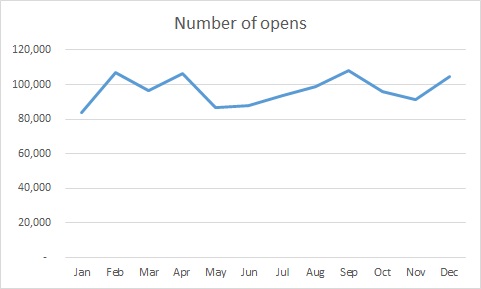
With email only campaigns, there’s another way of checking whether you are over-emailing your file – looking to see if your total opens and clicks fall.  There is a point at which open rates and click rates will begin to fall; however, you shouldn’t worry too much until adding another email not only lowers your open and click rates but lowers your total number of opens and clicks (similar to a focus on total net, rather than net per piece).

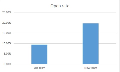
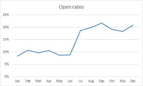
This tipping point in email is probably well past where you think it is.  Hubspot did a study of emails per month on both open and click-through rates.  The sweet spot with the highest open and click rates was between 15 and 30 email per month.

That’s right – opens and clicks went up until you got in the range of daily emails.  Things went downhill after 30 days.  So if you are sending more than daily emails (on any day but December 31 or the last day of a matching opportunity), you might be emailing too much – so take that as a cautionary tale for the .0001% of you who are doing this.  For the other 99.9999%, hopefully this will give support for the business case for testing up on your emails.

There are three tricks to cross-platform testing:

  1. There is a whole science of attribution testing. If you have the ability to look at this literature and your data systems will support this, go for it.  However, most organizations of my experience don’t have all of their data in the same place initially, making this exceedingly hard.  Thus, this sort of testing up/down for cadence should look at sources of revenue by audience test panel rather than through what medium the donation is made.  You may be surprised how much adding a mail piece increases your online revenue or adding a telemarketing cycle boosts the mail piece.
  2. Unlike with strictly piece-based attributes, I’d argue you have to test every cell here because there are interactions among the means of communication. It may be that mail + mail is better than mail and mail + phone is better than mail, but that when you have mail + phone + mail, you have diminishing returns that don’t compensate for doing both mail pieces.
  3. You will have to be vigilant about the creation of your testing cells. ft_15-07-23_notonline_200px
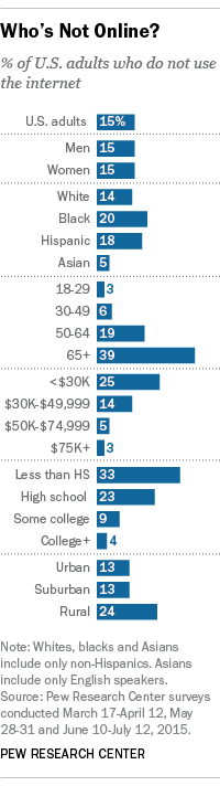
As much as you would like to call everyone who has a phone number or email everyone who has an email address, and use those who don’t have a phone number or email on file as a control audience, those are different types of donors.  Pew has a great summary of the non-Internet users of the US at right.  Even if you looked just at the age and income variables, you can see how this would make your control audience look very different from your non-control.In reverse, 66% of 25-29 year olds live in houses where there is no landline, compared with 14% of 65+ year olds, according to the National Center for Health Statistics.

    So, if you think of the average person for whom you have a phone number, but not an email address, that person looks very different from the one where you have an email address, but not a phone number.  Thus, you have to either control for all demographic variables in your assessment (hard) or split test people by means of communication that you have available. (marginally easier)

Thanks for reading and be sure to let me know at nick@directtodonor.com what future topics you’d like to see.

Testing beyond individual communications

Testing for smaller lists

One of my favorite non-Far Side single panel cartoons is

miracle


This is often what it feels like to be a small nonprofit or small division of a nonprofit.  You know exactly what you would do if you were big.  But you aren’t (yet).  And absent that miracle in the middle, you aren’t going to be there soon.  It feels like a Catch-22 – you aren’t big enough to test, but you aren’t going to enough to test unless you test.

A lot of people have this problem.  One of my favorite conversion sites, unbounce.com, recommends that you have 1000 conversions per month to do A/B testing.  That takes a large nonprofit to accomplish.  Like the Oakland As in Moneyball (both book and movie are recommended), you have fewer resources, so you are going to have to be smarter than your competition other worthy causes.  Here are some tips on how:

Learn what’s important first: Before you do your first test with online traffic, look at your analytics reports (do you have Google Analytics on your site?).  Where are people bouncing from your site?  Where are they dropping out of the donation process?  What forms aren’t converting?  You may be able to do more with one-tenth the traffic or donor list if you are testing the things that will matter to you.

Steal from other people first: There are some things that are almost immutably true.  Requiring more information on a form means lower conversion rates.  Having a unique color for your donate button that stands out from the other colors on your Web site will increase clicks.  Using a person’s name, unless it’s in a subject line, will likely increase response rate.  I commend the site whichtestwon.com to you.  I’ve had the privilege of presenting at their live events and the type of information that comes of them in terms of what others have tested first will save you time and money on things you can do, rather than test.

Go big: I’ve talked about things like envelopes and teasers and things to test.  If you don’t have a large donor or traffic base, ignore that.  You want to be testing audience and offer – the things that can be global and game changing.

Test across time: If you are testing an audience, an offer, or a theme, that doesn’t have to be accomplished in one piece or email.  Rather, you can test it over a year if you want.  Let’s say you want 25,000 people in each testing group, but only have 3,000, you can get a similar feel for the response to large-scale changes over nine pieces, rather than testing it all in one.

Require less proof: Chances are you are used to doing more with less already.  If you are Microsoft, you can run your test until you get 99.9% certain you are correct.  You should be willing to be less certain.  Some nonprofits choose 80% certainty as their threshold.  Even 60% can give you directional results.  Bottom line, this is a restriction you may be willing to relax.

Test cheaply:  Testing direct mail and telemarketing is expensive.  You want to do your learnings on your site with Google Analytics and either Google’s optimization tool or Optimizely, in email, or on social media.  I would go so far as to say that even larger nonprofits don’t want to test an envelope teaser that they haven’t already tested as a subject line to see if it grabs attention.  Survey tools like SurveyMonkey or Zoomerang can also help you pre-test your messaging either with your core audience (free) or with a panel of people who fit your demographic target (cheap, if you can keep your number of questions down).

Get testing subjects cheaply: I know it sounds like I’m in Google’s pocket, but they have many nonprofit solutions at the right price for smaller nonprofits – free.  One of these is Google Grants, which allows you to use their AdWords solution with in-kind donated advertising.  Get this now, if you don’t have it.  We’ll do a whole week on AdWords at some point, but in the meantime, if you have a form you are testing and you don’t have enough traffic, pause all of your campaigns except the ones directed to that form.  You will get your results a lot more quickly.

Test by year: It’s not an ideal solution, but if you test one thing one year and then another tactic the next year at the same time, you can get a gut feeling as to what is more effective.

Avoid word salad: Consider the time on West Wing (which I remember better than many real-life presidencies) when the Majority Leader who was running for president was asked why he wanted to be president:


“The reason I would run, were I to run, is I have a great belief in this country as a country and in this people as a people that go into making this country a nation with the greatest natural resources and population of people, educated people … with the greatest technology of any people of any country in the world, along with the greatest, not the greatest, but very serious problems confronting our people, and I want to be President in order to focus on these problems in a way that uses the energy of our people to move us forward, basically.”

Good writing converts.  Good writing mandates active verbs and few adverbs (my personal crutch).


“It’s an adverb, Sam. It’s a lazy tool of a weak mind.”
— Kevin Spacey in Outbreak

Good writing ignores the mission statement, discards stats, eschews your jargon, and touches you in a very personal place.  OK, perhaps not that active a verb.  I’m talking about your heart, you sicko.

Don’t test good copy versus bad copy.  Come up with your best before you test, lest you learn what you already should know.

Conspire.  You have coalition partners and people who are in similar positions around you.  Get out into the big blue room and see what they are doing.  And be generous with your own tests – deposits in the karma bank rarely fail to pay interest.

Finally, embrace the advantage of being small.  As a smaller nonprofit, you are going to have to be smarter about testing than bigger ones.  But you will be able to swing for the fences while they are still trying to get their different versions of teaser copy through the Official Teaser Copy Review Subcommittee.  You can be bold and find your voice honed to what works, rather than what your boss’s boss’s boss’s brother-in-law said you should try out over Thanksgiving dinner.

Tomorrow, we’ll go into some testing modalities that allow you to test things beyond a single communication or theme.

Testing for smaller lists

How to test more than one variable at a time

Yesterday, I articulated why you would want to test more than one variable at a time.  The trick is testing multiple things and still getting results you can act on.  Here’s how to do this without taxing your math skills and without exceeding the capacity of your list.  We’ll talk about mail testing as online testing is far easiest, given instant results, lower testing costs, the ability to see what specific calls to action (i.e., links) are getting the most action, and the ability to sequence tests (e.g., testing a subject line earlier in the day, then rolling out with a winning subject line and two test copy versions in the afternoon).

Let’s look at a simple testing matrix, where you would want to test two variables (let’s say envelope and copy) with two options each.  It’s easy enough to do the multiplication and say that, for a “test one variable at a time” approach, you would want four test cells; let’s call them A1, A2, B1, and B2.

Copy 1 Copy 2
Envelope A
Envelope B

By testing every option, you get the best testing results.  Likewise, you can see intuitively that no two testing cells will give you full results: if you tested A1 and B2, for example, if B2 did better than A1, you wouldn’t know whether it was envelope B or copy 2 (or both) that caused the lift.  And any other combination would not test both variables.

But three testing cells will get you the data you need.  Let’s say you did not test cell B2 and get the following results:

Copy 1 Copy 2
Envelope A  $.50  $.75
Envelope B  $1.00  ?

Here, you can see envelope B did 50% better on a gross per piece basis than envelope A when it had copy 1.  You can also see that copy 2 did 100% better than copy 1 when in envelope A.  From this, you can deduce that B2, which wasn’t tested, would have the best results at about $1.50 gross per piece.  This is because that is both 50% better than B1 (the result of the envelope lift) and 100% better than A2 (the result of the copy lift).

And if you ever do have results this clean, please let me know about them.

This is just a 2 x 2 matrix, but it illustrates a point that will apply to greater multivariate testing – any time you have significant results in three out of four of a 2×2 matrix, you can deduce the fourth.  I call this the testing L because of the shape it makes on your testing matrix.  All you need to do is to iterate a traditional A/B test and you can get a robust testing strategy.Let’s say you want to test three envelopes and three sets of copy.  Here you would only need five intersections instead of the nine you might expect:

Copy 1 Copy 2 Copy 3
Envelope A  X  X
Envelope B  X  X
Envelope C  X

You can see how the L technique would help you determine the remaining blank cells one at a time.

What if you wanted to add another dimension?  In addition to your three envelopes and three sets of copy, you’d like to also test three ask strings, for example.  Here, you’d only need to test both ask strings as a replacement for the existing ask string.  So to the above testing matrix, where you are testing:

A1$ (where $ is the existing ask string)
A2$
B2$
B3$
C3$

Adding, say, A2+ and B3% would give you an L over this new dimension (remembering that you were able to solve for the entire testing matrix in two dimensions).  If you were to try to test all 27 possible combinations with a quantity of 25,000 each, that would be a prohibitive 675,000 mailings.  This makes it a much more manageable 175,000 people.

This assumes, of course, that you want 25,000 people in each test panel.  There are some more advanced statistical techniques that would allow you to mail a larger number of intersecting tests.  These make it so that each cell is no longer independently projectable, but can still give you aggregate results.  I personally like having some experience at the cellular level, especially if there is a strong control already in place (in which case I will weigh the testing cells toward the control package’s attributes), but this is a possibility.

But even 25,000 is too large for some.  In fact, one of the more frequent questions I hear is how to do testing when you have a small list.  That’s the topic for tomorrow; then, Friday, I’ll talk about cross-platform and cadence testingcross-platform and cadence testing – testing that goes beyond the “here’s a communication; here’s another communication” type testing.

How to test more than one variable at a time

“Test one variable at a time” is a lie

It’s not an intentional lie and its heart is in the right place, but it’s wrong nonetheless.

The reason people will tell you to test only one variable at a time is that you want to be able to isolate why what happened happened.  So, for example, if you changed the teaser on an envelope and sent it to an equivalent audience at the same time with the same contents in the envelope, if there was an increased response rate, that is a winning test because of the envelope.

This is a fine way to test if there’s only one thing you want to learn at a time.  You can refine your program this way, getting better and better.  This is the direct marketing equivalent of kaizen – the practice of continual improvement popularized in manufacturing, but now applies to much strategic thinking.

But there are some significant problems with this:

  • You can’t test synergy between variables. Let’s say you have a subject line you’d like to test.  However, it may work better with a different version of your email; after all, you wrote the original subject line for this email – the new one may not fit as well.  Testing one thing at a time may not allow us to test the most coherent versions of each of your offers.
  • It can lead to small ball, where you only test things at the most granular level. In his book Fundraising When Money is Tight, Mal Warwick talks about testing teaser copy 25 different times with almost as many clients.  Of the tests, 21 – 84% — showed no difference (and these were at quantities that would have shown a difference had there been one).  This is an OK learning if you can learn other things from the package as well, but if that’s all you learn, you’ve investing in testing without any return more than four out of five times.
  • It can’t make significant leaps forward. Let’s say you have a control piece in decline.  You know it needs to be replaced because of its response rate.  Or maybe, in a more positive outlook, you’ve accomplished the goal you were striving toward.  Either way, the way to get rid of this piece isn’t to test the envelope one year and the response device the next year – you have to test more than one variable at once.

All in all, this violates a rule you should have for yourself – to learn as much as possible whenever possible.  Think of it as if you were trying to reach the highest elevation on Earth.  If you had the rule of “go up from where you until you can’t go up any more,” you will reach a peak higher than you are currently, but by no means the highest point possible.  Similarly, if you had the rule “climb to the highest point you can see, even if it means going down a bit,” you will be doing better and getting higher than you were, but this iterative process will not lead to you having to don an oxygen tank anytime soon.

So it is with testing.  Testing one variable at a time will get you closer and closer to your local maximum, but not the global maximum.

But the basis of the argument for variable isolation is not untrue.  You still need to be able to figure out what works and what doesn’t.  The trick is sussing out what did what in your test.  That’s what we’ll cover tomorrow: how to layer multiple single tests to get results you can act on.

“Test one variable at a time” is a lie

The basics of direct marketing testing

It’s testing week here at Direct to Donor and we’re going to start with some simple principles, as is our Monday pattern.  This is the first of many testing weeks, given the importance of the topic.

Unless it doesn’t work, in which case we might never speak of this again.

This is a great segue to the first rule of testing: that which works, works.  That which doesn’t work, doesn’t work.

I know, it sounds like I’m stating the obvious, but there’s an oft-forgotten conclusion from that, which is that if you aren’t willing either to roll out with it or to scrap it, you shouldn’t test it.

Two different much-beloved CEOs have expressed to me over the years that the single best predictor of whether a mail piece would succeed or not is whether they liked the piece.  If they liked it, it wouldn’t work; if they didn’t, it would.

Part of why they were and are much beloved is that it doesn’t matter whether they liked it or not – it was all about whether a tactic worked successfully.  The mantra that goes with this is:

Or, as I would put it, it doesn’t matter if the source if the quote is a damn dirty Commie if it’s a good quote.

That said, there are some things that are beyond what your organization will accept.  For example, an environmental organization shouldn’t use paper in their mailings from non-recycled old growth forests.

If that’s the case, then, don’t test it.  A goal of testing is to find something that will be able to use in some larger capacity in the future.  If that isn’t possible, it eliminates the need for the test.

That said, the list of sacred cows should be as small as possible.  You’ll hear me say test everything and I mean it – other than things that are untenable, experimentation is the best and truest way of learning.  Donor surveys are great, but they show what people think they would do and how they would react versus what they do do; it’s important not to confuse words and deeds.

There are things that are far more important to test than others.  That’s why it’s important to start with a hypothesis and to test the fundamentals first.  I love tests that nibble around the edges as much as the next person – if you can show me how to improve a piece with a different teaser and pick up 1.4% additional in response rate, I’m game.  But the most important tests that you run will be about fundamentals – who are the people that I should be talking to and what offer am I giving them.  Having a hypothesis will help with this and the broader it goes is better.  A hypothesis like “I believe our lapsed donors will respond best to the means and message that brought them into the organization initially” works well because it lends itself to testing on various platforms with a variety of tactics and a success could mean large things for the organization.  One like “I believe a larger envelope will work better” is restricted to one piece at one time and thus has limited ripple effect.

Finally, please learn from my mistakes and don’t test something by rolling out with it.  I did this in my first year of nonprofit marketing.  We had three underperforming mail pieces and I decided to replace them with new packages I had dreamt up.  Thankfully, I was lucky – the success of one of my pieces paid for the abject failure of the other two.  If I hadn’t been lucky, I might be blogging on effective panhandling tips right now.  You don’t want to put your nonprofit in a position where hitting goals and achieving mission is based on your hunch.

This may be a bit of conventional wisdom.  However, tomorrow, there is one piece of conventional testing wisdom that needs to be taken out back and shot for the benefit of your testing program.

The basics of direct marketing testing

The dirty dirty data tricks that dirty dirty people will use to try to get their way

Matthew Berry, New York Times bestselling author and mediocre fantasy football advice-giver (this is a compliment; you have to listen to the podcast), does a column each year called “100 Facts.”  In his intro, each time, he warns about the exercise he is going to undertake.  Statistics can be shaded in whatever way you wish (I’m paraphrasing him), so he acknowledges that he is presenting the best facts to support his perceptions of players.  But he goes further to say that’s all other fantasy football analysts are doing as well – he’s just the one being honest about it.  It’s the analyst’s equivalent of Penn and Teller’s cups and ball trick with clear cups – just because you know how the trick is done doesn’t make it less entertaining.

With the knowledge of statistics comes the responsibility of presenting them effectively.  My first and much beloved nonprofit boss used to say that if you interrogate the data, it will confess.  I would humbly submit a corollary: if you torture the data, it will start confessing to stuff just to make you stop.

A well-wrapped statistic is better than Hitler’s “big lie”; it misleads, yet it cannot be pinned on you.
— How to Lie with Statistics by Darrell Huff

So here are some common tricks people will use to make their points.  Arm yourself against this, less you be the victim of data presented with either malice or ignorance.

The wonky y-axis

The person presenting to you was supposed to increase revenue by a lot.  In fact, s/he increased it by only a little.  The weasel solution?  Make a mountain out of that molehill:

deceptiverevenuegraph

Note that the difference between the top and bottom of the y-axis is only $10,000.  Here’s what that same graph looks like with the y-axis starting at 0, as we are trained to expect unless there’s a very good reason:

zero based revenue graph

Both are true, but the latter is a more accurate representation of what went on over the year.

Ignoring reference points

Let’s take a look at that last graph with the budgeted goal added in.

revenue graph with budget goal

This tells a very different story, no? Always be on the lookout for context like this.

The double wonky y-axis

I’ve been saving a Congressional slide for this blog post.  I make no claims about which side of this issue is true or right or moral or whatever.  That said, this is also a good example of having quality debates with good data versus intentionally putting your spin on the ball.

This graph was presented by Congressman Jason Chaffetz in the debate over Planned Parenthood.


Hat tip to PolitiFact.

The graph seems to say that Planned Parenthood health screenings have decreased, abortions have increased, and now Planned Parenthood performs more abortions than health screenings.

But this is a case where the graph has two different y-axes.  Looking at the data, you can see that there were still well more than double as many prevention services performed as abortions.  When we look at the graph, it looks like the opposite is true.

Again, you may choose to do with this information what you will; there are many who would say one abortion is too many.  However, to paraphrase Daniel Patrick Moynihan, you can have your own opinions, but not your own facts.

The outliers

This is one of those things that is less frequently used by people to fool you and more often overlooked by people who subsequently fool themselves.

Here’s a sample testing report.

test2

This one seems like a pretty clean win for Team Test Letter.  Generally, you are going to take the .2% point decrease in response rate in order to increase average gift by $7 and an additional 14.6 cents per piece mailed out.  Game, set, match.

But one must always ask the uber-question, why. So you look at the donations. It turns out a board member mailed her annual $10,000 gift to the test package.  No such oddball gifts went to the control package.  Since this is not likely a replicable event, let’s take out this one chance donation out and look at the data again.
test3
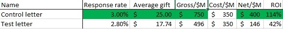
An even cleaner win for Team Control.  The test appears to have suppressed both response rate and average gift.

Percentages versus absolutes

Check out the attached graph of email open rates, where a new online team came it and the director bragged about the increase in open rates.  I actually saw a variant of this one happen live.

openrate1

Wow.  Clearly, much better subject lines under the new regime, no?  More people are getting our messages.

Well, for clarity, let’s look at this on a month by month basis.

openrate2

So, something happened in July that spiked open rates. Maybe it’s the new team, but we must ask why. One of the common culprits, when you are looking at percentages, is a change in N, the denominator.  Let’s look at the same graph, but instead of percentages, we are going to look at the number of people who opened the email.

openrate3

Huh.  Our big spike disappeared.

In looking into this, July is when we started suppressing people who had not opened an email in the past six months.  This is actually a very strong practice, preventing people who don’t want to get email from you, have moved on to another address, or were junk data to begin with off of your files.  As a result, your likelihood of being called spam goes down significantly.

So it wasn’t that twice as many people were opening emails; it was that half as many people (the good half) were getting the emails.

Correlation does not equal causation

The wonderful site FiveThirtyEight recently did a piece on how Matt Damon is more attractive in movies where he is perceived as being smarter.  For example, see how dreamy Damon is perceived to be as super-genius Will Hunting.  As Irene Adler says to Sherlock in the eponymous BBC series, brainy is the new sexy.

And you can look at this and think a logical conclusion: the smarter a Matt Damon character is in a movie, the more attractive that character is perceived to be.  This is plausible even though dreaminess was judged from a still frame – if Matt Damon is wearing an attractive sweater, it’s one of the Bourne movies; if it’s WWII garb, probably Saving Private Ryan.

This conclusion would reason that when Damon plays Neil DeGrasse Tyson in the upcoming biopic, his resultant sexiness will distract from the physical mismatching casting.

There’s also the hypothesis posited by the author: “The more attractive Damon is perceived to be in a movie, the smarter he is perceived to be.”  This says the reverse of the above: if Damon is attractive in a movie, he will be perceived to be smart.  This too is plausible – we tend to overestimate the competence of people we find to be attractive (hence why there is no picture of me on the site – you would immediately start discounting my advice).

Or it could be an exogenous third factor that causes both.  What if make-up artists want to symbolize dumbness by making actors unattractive (actually, since it’s Matt Damon, let’s say less attractive not unattractive)?  Film is after all a visual medium and since they know people underestimate less attractive people, they aim to make less competent characters less attractive.

Those are the ways correlation can go: A can cause B, B can cause A, or C can cause A and B.

This is what we must guard against in drawing final conclusions, but rather continually refined theories.  Let’s say you are seeing a general trend that your advocacy mail packages are doing better than your average mail package.  It’s generally safe to say more advocacy mail packages would be better.  But what if it isn’t the advocacy messaging, but that advocacy messages have a compelling reply device?  Or that when you mailed your advocacy pieces, you were also in the news?

One of the key parts of determining the results of a test is learning what the test actually means.  It’s important to strip away other possibilities until you have determined what the real mechanism is for success or failure.  This is why, for the blog analysis last week, I did a regression analysis rather than a series of correlations – to control for autocorrelations.

You don’t have to be versed in all manner of stats; the most important thing it to keep asking why.  From that, you can find the closest version to the truth.

The dirty dirty data tricks that dirty dirty people will use to try to get their way

7 direct marketing charts your boss must see today

Yay!  It’s my first clickbait-y headline!

I preach, or at least will be preaching, the gospel of testing everything.  There have been times that it has been a rough year for the mail schedule, but then we get to a part of the year we tested into last year, so I know that the projections are going to be pretty good and our tweaks are going to work.  It is those times that there are but one set of footprints on the beach, for it is the testing that is carrying me. So I eventually had to test out one of these headlines — my apologies in advance if it works.

The truth is that there are no such charts that run across all organizations.  There are general topics that you need to cover with your boss – file health in gross numbers, file health by lifecycle segment, in-year performance, long-term projections, how your investments are performing.

But what you need to do is tell your story.  You need to analyze all of the data, make your call, and present all of the evidence that makes your case and all of the evidence that opposes it.

This sounds simple, but how often do you see presentations that feature slides that educate to no end – slides that repeat and repeat but come to no point.  Also, they are repetitive and recapitulate what has already been said.

On Monday, I brought up the war between art and science marketers.  The secret to how the artists win is:

Stories with pictures

Yes, really. The human brain craves narrative and will put a story to about anything that comes in front of it.  It also retains images better than anything else.  There’s a semi-famous experiment where they gave noted oenologists (French for “wine snobs”)* white wine with red food coloring. The experts used all of the words that one uses to describe red wine, without ever noting that it was actually a white wine. When confronted with this, the so-called wine experts all resigned their posts and took up the study of nonprofit direct marketing to do something useful with their lives.

winesmeller

OK, I’m lying about that last part.

My point is that we privilege our sight over all other sense – in essence, we are all visual learners.  When we see words on a slide, our brain, which is still trying to figure out why it isn’t hunting mastodons, sees the letters and has to pause to think “what’s with all of those defective pictures.”

So, as I’ve been writing a lot of defective pictures and I promised the seven direct marketing charts your boss must see today, let’s discuss a story that you would want to tell and how you would present it.

1.

Graph1

The idiot I replaced the idiot that I replaced cut acquisition mailings in 2012.

2.

Graph2

It spiked net revenue for a time, enough for him to find another job.

3.

Graph3

But that has really screwed us out of multiyear donors coming into 2015.  You can see the big drop in multiyear donors in 2014 because they weren’t acquired two years earlier.

4.

graph4

And multiyear donors are our best donors.  You’ll also note that our lapsed reacquired donors have greater yearly value than newly acquired with about the same retention rate.  Thus, my first strategic priority to focus more in reacquiring lapsed donors.  Not as good as the multiyear donor that idiot made sure we didn’t have coming into the file this year, but pretty darn good.

5.

graph5

Lapsed donors have actually decreased as a portion of our average acquisition mailing…

6.

graph6

…yet they have been cheaper to acquire.  In summary, they are better donors than newly acquired donors and they are cheaper to acquire, yet we’ve been reaching out to them less.  Thus, we have an opportunity here.

7.

graph7

Because of this insight and because my salary significantly lags the national average for a direct marketing manager of $67,675, I believe I deserve a raise.  I’m now open for questions.

I swear that in many presentations, this would be over 30 slides and over an hour long.  I’ve actually given some of those presentations and if someone was in one of those and is still reading this, I apologize.

Some key notes from this:

  • Note the use of color to draw attention to the areas that are important to you. Other data are there to provide background, but if you are giving the presentation, it is incumbent upon you to guide the mind of your audience.  In fact, if you are giving the presentation, you may wish to present the chart/graph/data normally, then have the important colors jump out (or the less important ones fade away), arrows fly in, and text appear.
  • As mentioned, this is a different structure of presentation that would normally occur. Normally, there would be a section on file health, then one on revenues, one on strategic priorities, and so on.  However, when you structure like that, the slide that makes the point of why you are doing the strategic priorities you are doing may be 50 slides early.  You can say, “remember the slide that said X?” but regardless of what the answer is, the answer is really is no.  You are smarter than that.  You are going to use data to support narrative, not mangle your story to fit an artificial order of data.
  • There is one point per image (with the exception of #4, which had a nice segue opportunity) and no bullet points. Bullet points help in Web reading (hence my using them here), but they actually hurt memory and retention in presentations.

With this persuasive power, though, comes persuasive responsibility.  Not in the sense that your PowerPoint will soon have you enough dedicated followers to form your own doomsday cult, although if that opportunity arises, please take the high road.

What I mean is as you get better and better at distilling your point, there will be a temptation to take shortcuts and to tilt the presentation so it favors your viewpoint beyond what is warranted.  Part of this is ethical, to be sure – don’t be that type of person – but a larger part is that no one person is smarter than everyone else summed together.  Even readers of this blog.  If you omit or gloss over important data points, you aren’t allowing honest disagreement and insights among your audience that can come to greater understanding.  By creating an army of ill-informed meat puppets, you are going it alone trusting on your knowledge and skill alone to get you through.  There will be a day and that day may be soon when the insight you will need will be in someone else’s head.

You do have to prioritize for your audience.  You may have noticed some other points you would have covered in these graphs – retention in this program is falling and cost to acquire donors is increasing.  This person chose to focus on lapsed but didn’t hide the other metrics, which is sound policy.

So we will cap off the week tomorrow with tricks that other people use to shade their data.  I debated doing this section because it could be equally used as a guide to shade your data.  But you are trusting me and I’m trusting you.  Knowledge is not good or bad in and of itself, but let’s all try to use it for good.

* Oenology is actually from the Greek words for “wine” and “study of,” but that isn’t funny…

7 direct marketing charts your boss must see today

Metric pairing for fun and nonprofit

There is no one metric you should measure anywhere in direct marketing.  Like Newton would have said if he were a direct marketer, each metric must have an equal and opposite metric.

The problem with any single metric is, as either or both of Karl Pearson and Peter Drucker said, that which is measured improves.  My corollary to this is what isn’t measured is sacrificed to improve that which is measured.

So what metric dyads should you be measuring?

Response rate versus average gift: This one is the obvious one.  If you measured only response rate, someone could reduce the ask string and lower the heck out of the amount of the ask to spike response rates.  If you focused solely on gift amount, you could cherry pick leads and change the ask string to favor higher gifts.  Put together, however, they give a good picture of the response to a piece.

Net income versus file health: Anyone could hit their net income goals by not acquiring new donors.  More on this another time, but suffice it to say this is a bad idea, possibly one of the worst ideas.  Likewise, an acquisition binge can increase the size of a donor base very quickly but spend money even more quickly.

Cost per donor acquired versus number of new donors acquired: If you had to design a campaign to bring in one person, you could do it very inexpensively – probably at a profit.  Each successive donor because harder and harder to acquire, requiring more and more money.  That’s why if only cost is analyzed, few donors will be acquired, and vice versa.

Web traffic (sessions or unique visitors) versus bounce rate: Measuring only one could mean many very poor visitors or only a few very good visitors.  Neither extreme is desirable.

Click-through rate versus conversion rate: If only your best prospective donors click on something, most of them will convert.  More click-throughs mean a lower conversion rate, but no one should be punished for effectiveness in generating interest.

List growth versus engagement rates: Similar to Web site metrics, you want neither too many low-quality constituents nor too few high-quality ones. Picture what would happen if someone put 1,000, 10,000, or 100,000 fake email addresses on your email list.  Your list would grow, but you would have significantly lower open rates and click-throughs.  Same with mail – as your list increases, response rate will go down – you need to find if the response rate is down disproportionately.

Gross and net revenue: Probably don’t even need to mention this one, but if you measure gross revenue only, you will definitely get it.  You will not, however, like what happens to your costs.

Net revenue versus ROI: Usually, these two move in concert.  However, sometimes, additional marginal costs will decrease ROI, but increase net revenue per piece as in the example yesterday.  In fact, most examples of this are more dramatic, involving high-dollar treatments where high-touch treatments increase costs significantly, but increase net revenue per piece more.  A smart direct marketing will make judgment calls balancing these two metrics.

Net revenue versus testing: This is clearly a cheat, as testing is not really a metric, but a way to increase your revenue is not to take risks, mailing all control packages, using the same phone script you always have, and running the same matching gift campaign online that you did last year.  Testing carries costs, but they are costs that must be born to preserve innovation and prevent fatigue in the long run.

These are just a few of the metrics to look out for, but the most important part of this is that any one single metrics can be gamed (whether intentional or un-).  One of the easiest ways to avoid this is thinking in the extreme – how would you logically spike the metrics.  From there, you can find the opposing metric to make sure you maintain a balanced program.

Metric pairing for fun and nonprofit

The basics of direct marketing reporting – part two

Yesterday, we talked about the key metrics you want to look at in Excel – 13-14 indicators that speak to you about progress and testing results.

However, a direct marketing Muggle will look and these data and say “Huh.  Interesting.” This is direct marketing Muggle code for “this is not interesting and it makes me think of my Algebra II class, which was taught by a nun.”

While you will want all of the data, you will want a skinnier, clearer chart for others, preferably with colors that call out what is actually important.  Let’s look at a fairly standard test – your thesis was that extra personalization in the letter would increase average gift versus your control.  Here’s what this could look like:

uglytest

The first thing to notice is that your hypothesis was wrong – average gift didn’t go up.  But now you have another decision – should you pay for the additional personalization in the future?

You, as a direct marketing professional, can read this chart.  The increased personalization caused response rate to increase.  As a result, gross income per piece went up and net income per piece went up.  However, return on investment went down; the additional investment didn’t bring in as much as the investments before it.  What would you recommend to your boss?

This is a judgment call based on your goals for your program.  One good approach would be to call for a retest – possibly with even more personalization or to see if you can get the personalization costs down or different ask strings to try to boost average gift.  This is clearly not in the 95% percentile one way or the other (which are other good fields to add to your spreadsheet when you get more advanced), so more testing would be good.

But I know which one I would mail more quantity of when the next test is done – I would use the personalization version as the control.  For me, net per piece matters more than ROI.  Our donors’ time is a scarce and valuable commodity.  There are only so many times you have the opportunity to get in front of them, so if you have the opportunity to maximize their investment of their time, versus trying to go for cost control in borderline cases like this one.

Charity Navigator would disagree with me, as they focus on cost of fundraising, so that’s another point in my argument’s favor.  Remember the Charity Navigator Constanza test – hear what they have to say and do the opposite and it will be to your benefit.

So now you have your course of action.  Now you have to have other people see it your way.  Time to explain it:

pretty test

The first thing to note is that it’s legible.  The second is quantity and absolute gross, net, and cost numbers are gone.  These don’t have any relevance to the decision over what to roll out with.  If you leave them in, there’s a natural human temptation to think biggest = better, especially when it’s called revenue and has a dollar sign in front of it.  For a layperson, it’s good to eliminate these distractions.

Then we’ve color-coded the winning parts.  Control wins on cost; test wins on response rate and ROI, gross income and net.  This helps draw attention to the salient bits.  It is amazing how much these little steps can help focus minds.

You will note that I left ROI in there, even though it is evidence that does not support the case you are trying to make.  I’ve talked about testing as a central commandment on the direct marketer’s tablets.  But testing is nothing if there isn’t intellectual honesty.  You have to make the case, but also give your team all of the information to challenge you and make your arguments better.

This is usually where the aesthetic marketers get us data-driven marketers.  They tell quality stories based not on what is true, but on what we wish were true.

We must become equally good storytellers, because a good story plus data beats just a good story.  On Thursday, I’ll talk about how to present data in a compelling way, but first, we have to figure out how to measure our metrics.

The basics of direct marketing reporting – part two

The basics of direct marketing reporting

So there have been some unjustified slaps at Excel over the past week, as well as against hamsters, Ron Weasley, and the masculinity/femininity of people named Kris.  (The one against Clippy was totally justified.)

clippy

It seems only right, then, to talk about things that Excel is actually good at – doing calculations and presenting data.

There are two general schools of marketing people: art versus science.  The art folks appreciate the aesthetics of marketing and aim toward beautiful design and copy.  They will talk about white space and the golden ratio and L-shaped copy and such.  They elevate fad into trend into fashion. They were responsible for the Apple “1984” commercial and don’t understand why the guy with bad toupee on late night commercials is really successful. They can read the nine-point font they are proposing for your Website and don’t care if it is actually usable.

The job of the science people is to make sure that these people don’t damage your organization too much.*  Our motto is “Beauty is beautiful, but what else does it do?”, or it would be if we started having mottos.  Our tools are the well-designed study, the impertinent question (e.g., “I understand that our brand guidelines say to use Garamond, but our testing shows Baskerville converts better. Would we rather stick to the brand guidelines or raise more money?”), and the clear data presentation.

This last one can be hard for us. Too often, when we present our data, the data goes up against a beautiful story that people wish was true and loses.

So we need to cover not only what data you want to collect (today), but how to present it compellingly (tomorrow).

A standard Excel chart for mail pieces

The things I like to see, in approximate order, are:

  • Enough things to identify the piece/panel/list
  • Quantity mailed
  • Response rate
  • Number of donors
  • Average donation
  • Gross revenue
  • Cost
  • Net revenue
  • Gross per thousand
  • Cost per thousand
  • Net per thousand
  • Return on investment
  • Cost to raise a dollar

That’s for a donor piece; for acquisition, I’d recommend adding cost to acquire.

So that’s what data to collect; tomorrow, we will look at how to present it.

* I am framing this as a battle largely for dramatic purposes. Ideally, you have a data person who respects the talents of a high-quality designer and a designer who likes to focus on what works. These together are stronger than any one alone.**

** But if you have to pick one, pick the scientist.

The basics of direct marketing reporting